THE SCREENSHOT TOPIC RETURNS
Posts
Edit: Always with the new pages. O:<
So here is the last images from the last page, that I bumped off;
An outline on the text would fix any readability problems.
And I like the facesets.
So here is the last images from the last page, that I bumped off;
author=Lucidstillness
Thanks for the quick feedback guys! I'm still playing around with how things will look, so this is very useful.
I'm still wondering what to do about the combat portraits, as some of the characters are so bright they make the numbers hard to decipher. I think I'll probably put bars where the stats are to make things a bit clearer. I rather like how the heads go slightly above the bar, but that's a personal thing.
Map design is something I'm also still playing with, as I realized early on that the presence of on screen monsters that chase the heroes requires some room to maneuver (otherwise it's really cheap for the player). I'll be adding a lot more detail to the maps as time goes on, which brings me to another subject:
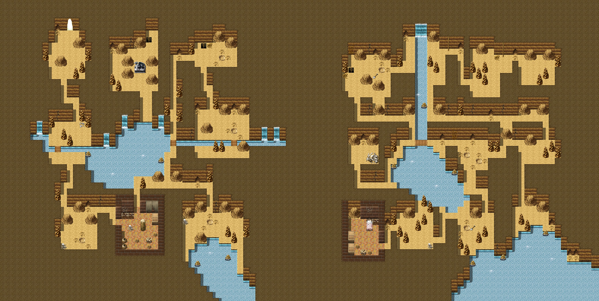
In this screenshot, do you think the top of the cave looks good? I know a lot of RPGs have a kind of 'trim' around the top, but I'd like to know if you think it looks good without it, since it's a fair bit of extra work at this point.
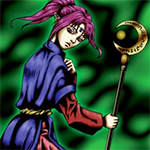
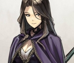
Thanks for your comment about the monsters dethmetal. I thought about doing the characters in the same style, but decided against it for two reasons. The first is that the characters have to emote a fair bit during the dialogue scenes, and anime art is just a lot easier to draw for that:
The second is that I wanted to make a kind of tribute to older RPGs like Cosmic Fantasy or Lunar. Hopefully the clashing styles will evoke those old games.
Thanks again for the feedback guys! :)
I'm still wondering what to do about the combat portraits, as some of the characters are so bright they make the numbers hard to decipher. I think I'll probably put bars where the stats are to make things a bit clearer. I rather like how the heads go slightly above the bar, but that's a personal thing.
An outline on the text would fix any readability problems.
And I like the facesets.
Thank you Khos. This is probably going to sound like a noob question, but is there a way to add an outline to a font used in RPG Maker XP?
:>
EDIT - This now has two modes of working, you can toggle between free-roam and snap-to-key mode by pressing shift. In snap-to-key mode you press left and right to move to the adjacent keys of the same colour as the one you're on.. And up and down to move a semitone up or down from the key you're on.
It also retains position between toggling modes :>
I HOPE YOU'RE HAPPY RHYME.
Whoa, that is really cool! The only way I think it could be better is if there was a graphic for the keys being pressed, but that is very impressive!
Personally, I think it really is not necessary, especially considering it's obviously a photography of a real piano and the mix reality/fiction (or abstraction) would clash (in a BAD way this time!), imho!
author=chana
Personally, I think it really is not necessary, especially considering it's obviously a photography of a real piano and the mix reality/fiction (or abstraction) would clash (in a BAD way this time!), imho!
Actually it's just a drawing I made on the pc :> but I'll take that as a compliment.
wow, you really had me there, with just that little bit of blurriness of photos taken too close and the slight slant at the tip of the "sharp" keys!
If I were you I would downsize the graphic to fit on the screen and assign the notes to the keys on the numpad. That'd make it a lot easier to play.
author=dethmetal
If I were you I would downsize the graphic to fit on the screen and assign the notes to the keys on the numpad. That'd make it a lot easier to play.
Then you'll love the new version that narcodis was kind enough to event-code for me earlier today.
@Khos:
I think the character sprites could use a little refining, and the maps could use a tad more detail. That being said, if those are custom graphics, they are quite good! I can't imagine the undertaking making everything from scratch would take!
I've got a question about my map design here! I've had critique on my game which said that my inside areas look strange because the outside border (cave wall) is not shown. Looking at these side-by-side images, which one looks best? I currently use the one on the right. Any feedback would be most appreciated!

@ Orias_Obderhode: Those aren't my screens, they are Lucidstillness'.
I was just quoting it since I bumped him off with the new page.
Also, for your question; I would do the method on the left, but instead of bringing the wall all the way down to the ground I would fade it out.
I was just quoting it since I bumped him off with the new page.
Also, for your question; I would do the method on the left, but instead of bringing the wall all the way down to the ground I would fade it out.
Ah, I believe you are referring to my work that Khos quoted Orias_Obderhode. Thank you for the compliment! I've been working on the game for about four months now, and I've gotten to the stage where I can start to add a lot of little details to the environments. For the characters, my design process is to first draw and colour the artwork, and then make the sprites. I made the sprite templates from scratch as well, so this is all a learning process for me. How would you refine them further?
As for your map, I personally think the one with the outside border looks nicer. It might seem a bit like 'negative space', but I think the overall impression is more pleasing with consistent borders throughout the area.
As for your map, I personally think the one with the outside border looks nicer. It might seem a bit like 'negative space', but I think the overall impression is more pleasing with consistent borders throughout the area.
@Ludidstillness:
Doh! I apologize. I wish I could offer really good suggestions on how to improve the character sprites. I can sprite ok, but I am really bad at making character sprites that are larger than 32x32. I usually work with gameboy styled graphics too, which is a bit different to make than those. They most certainly don't look bad, but something is just a little off, I can't quite discern what. Maybe try adding a black border around the characters? The female character with the brown hair's hair looks a slightly off to me as well. It is still looking quite nice and I say keep up the good work! :)
Khos and Lucidstillness, thanks for the suggestions on which to use! You know, I'm thinking the one on the left looks better as well. I had originally done it the way shown in the right because Dragon Warrior Monsters did their houses and caves that way, but everything doesn't have to be the same, huh?^^
Well, thank you for the advice Orias_Obderhode. I think I might try giving them a black border, since that might work better with the anime face art.
Yeah, I say be original! lol. It gives the dungeon a rather nice self-contained look, imo.
Yeah, I say be original! lol. It gives the dungeon a rather nice self-contained look, imo.
That looks much better!(except for the far ropes on the ring.) Is something wrong with the floor ? It works in the little room, but not in the big one, maybe the light?
author=Creation
Updooken!
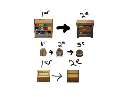
I like to keep a record of my stuff as I got along to see how much I've progressed:
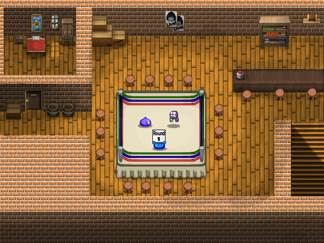
A new version of the ring, with most of the flaws fixed:
Once again, I'm looking forward to your criticism as to what to improve next :).
My only complaints are:
1. Door on the left, maybe use something other than a strong black for the outline?
2. The fuzziness on the curved parts of the colored ring ropes
But they're minor compared to the original.


