


THE SCREENSHOT TOPIC RETURNS
Posts
@KOG: I'm surprised people here just glanced over your beautiful screens. That's amazing work and I particularly love the second to last screenshot. I'd buy and support that game =]
-Kannes
Top of the page pic, Breakout Hero a wip.

-Kannes
Top of the page pic, Breakout Hero a wip.

author=meisamany tips?

Here you go, some graphical edits: http://divisionheaven.wordpress.com/material-list/materialtiles/

author=Satedauthor=LibertyBeing part of the RTP doesn't excuse them from beng ugly as fuck. They're just... horrible. Really, really horrible. I couldn't possibly take a map using those tiles seriously.
The canopy and tree trunks are the RTP - they're supposed to be square as balls. The other trees... yeah, they don't really fit, bar the other RTP trees.
@kindred - no reason, bar that people tend to forget it exists. Feel free to link from your locker as you will. ^.^
EDIT:
Square as balls..? I don't even.
It's doable if you work with the resources instead of against them.

Don't judge my square judging abilities (or lack there-of.) :<
@ Archeia_Nessiah wow they look a lot better thanks Archeia_Nessiah but I have some problems see the image

In the actual game they are a lot more visible, how can I solve this?
In the actual game they are a lot more visible, how can I solve this?

author=meisam
@ Archeia_Nessiah wow they look a lot better thanks Archeia_Nessiah but I have some problems see the image
In the actual game they are a lot more visible, how can I solve this?
Events. B)
Place events that look like tree bark over there. :)
Well, this is the way I do it on RM2K3, I dunno how ACE/VX/Xp work. :\
author=King of Games
Some mockups I did for an indie game called "Alacrity Mission."
Had a lot of fun designing the tiles/environments.


Not much to say about these other than they are all fantastic! Im glad you had fun designing and working on this, thats what this whole things all about aint it? having fun doing what you love! Looks great too.
Anyways, here's an underground camp thing I'm working on:

author=NOACCEPTANCE772author=meisamEvents. B)
@ Archeia_Nessiah wow they look a lot better thanks Archeia_Nessiah but I have some problems see the image
-snip-
In the actual game they are a lot more visible, how can I solve this?
Place events that look like tree bark over there. :)
Well, this is the way I do it on RM2K3, I dunno how ACE/VX/Xp work. :\
This pretty much
Not much this week in the way of maps, but I did do the intro of Mystic Quest to see how far I could get.
And... Kaeli's house.

Hopefully the Bone Dungeon ones will be more interesting.
And... Kaeli's house.
Hopefully the Bone Dungeon ones will be more interesting.

author=Liberty
Usually the beds wouldn't be seperated by a sink. That would in an area that were for washing up. Try to compartmentalise the room - one area for sleeping, one for cleaning, one for paperwork and one for medical supplies/information. Perhaps put the beds in the top or bottom areas only, add in some curtains for privacy, place the height and weight apparatus against a wall, move the bin to near the desk and the sink nowhere near the beds. A radiator would probably be good, too, for warmth. And chairs.
How is this? I think it's a little too clutter on the bottom left. :P


@Mr D: Nah, man, that actually looks pretty good. ^.^)b
You could, if you still feel that way, move the curtain up a tile to make it overlap the beds. Personally I think it looks much better, though. You've come a long way from your first map. You should be proud of your progress so far. :D
@megaman8x: It's really odd to see the Suikoden rips as a pseudo 3D, but interesting too. I like it, though I'm not so sure about whatever the bright pink is. A fence with the background colour showing? Interesting use if the tiles, though.
author=Liberty
@Mr D: Nah, man, that actually looks pretty good. ^.^)b
You could, if you still feel that way, move the curtain up a tile to make it overlap the beds. Personally I think it looks much better, though. You've come a long way from your first map. You should be proud of your progress so far. :D
Nyehehehe. Thanks. :D
How is this for a library? Beside putting some items on the desks, how is the layout? :P

I am thinking of putting in sofas and make the desks thinner. But that would make the map bigger, so that's an issue.
The main issue is that the chairs at the desks don't really fit with the ones at the top of the screen. So perhaps your idea for sofas would work. You could try editing the layout of the sofas so that enough of the top part is in the top tiles so as to look as though they're beneath the tables somehow. It would pretty much depend on the kind of sofa you'd be using, though.
You could also, instead, make the sofas against the walls instead and make the tables one tile thinner to fit another on the off-wall side. Like so:
The | being the wall,and being the sofas, O being the table and /\ being the middle rack.
You could also, instead, make the sofas against the walls instead and make the tables one tile thinner to fit another on the off-wall side. Like so:
|[O] /\ [O]|
The | being the wall,
[
]

@Liberty: So true! There aren't really bad resources, but more like bad mappers IMO. I can't wait to start working with Ace once my game gets done :D Good map by the way!
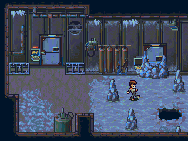
I also wanted to get some critique on my "pitch dark cave". It's A LOT easier to see when in fullscreen mode(especially the 1st screen), but it's still the good ol' dark cave.


It's suppose to be a little tricky to find your way around in there.
Do you think it's too dark, like bad/annoying for eyes dark or is the darkness good?
Thanks in advance!
I also wanted to get some critique on my "pitch dark cave". It's A LOT easier to see when in fullscreen mode(especially the 1st screen), but it's still the good ol' dark cave.
It's suppose to be a little tricky to find your way around in there.
Do you think it's too dark, like bad/annoying for eyes dark or is the darkness good?
Thanks in advance!

If I at first think it's just a pitch black image, then yeah, it's too dark @-@
(i did)
(i did)
author=luiishu535
@Liberty: So true! There aren't really bad resources, but more like bad mappers IMO. I can't wait to start working with Ace once my game gets done :D Good map by the way!
I also wanted to get some critique on my "pitch dark cave". It's A LOT easier to see when in fullscreen mode(especially the 1st screen), but it's still the good ol' dark cave.
It's suppose to be a little tricky to find your way around in there.
Do you think it's too dark, like bad/annoying for eyes dark or is the darkness good?
Thanks in advance!
The pitch dark cave is a bit too pitch dark, try adding just a bit more brightness or the player will not be able to see where he's going. :\
Today's HD screens eliminate all color shades that approach BLACK, so basically the game would be a dead end there. :\
There was this game I loved to death which I promised to never edit out anything.
Turns out he, the creator, was making it on a very old computer, so when I played it, I could not pass the dark cave stage no matter how much I tried.
Had to open it up in RM2K3 and eliminate the event which causes the screen tint.
However, This is VX/VX ACE, so there will be no opening and editing here. :\
Lol! XD Thanks for the quick reply guys, I edited the tint and made it a bit lighter.

Much better, or is too light?
Much better, or is too light?
author=luiishu535
Lol! XD Thanks for the quick reply guys, I edited the tint and made it a bit lighter.
Much better, or is too light?
MMmm, that's much better! :D
Good enough! :)
author=Liberty
@megaman8x: It's really odd to see the Suikoden rips as a pseudo 3D, but interesting too. I like it, though I'm not so sure about whatever the bright pink is. A fence with the background colour showing? Interesting use if the tiles, though.
thats just a gate texture im working on, pink is the invisible color in the engine

