


THE SCREENSHOT TOPIC RETURNS
Posts

YOU SHOULD not have transparent background for text in your game. That's even worse than before. There WILL come a time where you will want to have the same background as the text color you choose. I don't care if I'm not your mum. Stop trying to avoid sound advice just because someone doesn't tiptoe around your sensitive little ego.
Do as I said in my earlier posts.
Do as I said in my earlier posts.
Transparent text backgrounds can be useful. If you have an introduction to your game that is entirely text based but you don't feel like making a picture for the text, that is when transparent backgrounds come into play. Of course, VX/VXAce has the "Dim Background" option for text, which is more useful than not having a message background.
Sure you can have transparent background for a couple of messages, like introductions, but I assumed he was going for transparent background during the whole game.
I understand now. The only reason you'd ever want a transparent background for the whole game is if you are using a picture to serve as the text box.

author=SnowOwl
Sure you can have transparent background for a couple of messages, like introductions, but I assumed he was going for transparent background during the whole game.
What gave you that impression?
The point is, if during the intro cutscenes (which is basically when you use it this game) within like the first FIVE MINUTES, you run into something that makes it unreadable, it's time to try another one. And that's perfectly fine.
I did however have that for Oracle of Tao (this is a different game I'm working on, with the only bar to launch the text), but this was because I had a menu system that revolved around this.
The reason for transparenting the whole game is because of this (Oracle of Tao, not this game).

I btw have four of these, including one that shifts depending on day/night (game_clock FTW). Yea, solids totally works when this probably covers one BG color. But if I have multiple competing colors, I'm gonna need to make an actual effort to get things to contrast against multiple colors.
Thanks for all your help Snowy. And thanks for listening, I really feel like I'm not talking to a brick wall here.
The yellow text here is hard to read. The effect where its
darker at the bottom gives it a blurry effect and doesn't
help with the background here.
Forget it, I give up.
I can read this text across the room, I've tried many many different colors before arriving at this one, and I've got to somehow figure out this stupid thing so that you guys can read it. Clearest it's ever been, and yet it's still "hard to read."
Ambrosia Oracle
L26 Healthy HP 2886/2886 (the 8 is the only thing troublesome, because it looks vaguely like a 0)
151649/161200 (exp) MP 0/0
Nevras Swordswoman
L29 Healthy HP 1998/1998
184800/197200 MP 77/77
Elias Shrine Maid
L24 Healthy HP 1202/1202
138366/139200 MP 192/192
Aqorm Thief
L24 Healthy HP HP 2136/2136
138449/139200 MP 100/100
I'm not posting here anymore. Screenshots are horrible.
You are most welcome. In the future make sure that the background for text is either
A: Dark on light/light on dark
or
B: Opposite color
If you really have to keep using that gradient text which honestly I find veeery 90ies (not in a particularly good way), do not make the 2 colors used in the gradient opposing colors or light to dark (white to black would be a offender of both these) because it makes it harder to read.
Too many colors and too much contrast in a picture background is also not prefered. The simpler the better.
That forest picture with yellow text is not very good.
Yellow and green is not a good match, since yellow is pretty close to green (making it hard to read). Look at that color wheel, pretty fuggin close.
The picture also goes from dark to light in a number of spots under the text.
That Elias text is barely readable, for example.
If you really have to have that background picture (which you don't, just google something prettier, it's pretty ugly actually) make it darker, and preferably change the text color.
You have to take into consideration alot of people have shitty monitors/ bad resolutions/ shitty color settings/other stuff making display quality shit.
It might be no problem reading all of the text for you, but it won't be the same for everyone.
author=bulmabriefs144
Forget it, I give up.
I can read this text across the room, I've tried many many different colors before arriving at this one, and I've got to somehow figure out this stupid thing so that you guys can read it. Clearest it's ever been, and yet it's still "hard to read."
Ambrosia Oracle
L26 Healthy HP 2886/2886 (the 8 is the only thing troublesome, because it looks vaguely like a 0)
151649/161200 (exp) MP 0/0
Nevras Swordswoman
L29 Healthy HP 1998/1998
184800/197200 MP 77/77
Elias Shrine Maid
L24 Healthy HP 1202/1202
138366/139200 MP 192/192
Aqorm Thief
L24 Healthy HP HP 2136/2136
138449/139200 MP 100/100
I'm not posting here anymore. Screenshots are horrible.
I can read the menu text fine, it's just that the yellow colored text clashes with the forest BG.

http://rpgmaker.net/media/content/users/204/locker/jrpgwindowideas.jpg
http://rpgmaker.net/media/content/users/204/locker/colorscheme_ideas.jpg
To state the obvious. Professionals do not fuck around with noise or heavy information behind the text. Even with the trick of white text/black border working on everything, it's still better to keep the back flat or noiseless as possible. Blending yellow with grey on a gradient is just weird and you're just overdoing it.
Anyone else NOT a professional? What kind of answer is that?
Same question I've been asking since like page 348. What color goes with green, blue, yellow, black, grey, and white? And not a BG color scheme. An actual text color. If you haven't got an answer, don't tell me about busy colors and "professionality." I'm interested in only one thing, functionality.
Why are green and gold so often paired in schools then? I don't understand it. I suppose red would work, for that, but then I get a problem with my blue picture, or my yellowish one, or my other. Urgh....

author=bulmabriefs144
Anyone else NOT a professional? What kind of answer is that?
Same question I've been asking since like page 348. What color goes with green, blue, yellow, black, grey, and white? And not a BG color scheme. An actual text color. If you haven't got an answer, don't tell me about busy colors and "professionality." I'm interested in only one thing, functionality.
Why are green and gold so often paired in schools then? I don't understand it.
If you think that works well, just go with it and do whatever you desire. None of us are professionals, so we try to be. I don't know which schools did you go to, though.
My advice is when you try many similar things and they don't work, do something else completely different.
I just posted an entire slew of examples of functionality. What are you not understanding? The commercial games have the easiest approach to text ideas ever.
White with black border is the most adaptable text to anything really. There are some exceptions but that can be fixed with a black transparent box behind the text to darken anything behind it.
White with black border is the most adaptable text to anything really. There are some exceptions but that can be fixed with a black transparent box behind the text to darken anything behind it.
author=bulmabriefs144
I'm not posting here anymore. Screenshots are horrible.
I'm surprised you've kept posting up to this point, and I would bet that you continue to post.
You know, when you post screenshots and keep them small, it only adds a layer of distortion. Nobody plays the game that size and it makes the readability worse. Maybe you should consider posting larger screens.
Oh, I'm not sure if you even realize this, but you can change the color of the text at any time! How convenient~ That means you don't need to find a single text color that matches every single bg color.
You don't seem to have any good design sense, as almost everything you make has some weird mashup of color. You are completely resistant to any kind of feedback, as you seem to want to stick with your tacky design choices. Your stuff isn't IMPOSSIBLE to read, it's difficult to read. I don't like playing a game where I have to lean in and squint just to read. One of the most basic design principles is to make things clear. If your cutscenes of varying bg colors and window transparencies are causing problems, then you don't need a change of color. You need a complete overhaul of how you are handling text.
Or just
author=bulmabriefs144
give up.
author=bulmabriefs144
Why are green and gold so often paired in schools then? I don't understand it.
Because schools use those colors in their logo and sports uniforms, not the typeface in their newsletters haha
My first high school used Gold and Green xD
author=GamingMitchell03232013Just finished this interior. Its really bare-bones as of right now, but it'll have to do.
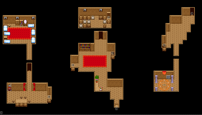
What kind of building is that? If you try and piece it together, it's either a really funky shape or some kind of
author=Link_2112author=GamingMitchell03232013What kind of building is that? If you try and piece it together, it's either a really funky shape or some kind of understand series of small rooms.Just finished this interior. Its really bare-bones as of right now, but it'll have to do.
I probably should of explained it's design in-depth on the first post the image was on. Basically, it's supposed to be a house inside of a cave, I just haven't edited the chipset to have graphics from the RTP Cave.
author=Mr_Detectiveauthor=bulmabriefs144If you think that works well, just go with it and do whatever you desire. None of us are professionals, so we try to be. I don't know which schools did you go to, though.
Anyone else NOT a professional? What kind of answer is that?
Same question I've been asking since like page 348. What color goes with green, blue, yellow, black, grey, and white? And not a BG color scheme. An actual text color. If you haven't got an answer, don't tell me about busy colors and "professionality." I'm interested in only one thing, functionality.
Why are green and gold so often paired in schools then? I don't understand it.
My advice is when you try many similar things and they don't work, do something else completely different.
I like this advice.
author=Link
I'm surprised you've kept posting up to this point, and I would bet that you continue to post.
You know, when you post screenshots and keep them small, it only adds a layer of distortion. Nobody plays the game that size and it makes the readability worse. Maybe you should consider posting larger screens.
Oh, I'm not sure if you even realize this, but you can change the color of the text at any time! How convenient~ That means you don't need to find a single text color that matches every single bg color.
I'm basically a Tsundere. I get all huffy and bothered, but yea, if I wasn't interested I'd have given up on it by now.
320 x 240 is my full screen. I use imageshack because it's free and doesn't require a login. I suppose I could do 640 x 480 blowup, but that would be it look distorted too.
Oh yea, the \c through \c thing. I'm not sure if I'm comfortable going through and trying to match every text to every BG. I mainly use the color text for special stuff like "You got a Mana Potion." So ideally, I'd like a one-size fits all text. Anyway, the real issue is those menu colors. Hmmm... that is a good plugin idea.

It seems to me the single thing you could do to make the text readable is get rid of the grading, as Snowy keeps saying. The yellow part of the text is fairly legible but as it gets darker at the bottom it makes the letters look cut off and thus hard to read. I know you've been resistant to using non-graded text but perhaps you ought to wonder why. Is it just because you personally like it? If loads of people, who will be the ones playing your game, don't like it isn't it better to swallow your pride and just change it? Otherwise if you're making the game just for you why release it here?
This is not criticism, I'm generally confused why you seem so reluctant to change the font.
This is not criticism, I'm generally confused why you seem so reluctant to change the font.
author=bulmabriefs144
320 x 240 is my full screen. I use imageshack because it's free and doesn't require a login. I suppose I could do 640 x 480 blowup, but that would be it look distorted too.
If blowing up an image x2 makes it look distorted, then you're doing it wrong.

Hosting an image on RMN is free, too.
Oh yea, the \c through \c thing. I'm not sure if I'm comfortable going through and trying to match every text to every BG. I mainly use the color text for special stuff like "You got a Mana Potion." So ideally, I'd like a one-size fits all text. Anyway, the real issue is those menu colors. Hmmm... that is a good plugin idea.
You could make copies of the system file where the only difference is the first text color. Then you would just need to change system graphics once and a while. Maybe not a one size fits all, but I'll insist that if you choose to use all kinds of bg colors you might never have a perfect solution. You might either need to change the font color or stop changing the bg color.

You have two issues with that menu:
- One is that you're putting light on light. You want to create more contrast in the text without making it eye-bleeding. Gold on green is fine, but make it a darker green.
- The second is that it's too busy. Your eyes are drawn to the background instead of the words. This is the reason people say Keep It Simple, Stupid when designing things. If you darken the background image it should help a bit but look at some commercial game window scenes and you'll see that behind the text, the majority have solid or at least minimal patterns. In the cases where they use patterns and pictures, they also use contrast to make the text pop out better.
- Another problem is the drop colour. Make it darker to make the text pop better, too. As it stands it just blends in with the text colour, making it look more blurred instead of standing out. This is why the default is black. Yours doesn't need to be black, but it should be a lot darker than it is.
And no, most of us aren't professionals, but we have learned over a long time what works and what doesn't. Don't worry, you're not the only one who learned all this by trial and error. (I used to love bright colours, red/blue text together on purple backgrounds and green edging. It took a while but I eventually learned what not to do. Don't fret.)
Oh, and there are some among us who are professionals in art - meaning they get paid for it and went to school to learn such things as colour usage, pattern creation and mixing of different elements among other things. Don't discount your fellow creators. You never know just what they have under their belts in real life.
(Not me, though but they are out there.)
author=papasan96
It seems to me the single thing you could do to make the text readable is get rid of the grading, as Snowy keeps saying. The yellow part of the text is fairly legible but as it gets darker at the bottom it makes the letters look cut off and thus hard to read. I know you've been resistant to using non-graded text but perhaps you ought to wonder why. Is it just because you personally like it? If loads of people, who will be the ones playing your game, don't like it isn't it better to swallow your pride and just change it? Otherwise if you're making the game just for you why release it here?
This is not criticism, I'm generally confused why you seem so reluctant to change the font.
Uhhh, it's like this (for the seventeenth time). I also have a yellow BG (BG4 below). I'm pretty sure yellow blends with yellow. So, choose another solid right? Nope, something blends with that. And so on. Yellow does not however blend with brown, they're opposite tones, so by doing near or opposite tones, I can ensure that at least part of the text is readable (that's the theory anyway). I could try to do this with text-backing like yellow with blue/purple, but then a third color near both (like green) ruins the mix.
BG 1 is Day/Night (a grey/black/white shifting BG)
(BG 2 is forest above)

BG3 is this.

BG 4 is this.
Pride has nothing to do with it. But it is annoying trying to explain this to everyone, only to have them decide I'm being "stubborn" or "proud." So, no, I won't "swallow my pride" I'll make this work (even if I have to use butt-ugly rainbow color text), but I'd appreciate some sort of help mixing all colors correctly. If not, rainbow puke it is.

