


BLIND'S PROFILE
Blind

2262


Search
Filter
 FF7 remake. It's a thing.
author=Feldschlacht IVauthor=kentona
I derive the most satisfaction from the challenge of building my character's skills/equipment/party/class to face the game's obstacles (most often battles). The battles are a test of my ability to plan, anticipate, and craft a well-rounded and powerful avatar.
I agree, so what I'm saying is that I don't want my ability to plan, anticipate, and craft a well rounded and powerful avatar to make the game easy. I want my ability to do those things to be met with an appropriate challenge where I can test those tools and use them to conquer that challenge, not steamroll it, which is what I was contesting. There are plenty of pure (not action) RPGs that meet even the best planning and party with real challenge that feels great.
You responded that that mindset is most applicable to action games, and my retort is that instead it should be applicable to all games.
author=ken
I hate it when it is undone simply because I can't press buttons fast enough. I don't like having my twitch skills tested unless I am specifically playing an action game.
Sure, but that's not what I'm talking about (although your ability to press buttons fast enough and correctly is also a skill, but isn't a requirement for a game to be a game or a challenging game).
Agreed, for the most part.
(Hero's Realm suddenly makes more sense, hearing Kentona's ideology. XD)
Streamlining combat and infusing "action" elements into more classic jRPG mechanics isn't a new thing for the series, though. It's just been seeping into Final Fantasy very gradually - first with the ATB (which was a pretty significant shift), and then again in FF7-9, where they kicked it up a notch. Speed and quick-thinking became essential to the underlying strategy of the battle system.
In fact, I'd even say it's been shifting gears more toward a "Kingdom Hearts" type of system for almost a decade (with FF12/13 and even more with 15), although hopefully it's not quite as utterly mindless as something like KH.
For better or worse, it makes sense for Square to forego the classic FF7 system to fit with the aesthetic of the remake...although hopefully it keeps enough similarities that the "spirit" of the original endures.
Screenshot Survival 20XX
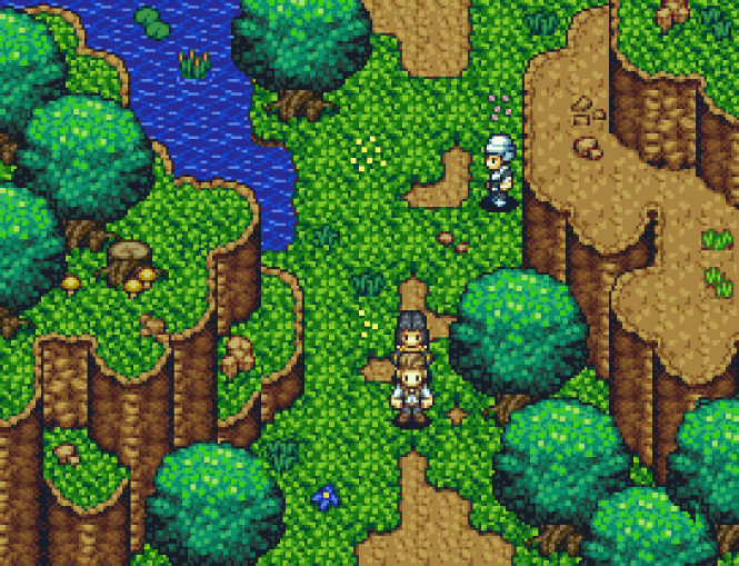
Sevens_Ace: Stylistically, everything meshes together for the most part, so nice job with that. Some of the objects, such as the shrubs and flowers, have a much thicker/darker "border" than everything else. It makes them appear more cartoonish and retro, whereas the RTP trees are smooth and rendered.
This might be a nitpick, but I've never been a fan of using more than 2-3 distinct trees on any particular map. It can break the illusion of a "forest" and just look like different objects plastered together on a map. Maybe keeping the shadows consistent could help with that?
This might be a nitpick, but I've never been a fan of using more than 2-3 distinct trees on any particular map. It can break the illusion of a "forest" and just look like different objects plastered together on a map. Maybe keeping the shadows consistent could help with that?
 shipwreck.png
Yeah, phenomenal work here. Seriously, the amount of detail and artistic excellence surpasses even a lot of SNES material.
TitleScreen2016.gif
author=dethmetal
This is wonderful! Did you create thid image yourself?
Thanks!
It was actually commissioned by a great pixel artist I'd worked with. I believe she's actually done some work on Rise of the Third Power as well. XD
Screenshot Survival 20XX
author=Kaempfer
It's not incredible or anything, but I feel like the tiles are a bit washed out by default and that addresses this... a bit.
Yeah, the color palette feels more harmonious in Kaempfer's edits, although I can't quite put my finger on why (the brown cliffs, especially, work nicely). There's a decent amount of contrast in the original tiles, but the colors don't necessarily create a sense of warmth or vibrancy. It could be a matter of personal preference, of course.
I used to enjoy creating maps that were almost 'overwhelming' in their contrast, but it can be tedious or difficult to design an entire game that way. XD
new.png
poison1.png
author=dethmetal
Blindmind, monotony is something I'm always keeping in mind when designing big maps. I have a few techniques to help combat this:
1. None of my dungeons take place in a single type of location. For example, if it takes place in a large tower, there will always be sections where you go outside as well to advance. If the dungeon is located in a cave, there's always a forest section or mountainous section as well.
2. I try to place "landmarks" throughout my maps. If you look at the full map I posted of this cave, you'll notice there are some manmade structures placed throughout the map. This helps break up the monotony of the cave and are easily recognizable. As well, many of my maps have rivers or other water sources weaving in and out of the player's path which I believe helps orient the player.
3. Most of my dungeons, when heavily simplified, are a simple shape. This one is kind of like a plus sign if you simplify it enough.
4. I always make sure to make the path clear and highly visible.
5. If you find a key, you'll always have seen the door it belongs to beforehand. Likewise, if you flip a switch that opens a passage, it will be a passage that you've seen so you don't get lost looking for it.
I learned most of these things from studying Zelda's dungeons. I really hope players don't have a problem navigating my maps! The last thing I want is for my caves to seem bland and repetitive.
Wow - well, it seems as though you've given it quite a lot of thought, which is excellent. I'm not exactly a dungeon connoisseur (XD) but I was more just commenting on what I saw in the screenshots.
I look forward to experiencing it in-game!
poison1.png
Cliffs are looking great once again, but yeah, the bridge seems to be missing the support beam on the right side.
Considering how huge this map is (as well as a lot of your other ones), the only potential negative is that there's not much contrast/dynamism in this dungeon. The mapping itself is good, but the area could blend together or become monotonous. Try adding more torches or notable elements (maybe with color?) that guide the player along.
But that could just be my nit-picking XD
poison2.png
This looks great. Your mapping in general, especially the tile-blending and elevation, has become truly impressive. XD

