


BRADY'S PROFILE


Search
Filter
 RMN v4.5 (and beyond) Feature Idea List
I'm with alterego on the star rating thing. A huge number of games go without any kind of star rating despite having hundreds of downloads because not enough people want to write detailed reviews that meet staff standards, and this only hurts the overall library of games on RMN knowing that only the popular/well-advertised/exceptionally good games are getting any star ratings at all. The majority of games that are maybe not fantastic but still good are being left at "unrated" along with any terrible games and never seeing any extra ratings.
There surely are ways to admin this though so that everyone wins. Off-hand, the two ways I could think of are:
-Giving separate rating systems for "free ratings" and "reviewed ratings". On the Games page, a game would have two wee star-bars instead of one, showing the general "quick rating" a game has and the more detailed "reviewed rating" as well.
-Allowing people to rate it only if they've downloaded the game, to prevent people rating it based on profile/images alone.
Is a main protagonist essential?
A "main" character simply means that the attention is being focussed on one character instead of many. By not using a main character, FFVI style, you're using a "main group" instead.
The only way to not have any main characters at all is to make a game like Tetris.
The question then becomes less about whether you want one or many main characters, but about whether or not you want to develop the character/background/story of one or many characters.
If you only have one character who you want to develop and build and follow around, he'll inevitably become the "main", even if that character isn't the most important for a story. For example, FFX's "main character" was completely and utterly irrelavnt to the central story and could probably be removed without changing the story at all until the end, but the game focusses infuriatingly on him and his ilfe and story and memories, so he became the "main" despite Yuna being the important one.
FFVI didn't have a main not for lack of importance, but because many of the characters had equal development and interest. Similar in a sense to the Big Bang Theory tv show: Leonard is clearly the "important" character with which the story revolves around, but there's no "main" character in the show; it's about everyone.
So...do you have one character you'd like to develop and reveal to the world with a cast of others less interesting, or who revolve around him...or do you have many to talk about?
RMN v4.5 (and beyond) Feature Idea List
 The Screenshot Topic Returns
It's "right" in the sense that it's one of the few things that add depth to the map, that really separates the floor from the ceiling tiles.
The reason the north corridor looks so weird is because the ceiling and floor tiles appear to be on the same level, amplified by the lack of a wall image at the back and from being four tiles away from the other nearest wall; it creates a small section where you can't tell that there's any walls at all. You shouldn't need to look at another part of a map to understand one part. A shadow in that back corridor, albeit possibly illogical, will create a determined effect that there is indeed a wall there.
I imagine there are other ways to create depth, but he's not using any at all. The shadow tool is the easiest one, that's all~
The Screenshot Topic Returns
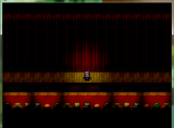
Not all games/maps/styles need them, but there's just something about that screeny that looks totally wrong without them. I think it's because he's using three-tile-high walls, so that back corridor just seems to lack the appropriate depth. The other objects look like they're designed to be placed against a wall, but logic dictates that they're sitting about 2/3 tiles away from the wall and that back corridor would have a huge bit empty gap between the door and the machines.
Have seen plenty of other maps without shadows that didn't look wrong so couldn't say for sure, but I do know something just doesn't look right, and my first instinct was lack of shadows.
Have seen plenty of other maps without shadows that didn't look wrong so couldn't say for sure, but I do know something just doesn't look right, and my first instinct was lack of shadows.
The Screenshot Topic Returns
The Screenshot Topic Returns
author=Mr_Detective
I think I'll replace the 2 pot plants at the bottom with the top ones, so that the art styles will clash less noticeable. I could also cut the tables back to 3 tiles, if necessary. The clocks are divided into 4 sections/offices, so I don't know if that's a bad thing. :-? The high-tech boards on the wall are there to make it looks like whoever is working on the computers need to get some information from them. ;)
Uh, I don't use shadows so I don't understand what you meant. Those big machines are supposed to be like a master computer of the school, which stores all the information about students, teachers, ect. At one point in the story, the players will have to "enter" those machines to secure the information. :D
I mean that the top corridor with the machines looks totally funky since there's no shadows; it seems to sit weirdly. Maybe that's just me though, since no one else has mentioned it?
If you're wanting them to be like the primary servers, surely you'd give them more of a "room"? Or maybe you have; but in that screenshot it kinda just looks like you've just bunged them in a corridor.
The Screenshot Topic Returns
Clutter is typically good, and has reailsm; but I'd say you've made it too cluttered. There's something on basically every non-floor tile; all the tables are filled to the brim with stuff that needn't be there.
For example, there are four different kinds of plants at each doorway; that kind of inconsistency is a bit weird. There are four clocks which would just never be the case irl, and there's those hi-tech future panel things that seem to be there purely to fill the wall space, considering that in the same room you have books, desks and scattered papers. Looks a tad out of place. But hey, I don't know your setting~
There's like three different art styles and although they don't clash terribly, they are noticeable.
There's no shadows at the sides of the walls/floor, which isn't that big a deal until you look at the very north corridor which just looks totally weird.
those big machine things in the north corridor...what are they supposed to be that can legitimately fit into a school office?
The Screenshot Topic Returns
When that first image was posted, I kinda thought the photo was a plaecholder to be traced over and given more appropriate graphics. I use photos a lot and trace over them and turn them into graphically appropriate art so just presumed that's what his plan was; to turn the photo into art that'd suit.
But now am kinda getting the vibe he's just...leaving it as a photo?
Naw, can't do that unless this is some kind of Alice in Wonderland game in reverse...
But now am kinda getting the vibe he's just...leaving it as a photo?
Naw, can't do that unless this is some kind of Alice in Wonderland game in reverse...
The Screenshot Topic Returns
@mawk:
I really like the soft blue. Has a good vibe to the tileset, and matches the text window nicely.
@off-topic:
You can't argue that "It may not be 45degrees, therefore the stairs can be w/e height I want".
Drop the geometry and stop tryin' to calculate it so clinically and just use your fucking eyes. If you have a wall (that we all know and accept is entirely vertical) and stairs beginning at the bottom of the wall, and ending at the top of the wall, then the stairs are vertical. The angle of the camera is entirely irrelevant by this point. We have a comparison point, we have perspective: the stairs cannot be the same tile-height as the walls or they will be vertical.
And again, artistry, geometry and all that shit aside: having vertical stairs looks balls-out stupid. There's no two ways about it; it just does not look right.
I accept that having a 5 tile high wall looks awful with ten tile high stairs becasue it takes up so much of the map, but there's a reason that no decent mapper does that. In these situations, stairs are spread out in smaller chunks or are side-view specifically for the sake of avoiding big staircases that take up the map.
Either use smaller walls so that the correct stair heights don't look weird; spread your steps out to the sides and make it more of a zig-zag climb; or just use side-view. Vertical stairs are stupid. Get over it.

