


BRADY'S PROFILE


Search
Filter
 The Screenshot Topic Returns
Not trying to be rough, just have no idea how else to explain it.
However, if you're happy with a vertical staircase, then feel free to completely ignore us: it's your project, and ultimately you're the only person that needs to be happy with it, irrespective of what others think. Worry about making others happy after you're happy with it~
However, if you're happy with a vertical staircase, then feel free to completely ignore us: it's your project, and ultimately you're the only person that needs to be happy with it, irrespective of what others think. Worry about making others happy after you're happy with it~
The Screenshot Topic Returns
@Mr_Detective: Honestly it baffles me that you can't seem to understand how making the stairs 100% vertical looks completely wrong. Not to be mean or whatever, but how the hell can't you see it after we've explained it so much, and even given you multiple explanatory images?
@DemonLamma: Mind there would be no shadows on staircase #1. Dunno if you just forgot about that or not since it was just made for demonstrative purposes.
@TDS: Menus look great, as always.
I feel you on making tilesets though; even simple, basic ones take a lot longer to put together than you ever expect. S'always nice to have a fresh tileset though!
The Screenshot Topic Returns
@alterego:
Never realised you were just meaning in comparison.
Aye, the orange is supposed to be extremely standout; is designed to appear as such in the panels as well as the maps. Although there's only one (there might be a second at the end, I forget) forest map in this story; the rest is inside. Although even then, the orange is meant to be totally standout.
In defiant contrast to the fact that it's all about sneaking around stealthy like :3
The Screenshot Topic Returns
The obvious solution there is to simply not have such high stairs. Having stairs that are four tiles high lets them look logically acceptable while avoiding them taking up the full screen and looking bad.
Personally, I'd rather the logical look over pretty. They can look as good as they want, but if I stop and think "I'd need rock climbing gear if I expect my character to walk up them" then it just destroys the immersion for me.
@Alter: there's not really any spare objects around yet; the maps are as basic as possible at the minute for the sake of getting basic layouts done and leaving fluff object an prettifying till later.
Although "night"? Would have to ask if your screen brightness is right, because although he colours are mostly dark, it's meant to be pretty vibrant, especially with the black outlines o.o
The Screenshot Topic Returns
This is how I would have done it:
Also, once you're finished with it; don't forget to add back in your trees and flowers and such :3
EDIT:
the wall behind the building is off-scale: it should be the same height as the wall teh stairs are against. Was sketching over a screencap of the screencap so I kinda confused myeself!

Also, once you're finished with it; don't forget to add back in your trees and flowers and such :3
EDIT:
the wall behind the building is off-scale: it should be the same height as the wall teh stairs are against. Was sketching over a screencap of the screencap so I kinda confused myeself!
The Screenshot Topic Returns
Hopefully LockeZ's image helped?
Moving the stairs back like that didn't actually do anything to help the problem. What you'd need to do is move the wall itself back (as in, create more grass).
@alterego:
Aye, anything CAN happen I suppose, but even when things like that happen in real life it looks weird. I'm not saying every tree in a fictional forest needs to be the same, but having half a dozen different kinds of trees within the same fifty square feet just looks plum weird.
The Screenshot Topic Returns
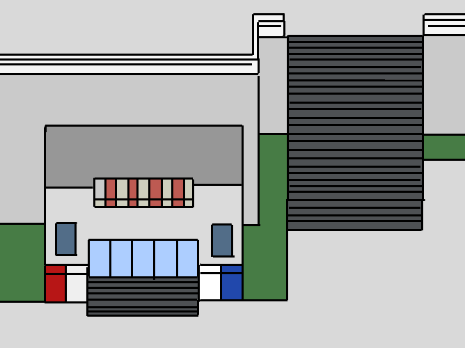
They look wrong because they're taller than the building, yet the horizontal distance from the foot of them to the wall is about five feet.
In other words; they're basically vertical, they're that steep.
Fixed by pushing the wall back several tiles.
The building has a similar issue, with the foot of the steps at the edge of the pavement where the vending machines are, while the top of the stairs is apparently directly above them leading to the door. If there is any distance between the buildings walls and the vending machine (which there should be), it's not been made apparent.
The Screenshot Topic Returns
Not sure what to do about the sprite tbh; I was trying to keep the colour palette to two to suit the comic/tilesets. I was skipping heavy outlines mainly because it was just removing too much of the detail. Then again, I am kinda wanting the sprite to oomph a bit from the tilesets.
Either way, none of this is finalised yet, so am still just editing and adding things as we see fit! ^^
ALTHOUGH, s'a good point about the sides/edges of the trees! Never really noticed that until you said it. Am going over them now and trying to make them smoother and a bit less clone-y~
Either way, none of this is finalised yet, so am still just editing and adding things as we see fit! ^^
ALTHOUGH, s'a good point about the sides/edges of the trees! Never really noticed that until you said it. Am going over them now and trying to make them smoother and a bit less clone-y~
The Screenshot Topic Returns
Good way to look at it Allastorn. Despite any issues it may have, it still look great; the art on it is pretty damn...pretty!
Can imagine taking forever to make a whole game like that though but hey; if you have the dedication to do it, go ahead!
Personally, I like going with the simpler look myself, albeit that may partially be down to just me being a lazy bum!
Although this tileset is designed to match up with the comic style of the game so that a transition from the interactive map to the comic looks natural~

The Screenshot Topic Returns
I'm with Craze about the trees. I can never understand why people hump together six completely different species of trees in the same twenty feet and expect it to look natural. Never seen a forest in my puff where that happens.
As boring as it may seem to just use the same tree over and over in your forest, at least it looks right and natural; adding in other ones for flavour just makes it look like a weird acip trip.
Differentiate trees with size and slight hue changes, not a different species.
Saying that; the giant tree-houses were cool, I thought. I always like human nature-society mixes. S'a shame you don't see it very often with Tolkien-style elves immediately tagged on, but w/e
//tangent.

