


KAEMPFER'S PROFILE
Kaempfer

1932
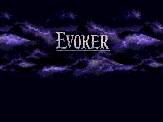
Evoker
The walls between worlds begin to weaken, and one man seeks to bring them crashing down for good...
The walls between worlds begin to weaken, and one man seeks to bring them crashing down for good...
Search
Filter
 post your picture
Dreams
I can't brake in my dreams. Like, in a car. Whenever I slam on the brakes, the car only slows down slowly, usually not enough to stop me from hitting whatever I am slowing down to avoid. It happens so often that I am afraid of driving.
Is there a better way to manipulate the Level/Exp settings?
Hey, this is really useful information, as I was concerned as well! Thanks Ocean! I'll probably play around a tiny bit and end up using those exact numbers. But wait, is that even possible? It seems to limit me to using 1 for Primary.
anybody have
Guys does anyone have a sprite in the style of Alex from the RTP but he has red hair instead? This is important I need it pronto for my new game (Crysis remake for RPGMaker 95)
Importing pictures without setting a transparency?
Unless you want there to be a transparent colour without having to manually select it, that is. I think Rm2k3 will automatically choose certain colours to be transparent if none is selected. When you're importing other images, see which ones start flashing. I seem to recall having some success with this in the distant past, but I could be dead wrong.
Cliff Spriting Help
I disagree, Tardis. That looks a little bit too close to pillow shading. To add depth to the bottom I'd probably run a few buttresses of rock out, which will both break up the lines and keep the eye on the right track.
 SHOW ME YOUR SCREENSHOTS - Fall Edition
Hello Darken I am going to give you some rather heavy C&C since, while I think your graphics are great, they could be much better! If you want to ignore the advice, that's cool because you will already impress most people with them as is. However, if you want to reach for the stars...
One thing I noticed immediately is how weak the shading is on the rock face: I would probably elongate the rocks vertically so they are not so round, but that is mostly a stylistic choice. However, the rocks themselves seem almost to exist as a black background with round rocks glued on to it as opposed to a solid piece of rock with pieces jutting out, which is what any cliff face is. Don't be afraid to sharpen the shading on the rocks themselves and lessen the shading between the rocks to make them look like they all belong together. I think one thing is that each rock is trying to hard to be it's own rock, outlined in black- you can easily outline a shape (in this case, a rock) by using the darker shades of brown if they are up against the lighter shades of brown, since that implies the shape with forcing it: black isn't always the answer.
Another thing I think is lacking is cohesion between individual pieces of the chipset: the trees don't look organic, instead bulging randomly. Again, though, that is a stylistic choice. One thing that does bother me is that certain objects seem to be floating on the snow, instead of buried under it. Roots, for instance. The larger snow drifts are nicely done, but the shading isn't pronounced enough; I'd probably add another shade for the snow to give it some more depth.
The smaller drifts- the ones that are only a couple of pixels- look literally like you randomly applied white pixels in MS Paint. One thing you have to remember is that certain snow piles wouldn't be large enough to appear to the player's eye, and if they are large enough they would have some detail to them to be worth it. The snow itself also seems to have detail applied randomly. When applying detail, remember that there is a logic behind it- is the wind blowing it in one direction? Is dirt peeking through here and there? The dirt looks pretty good, although I'd alter the edges a little to make it appear more organic and less "oh hey an autotile".
I think the idea of the struts holding up the wooden platforms is a great one, as is the overall idea of the map, but they need a little bit more substance to look appropriately detailed and, as it stands, they look detached from the rocks.
Like I said, I really like it so far, it just needs a little polish. The composition is wonderful, but the details aren't holding up there end of the bargain.
SHOW ME YOUR SCREENSHOTS - Fall Edition
I like how he posted the EXACT SAME POST at GW. What a worthless person S4D is. Anyways, let's stop talking about him. Then he'll go away.
@Ocean: Don't ruin amazing custom graphics with the humour of children!
@Ocean: Don't ruin amazing custom graphics with the humour of children!
Bye.
I'm new, and even I can tell you're awful. A quick skim through your last however many posts is a pretty clear indicator what an asshole you are.
Hahahahahahahaha what a trainwreck of a person you must be!
Also,
Oh no not your living piss! Learn how to use idioms correctly, please. Goodbye!
Why the fuck not? If I don't like somebody, why do I have to pretend to be nice just so that their little pussy feelings don't get hurt? That's a lot of crap.
Hahahahahahahaha what a trainwreck of a person you must be!
Also,
post=101497
That, and most of you happen to annoy the living piss out of me.
Oh no not your living piss! Learn how to use idioms correctly, please. Goodbye!

