


PUNKITT'S PROFILE
Just a dog makin' games. Shoot me a PM anytime!

Search
Filter
 Screenshot Survival 20XX


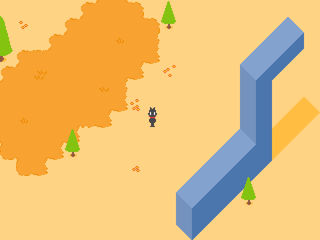
Working on creating a desert tileset. I still need to add tons of detail, GUH
A sneak peak at the building's inside, too.

I need to add some more tile variation to everything here. Anyone got any suggestions?
OHANDALSOHEY
I got a gamepage set up for Happup! That other game people seemed to like here!
 Temple_Gate_new.png
 Happup
Temple_Gate_new.png
I can give it a shot if you want!

EDIT: Oh look I jumped ahead and did it, ack!
Anyhow, I used the same outline as the rest of the room, but other than that I kept the colors completely the same. I hope this works!
EDIT: Oh look I jumped ahead and did it, ack!
Anyhow, I used the same outline as the rest of the room, but other than that I kept the colors completely the same. I hope this works!
Temple_Gate_new.png
ooh, so foreboding! I love it. However, those (dynamite?) boxes have a completely different perspective than everything else in the room. It's got a diagonal view when the rest has a top-down front view. I'd suggest changing it to fit the room better.
Crystal.png
Screenshot Survival 20XX
Screenshot Survival 20XX
Fantastic work, everyone. I love what I'm seeing!
Been working on the battle assets more. I've been making unique battle backgrounds for certain enemies, like this TV guy over here;

The background isn't finalized, since I want to smooth out some of the more open spaces in it, but the concept itself is going good. As you can see, some other things aren't done yet, like the cursor for selecting your character.
(Ignore the weird cutoff on the zig-zags on the top. It's since been fixed.)
Been working on the battle assets more. I've been making unique battle backgrounds for certain enemies, like this TV guy over here;
The background isn't finalized, since I want to smooth out some of the more open spaces in it, but the concept itself is going good. As you can see, some other things aren't done yet, like the cursor for selecting your character.
(Ignore the weird cutoff on the zig-zags on the top. It's since been fixed.)
Screenshot Survival 20XX
Screenshot Survival 20XX
author=Dookie
A little constructive crit for you punk
I did these mockups in like 2 seconds, i would suggest not using them and doing better ones yourself.
The bottoms of your trees look weird, the leaf shadow doesnt really line up with the outline.
Your leaves? looked kind of small. Maybe toy around with larger ones, and have some overlap?

Yeah, those are leaves! I've been meaning to change them for a while now. I'll give them some overlap and change the shape.
Also idk if those clumps are supposed to be leaf piles or bushes, but they don't really look like either. Might wanna go back to the drawing board on those.I'll rework 'em! They're meant to be leaf piles. I want to make that more obvious, but I'm unsure how to do so. Any advice?
^_^
Anyway I love the cutesey minimal style, but something was more charming about the more surrealy happup stuff
Well hey, I'm glad you like it (I think!) Means a lot you do! I know I haven't posted about Happup in a while, but I'm still chipping away at it. I'm actually working on setting up a game page for it so I can focus screenshots there and not bombard this thread, but it's...kind of confusing! I'll get one up eventually though, hopefully soon!
@Pizza Oh man, that looks gorgeous! Excellent color choice, both with the water and the dirt. Nice 'n' bold. I will say, though, I still don't register the leaves as 'leaves' until I see someone mention it on the the thread, and then I get reminded.
author=octopaca
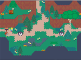
I'm slowly recreating maps for my game.
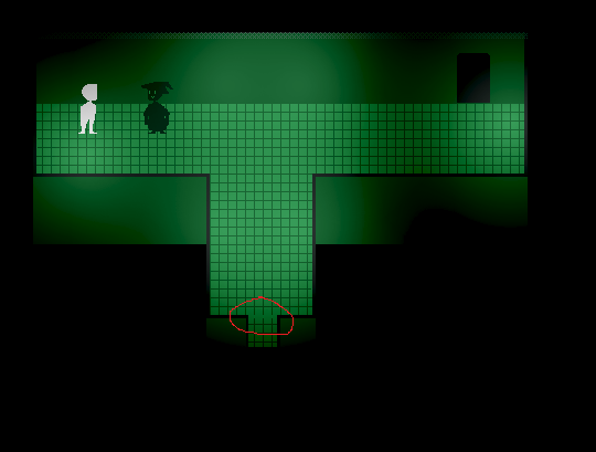
Oooh, I really like the looks of that crying girl's room. The surreal creepy stuff is coming along really nice.
There appears to be some weird cuttoff here!

