


PUNKITT'S PROFILE
Just a dog makin' games. Shoot me a PM anytime!

Search
Filter
 cafe_20.png
Screenshot_SceneCampfire.png
 Screenshot Survival 20XX
Screenshot Survival 20XX
Looking pretty good! But yes, I agree with Dookie. The shadows are a little too dark. And...I can't quite tell what's up with the palm tree shadows. The trunk doesn't have a shadow and it looks a little strange. Still excited, though!
On another note, thanks for the feedback on the header! I'll work on it in a little bit. For now, have a crow. (I feature them so much because they're one of the few NPC sets I have complete ;u;)
In this world they're essentially farmers. Water is subject to change!

The .gif doesn't loop perfectly. The pause on the right is meant to be identical to the one on the left.
On another note, thanks for the feedback on the header! I'll work on it in a little bit. For now, have a crow. (I feature them so much because they're one of the few NPC sets I have complete ;u;)
In this world they're essentially farmers. Water is subject to change!
The .gif doesn't loop perfectly. The pause on the right is meant to be identical to the one on the left.
Screenshot Survival 20XX
author=Craze
i hate the letters shifting around on top of not being parallel. either have them moving but with the same origin x, or have them stationary but jumbled. both at once is headache-inducing.
Makes sense, and I see where you're coming from! However, word bubbles are used very few and far between (barely any characters talk, and only sparingly.) and they're there for all of 2.5 seconds, so I think I'll keep it where it's at. I'll make some minor improvements, though.

Tried my hand at a title header! Think it turned out pretty well.
Screenshot Survival 20XX
Very nice interiors! The carpets look fine to me, but when the furniture creeps into the edges of the carpet it looks a little weird to me. I'd suggest moving them away from the furniture, or the other way around.
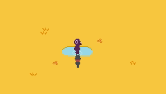
Woah hey looky here! I got me some screenshots. The first is a test for the word bubbles found in game. It's a little off center because the character that uses the bubble is actually supposed to be to the right more. The crow is just a placeholder.
The second is a screen from a new area I'm working on.
 Release Something: Gotta Go Fast!!!
aw jeez my inbox is freakin' exploding
Also, I uploaded a little test of the word bubbles found in-game! It's going to be a little off-center since it's not intended to be used on that character, though!
Also, I uploaded a little test of the word bubbles found in-game! It's going to be a little off-center since it's not intended to be used on that character, though!
Release Something: Gotta Go Fast!!!
author=Irog
@Punkitt
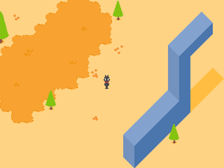
I like the tone of your graphics. The blue object stand out too much because of their military (oblique) projection. An isometric or dimetric projection would look better (see https://en.wikipedia.org/wiki/File:Graphical_projection_comparison.png)
I'd check that out but the link is broken!
Release Something: Gotta Go Fast!!!
Wow, thanks for the feedback guys! I removed the weird L-Shape in the weird_geometry.png picture and replaced it with a better looking one. I also added in a screen of another area.
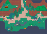
@Lucy_Fox
@Lucy_Fox
That looks absolutely gorgeous! However, that bridge looks really out of place, and there's cutoff.
Release Something: Gotta Go Fast!!!
@Kr0x
@zDS
Hehe, I love the overworld stuff. Looks like an NES screenshot with more shading and slightly muted colors.
For the battle screen though, the eyeball looks slightly rectangular. Try making the eye more circular and maybe make the tentacles go crazier, since right now they look kind of stiff.
The (druid?) character looks pretty decent, but I'd suggest elongating the arms or making the hands a little bigger. The ghastly looking thing on the far left needs some revision, since it looks like it bends at a 90 degree angle.
J0e.png, Coach_Imani.png, Art_Teachers_Kama_Ananta.png, Music_Teacher_Amna.png
Holy crap, I love these crazy designs. Perhaps the movement frames for some are too direct, like (standing still, then having the arm swing waayyy out there, then come back in). I'm worried that'll make the animation look too stiff.
Auughhh I explained that horribly sorry
clip0010.gif
Gorgeous colors, nice scroll, good logo. Can't see anything wrong with it.
clip0003.gif
The shading on the hair is a little weird and the outline of the PC is kinda dark compared to some of the background items, but that's probably just stylistic choice. Mostly looks fine to me! (Awesome text bubble, by the way. Looks great!)
@zDS
Hehe, I love the overworld stuff. Looks like an NES screenshot with more shading and slightly muted colors.
For the battle screen though, the eyeball looks slightly rectangular. Try making the eye more circular and maybe make the tentacles go crazier, since right now they look kind of stiff.
The (druid?) character looks pretty decent, but I'd suggest elongating the arms or making the hands a little bigger. The ghastly looking thing on the far left needs some revision, since it looks like it bends at a 90 degree angle.


)