


ROACH714'S PROFILE
Roach714

170
Search
Filter
 The Screenshot Topic Returns
The Screenshot Topic Returns
Kaempfer:
Love it. Really good. Consider graying out the panorama the slightest bit though, (specifically the green tones) so it sinks into the BG more, maybe add a touch of blue as thats what happens when objects look farther away.
Looking great.
Itaju: I think everyone must be speechless from that interior. You are truly a master of tilesets. Blown away.
The Screenshot Topic Returns
bizarre,
in the battle shot you might want to adjust the saturation of the dark purple in the slime, or add an inbetween color in there as well. Its a bit too contrasty at the moment, the way its shaded.
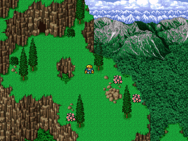
also, in the screen before, theres no reason not to fix the cliffs with the brown edges at the top. you can keep the brown on the side for tiling but replace those top ones with green versions.
in the battle shot you might want to adjust the saturation of the dark purple in the slime, or add an inbetween color in there as well. Its a bit too contrasty at the moment, the way its shaded.
also, in the screen before, theres no reason not to fix the cliffs with the brown edges at the top. you can keep the brown on the side for tiling but replace those top ones with green versions.
The Screenshot Topic Returns
The Screenshot Topic Returns
Lookin pretty neat.. here's a small comment on the 2nd screen.
Im having a problem with how the trees sit inside the squares. They need to be moved up, so the trunk is in the center of the square of grass.
Also try rounding out the base of the trunk of the smaller trees (in both screens its way too flat.)
Im having a problem with how the trees sit inside the squares. They need to be moved up, so the trunk is in the center of the square of grass.
Also try rounding out the base of the trunk of the smaller trees (in both screens its way too flat.)
The Screenshot Topic Returns
Yikes, can't say I'm a fan of that.
Here's why:
The resolution is all over the place. Look at the font, versus the mountians in the back, versus the smallest portrait, versus the largest portrait.
Next, that font...I think it's safe to say even for a game called Epic Grandma Tale that font looks like a wet noodle, with the colors of someones 1999 AIM profile.
5 character facesets over an empty field...I'd say go back to the drawing board on this one. Or tell your friend politely that you're gonna make your own title screens from now on.
oh, I don't like the house either
The Screenshot Topic Returns
The first image sits better for me.
These are TOO vivid, it looks like every rtp screenshot to me.
theres probably a happy medium between the too, honestly, if you don't mind adjusting the saturation.
I'm a sucker for desaturated, drab looking washed colors though so I may be biased.
These are TOO vivid, it looks like every rtp screenshot to me.
theres probably a happy medium between the too, honestly, if you don't mind adjusting the saturation.
I'm a sucker for desaturated, drab looking washed colors though so I may be biased.
The Screenshot Topic Returns
you could to try lower the saturation of the tent if you want to see if it works like that.
i think the brightness of it is making it look like a bouncy house for kids
i think the brightness of it is making it look like a bouncy house for kids
The Screenshot Topic Returns
Trees seem a bit out of place, with the map and with each other....
maybe one of those could be tweaked to work with the map but they all seem to be pretty different
maybe one of those could be tweaked to work with the map but they all seem to be pretty different

