


ROACH714'S PROFILE
Roach714

170
Search
Filter
 The Screenshot Topic Returns
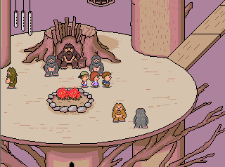
@Locke- Something about the bench legs is whats throwing it off for me. Maybe even recolour/repurpose the table legs above for bench legs? Also the side angle chairs look a little large compared to the back.
Begriff- you could maybe tighten up both floors by reducing the height by a tile or two.(especially the upper landing)
The counter top is bugging me. Looks like its not deep enough. It should be at least the same size as the tabletop neat the tv.
I'd also recommend more consistency with the dark outline. If you're gonna do it on the furniture, the steps and walls should also have the same bold outline. As it is, those elevator doors seem to pop right off the walls cause the outlines so stark.
My only other gripe is the white negative ceiling space. I think it pulls the eye away from the rooms and takes away that interior feeling. maybe its just me though.
overall looking better.
The Screenshot Topic Returns


The Screenshot Topic Returns
Eh, its a bit of an added to pain to display the letter above the boxes.(In battle their sprite appears above)
The names appear when selecting on who to use an item/armor like in EB though.
I made my own naming system cause 2k3s italian fix was so ugly.
The names appear when selecting on who to use an item/armor like in EB though.
I made my own naming system cause 2k3s italian fix was so ugly.
The Screenshot Topic Returns
The Screenshot Topic Returns


The Screenshot Topic Returns
@Lihinel
WAY better, and I suppose as Tau said this would be nitpicking, but thats the point of this topic, no?
Lets look at how the masters did it in FF6 Figaro Castle Map(I remember getting lost in this place many time, and it FEELING like a big ass castle.)
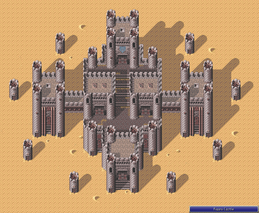
Look how tight and small the walk areas are.
I have a feeling you've been designing the castle at a very zoomed out perspective, which is fine, but remember the player never sees from this angle, and in the game, perception is reality.
NITPICKS:
I'd reduce tower height so the player can see the tops of the towers from the walkways.
I'd also tighten up the walk areas on the 4 tier main castle structure so they can see the wall above and below from any point on the walkway.
- Maybe give a color or two to the Roof tiles inside the walls(even if another darker shade of brown or something) As they stand they look like uncompleted buildings. (Maybe only add the extra snow on these building rooftops?)
- Add some flags or banners or something to give it a little more flavor and to help make this map stand out.
Say you have 2 other castles, what makes this one any different other than that its "in the snow."
For example: Figaro had the animated machinery (propellers) and they eventually tied that into the games story too. Vektor was rust and metal with those huge red banners.
Whoever suggested secret path was right on the money. That would be very cool. Maybe even show a few hints than you'd be able to get up there visible from the rear wall (like a treasure chest or something)
Its looking great from far away, but I bet semi dull in any one-off screen.
Forget realism, it's about design. The player will never see from a 1/4 or 1/8 zoom. Tight and concise always beats out large and overblown.
Sorry for the long post, the Map is definitely coming along and if you don't feel like modifying further that's your call!
WAY better, and I suppose as Tau said this would be nitpicking, but thats the point of this topic, no?
Lets look at how the masters did it in FF6 Figaro Castle Map(I remember getting lost in this place many time, and it FEELING like a big ass castle.)
Look how tight and small the walk areas are.
I have a feeling you've been designing the castle at a very zoomed out perspective, which is fine, but remember the player never sees from this angle, and in the game, perception is reality.
NITPICKS:
I'd reduce tower height so the player can see the tops of the towers from the walkways.
I'd also tighten up the walk areas on the 4 tier main castle structure so they can see the wall above and below from any point on the walkway.
- Maybe give a color or two to the Roof tiles inside the walls(even if another darker shade of brown or something) As they stand they look like uncompleted buildings. (Maybe only add the extra snow on these building rooftops?)
- Add some flags or banners or something to give it a little more flavor and to help make this map stand out.
Say you have 2 other castles, what makes this one any different other than that its "in the snow."
For example: Figaro had the animated machinery (propellers) and they eventually tied that into the games story too. Vektor was rust and metal with those huge red banners.
Whoever suggested secret path was right on the money. That would be very cool. Maybe even show a few hints than you'd be able to get up there visible from the rear wall (like a treasure chest or something)
Its looking great from far away, but I bet semi dull in any one-off screen.
Forget realism, it's about design. The player will never see from a 1/4 or 1/8 zoom. Tight and concise always beats out large and overblown.
Sorry for the long post, the Map is definitely coming along and if you don't feel like modifying further that's your call!
The Screenshot Topic Returns
Xenomic I know you're trying to get advice and all but I think at this point you may want to take a little time, let some of what people said sink in and just work on some stuff solo.
The real way to get better at mapping is PRACTICE. It's not a single trick or tip that will do it for you, clearly.
Spend a few sessions just making more maps.. A lot of them. (Not for your game, more like case studies)
Take some time and STUDY commercial games and how they design rooms and dungeons
Try other tilesets. Dont upload every modification of your maps to the screenshot topic. If you have to ask advice on every detail when mapping, you aren't ready.
I'm glad you're trying to improve but this is getting over the top.
Yes we are here to help, but I feel like I'm going to overdose on that chipset very
soon.
Itaju- Absolutely love it..SO much style. I'd love to see more. Are these 100% custom assets?
The Screenshot Topic Returns
Dragol what do you think of this? I kind of like the idea of using a picture overtop the smoke overlay for the negative space roof tile. I just think it makes it look more INSIDEY and less IN YOUR FACE with the obvious oiverlay. just a thought though.

also maybe shorten the smoke trails a little bit? they seem taller than the suggested room height.
also maybe shorten the smoke trails a little bit? they seem taller than the suggested room height.
The Screenshot Topic Returns
Arandomgamemaker- There's a few things really bothering me about this screenshot.
- Appears to be redrawn or edited down RTP (if you're going to take the time to do that maybe just make custom tiles?)
- The system skin (clashing super smoothness with hard pixel edges) and Orange text irk me
- The trees look like cardboard cut outs. Like paper mario trees or something. I think that thin highlight on the one edge gives it this effect (paired with total flatness of the leaf area. If you insist on using this style, maybe study how the rtp lit the tree tops and try to recreate that or whatever youd id with the grass/pavement
- the grass and pavement and all textures just look weird. points for effort though I guess, but I dont see why you dont just use the RTP at this point.

