


ROACH714'S PROFILE
Roach714

170
Search
Filter
 [Poll] 16-Bit(Pixel Graphics) VS HD
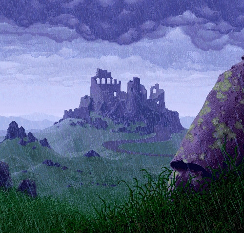
 The Screenshot Topic Returns
Locke- Regardless of the size of the interior, sometimes a bit of downsizing is required to get the message across. Like the buildings in any rpg. If you insist on making it that large, I'd still map the south side, and show it in a camera pan going from bottom to top. You need to establish its sitting in water, otherwise it just looks like a friggin warehouse on the waterfront.
The Screenshot Topic Returns
Locke- Idk man I think you need that foreground side of the boat to establish this isnt a rooftop overlooking the water. I know this is a bad mockup but even somethign as simple as this looks better to me:

The Screenshot Topic Returns
Sated I think there needs to be a bit more definition between walls and floor tile there. Its making me have to really lean forward in my chair. Even some tufts of grass/things against the wall might help establish the separation if you're changing/modifying what you have.
The Screenshot Topic Returns
@kory - I think making that new clay border a few shades lighter would do wonders.
Also consider warming up the colors in the stone. a little more red/brownish and less purple blue would help tie it all together.
Also consider warming up the colors in the stone. a little more red/brownish and less purple blue would help tie it all together.
The Screenshot Topic Returns
The Screenshot Topic Returns
This is a free exchange of ideas, "Liberty".
DO take me to heart, Begriff. I may be a bit forward, but I'm really trying to help. I even edited (poorly) the tiles to show you what I meant specifically on the last page.
I'm not wasting my time posting this stuff for fun, I'm tired of seeing that map look the same. (below average).
I touched on the lighting a little earlier, but heres what I mean.
Here was the old lighting from 1/28

Heres the "new lighting effect" 2/9

This is no improvement. I'd say stop screwing with the lights and get the room 100% before you light it. BUT HEY DO WHATEVER YOU WANT IN WHATEVER ORDER YOU WANT
People are too nice. They won't be straight up with you, I will.
Speaking of which, your cutscene screen.
The art looks fine enough (is it static or is there some kind of animation?),
I'd personally ditch the voice acting idea, and just stick with text. Even a lot of commercial voice acting is facepalm level embarrassing and unnecessary,(not to mention a lot of work). I like to read at my own pace and internalize the dialogue, but thats a personal preference.
DO take me to heart, Begriff. I may be a bit forward, but I'm really trying to help. I even edited (poorly) the tiles to show you what I meant specifically on the last page.
I'm not wasting my time posting this stuff for fun, I'm tired of seeing that map look the same. (below average).
I touched on the lighting a little earlier, but heres what I mean.
Here was the old lighting from 1/28
Heres the "new lighting effect" 2/9
This is no improvement. I'd say stop screwing with the lights and get the room 100% before you light it. BUT HEY DO WHATEVER YOU WANT IN WHATEVER ORDER YOU WANT
People are too nice. They won't be straight up with you, I will.
Speaking of which, your cutscene screen.
The art looks fine enough (is it static or is there some kind of animation?),
I'd personally ditch the voice acting idea, and just stick with text. Even a lot of commercial voice acting is facepalm level embarrassing and unnecessary,(not to mention a lot of work). I like to read at my own pace and internalize the dialogue, but thats a personal preference.
The Screenshot Topic Returns
Look, no one cares whats physically holding you back, we only care about results.
You were well enough to make these posts and screencap your map and add spotlights, i think you could edit a few tiles.
When building a house, there's a reason a foundation is constructed before people start decorating. Which is what you're doing. These new "improved" lighting effects look worse than before, and do nothing to improve the map or scene.
I commend you for making your own tiles, but its clear you didnt have a scale in mind when making them. Maybe the easiest answer here would be to shrink the sprite. That way you wont have to re edit all of your chipsets.
The truth hurts. Stop making excuses left and right and fix your map.
plus you said it was your ankle..
The Screenshot Topic Returns
Begriff your excuses are lame, I'm sorry to say.
I did this in 5 seconds. (The colors are off cause your overlay was on the image but just to show you how little effort resizing takes)

maybe they arent perfect size either, but the point is EXCUSES DON'T PRODUCE IT.
Stop frigging around with the lighting effects when you have GLARING map issues.
Do lighting last.
You can pour dressing and spices all over this dish but if the meat isnt cooked its still going to taste like shit.
I did this in 5 seconds. (The colors are off cause your overlay was on the image but just to show you how little effort resizing takes)
maybe they arent perfect size either, but the point is EXCUSES DON'T PRODUCE IT.
Stop frigging around with the lighting effects when you have GLARING map issues.
Do lighting last.
You can pour dressing and spices all over this dish but if the meat isnt cooked its still going to taste like shit.
The Screenshot Topic Returns
Begriff- unless those light sources are going to be literal spotlights, you want to soften up the overlays edges. Way too hard of a circle.
Also you never fixed the midget table *shakes head in disappointment*
Make those tables legs (and bed legs, and lockers, and the door)taller ,son.
Thatsan easy fix that will make your map look better.
Personally I'd worry about the maps construction(including all items and light sources) BEFORE adding overlays.

