


BLUEPERIOD'S PROFILE

Search
Filter
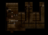
 Screenshot Survival 20XX


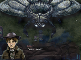
Here's a couple of screenshots for a small thing I'm working on that was originally meant for the RMN anniversary event. It's a spooky game about trying to fall asleep.
Screenshot Survival 20XX
@Punkitt oo that looks really pretty! is that the only way characters can communicate? like is there dialogue at all? would be interesting if so!
 Tristian: Lady of the Lion
Screenshot Survival 20XX


2015 "Official" Misao Predictions/Discussion Thread
I haven't played much of anything except The Amber Throne, which is by default my favorite RM game of the year.
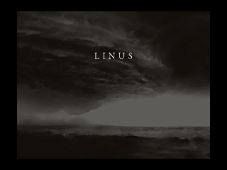
 Liberty Plays: Linus
Even though it is a dark and SUPER SERIOUS game I really enjoyed the LP, Libby! All the joking around was a lot of fun! And yes, #BLUEGENE forever.
 Duty vs. Morals. And other stuff.
Is Ianna using Tristian's cape as a blanket? If so, I LOVE that detail (especially if you don't call attention to it via dialogue).
Screenshot Survival 20XX
@Sated: The system I'm currently using is all variables and events-- kind of a jerry-rigged monstrosity of parallel events and conditional branches. It works okay for now but a script would make the process a lot easier and less complicated though. :p
Screenshot Survival 20XX
Screenshot Survival 20XX
Trying out some UI configurations for a new turn-based battle system I'm working on. This is what I'm currently going with.

First, a bit of context: The command cross on the lower right has 4 buttons that pertain to different actions (walk, attack, interact and inventory). When your turn comes you must make 2 actions from these 4 choices. In the screenshot, the walk option is selected and thus a movement gauge appears. This gauge depletes automatically and you have about 5 seconds to move your character wherever you want on the map.
Anyway, I'm not sure if the lower right is the best place to have the command cross and movement gauge. Would it better if the cross/movement gauge was on the upper part of the screen instead? Also, any thoughts or opinions on how the thing it looks? This is my first time creating a UI and it's been kind of a challenge, but also fun!

