OROCHII'S PROFILE
Search
Filter
 s.png
s.png
The tall guy is from Phantasy Star IV.
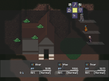
The tiles are RTP and Mack&Blue, and some others I'm not sure where they came from (the simplest ones). Some of them remind me of those futuristic chipsets that came along with "DonMiguel's packs".
When playing, I liked the backgrounds... well, not all, but they were fine. The houses are just too flat, and the other elements are just fillers (the crates, for instance, have their passability... wrong).
 sd.png
There are so much distractions in the background. And the main elements have little colour emphasis. You should rework that part, because confuses a little (that is clearly product of using that much different graphical sources).
However, some elements are good. You can just eliminate that... beam? and everything will be much better.
And the second part that you should consider to change is the centering of the screen. The "actions" are just too high. Center the main part of the scene a little more.
And I'm wondering, is that guy on the top floating or it's supposed to be in some platform?
 screen_menu1.png
Thanks =). And now that I see this, I need to update this image. I have just ended the new chipset for the map at the background (and translated the stuff).
--Updated, although all are just (somewhat) minimal changes--.
--Updated, although all are just (somewhat) minimal changes--.
 cyrusbar.PNG
That works. What's important is the contrast (and it's still enough). I said something about brighter being "closer", but it's not a golden rule xD (say, for example, a white floor...).
So, thumbs up =),
Orochii Zouveleki
So, thumbs up =),
Orochii Zouveleki
 PC5.PNG
The only thing I have against those trees is that in style they seem very apart (they are like shinning compared to the rest). A little change in palette (and if resist, maybe even a little work in the outer parts) would do it.
Anything else, great, even if it's the most uncustom one, cheers,
Orochii Zouveleki
Anything else, great, even if it's the most uncustom one, cheers,
Orochii Zouveleki
 SSTwo.png
Hats off to you, closedworlds. And all the other people in the project too, since the game in general looks and seems (and hears!) like a great work. I just want to "feel" it.
Cheers,
Orochii Zouveleki
Cheers,
Orochii Zouveleki
 Remora.png
I think about coeurls just before going to bed.
About them, I have always hated the paralizing attack they did.
Nice shot,
Orochii Zouveleki
About them, I have always hated the paralizing attack they did.
Nice shot,
Orochii Zouveleki
 ragnarokr_battlescreen.png
Ah! Don't worry, the faces are going to be "unclashed" :P (but I need to finish a couple of things first).
Thanks for the comment,
Orochii Zouveleki
Thanks for the comment,
Orochii Zouveleki


