


SCREENSHOT SHOGUNATE
Posts

I like that chipset, and the map itself. However, get rid of that blur. It looks like someone jizzed on it.

I took the screenshot in-game and resized it to 640x480 (my mistake). But, thanks for the comments, it's a WIP, so there's still more work to do. Here's another one (320X240):

Ah, that looks better/cooler. The map looks great, the trees stand out a bit, though, but its nothing major.
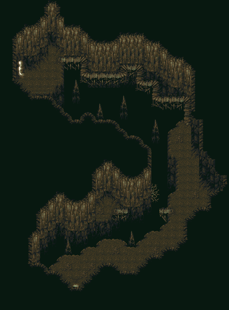
author=Ultima187 link=topic=1503.msg31408#msg31408 date=1221337942Not bad, I like the detail on the map. There are issues with it, though. Like Karsuman said, the colors need work. The problem is the ground and water tiles are too similar to each other, so it's hard to distinguish them from one another. The only thing that separates them is that blue edge you've got. The Star Ocean grass tiles don't fit in well enough either. They're too bright for the rest of the chipset, I would lower the saturation on them a little bit. There's also a slight perspective issue. The vine in the water is growing straight up, but the cliffs have a diagonal slope to them. But anyway, I'm being nitpicky. It's a good map, I like how you have those bats on the ceilings. Little details like that can really make a game stand out.
Look for feedback on this cave I'm working on:

Edit: Oh another screen. I already pointed out what I needed to say.
author=Neophyte link=topic=1503.msg31461#msg31461 date=1221341934
Not bad, I like the detail on the map. There are issues with it, though. Like Karsuman said, the colors need work. The problem is the ground and water tiles are too similar to each other, so it's hard to distinguish them from one another. The only thing that separates them is that blue edge you've got. The Star Ocean grass tiles don't fit in well enough either. They're too bright for the rest of the chipset, I would lower the saturation on them a little bit. There's also a slight perspective issue. The vine in the water is growing straight up, but the cliffs have a diagonal slope to them. But anyway, I'm being nitpicky. It's a good map, I like how you have those bats on the ceilings. Little details like that can really make a game stand out.
Edit: Oh another screen. I already pointed out what I needed to say.
I like the ground tiles, so I may change the water tiles. But, it's a dim cave, so I don't want the water to be too bright or dark. I'll take everything else you said into consideration (vines, grass). Also, the bats fly away when you get too close :)

Lol, you should remake the scene with Locke & Rachael. But this time...Locke plummets to his death! ^^ (Nah, I like Locke) :)


Moooog: Personally, I'd probably recolor the cave walls, or leave it and maybe add an object/tile to make it more than just brown. Otherwise it looks good, just seems a bit much like a FF6 map rip to me. If that's what you're going for, then I don't object.

Since the game is inspired by FF1, I thought I'd have some GIANTs in there. And there definitely will be a hall of Giants, I just have to find where to put it.
Since the game is inspired by FF1, I thought I'd have some GIANTs in there. And there definitely will be a hall of Giants, I just have to find where to put it.
LMAO!!!
OMG OCEAN THAT GIANT Looks like a big huge dickie with spinning blades on it. Hahahahaha. Anyways like before I love the background, sprites, layout...everything. Hey!? WHY ARE WE PICKING ON S4D TO RELEASE THE MONOPOLO!? WHY DON'T WE PICK ON THE OCEAN'S SOMETHING TO RELEASE HIS / HER PROJECT AND TAKE THE MOBBIE OFF MY BACK!!!
Can't wait, both you and Feld. :)
author=silver4donuts link=topic=1503.msg31601#msg31601 date=1221377406
LMAO!!!
OMG OCEAN THAT GIANT Looks like a big huge dickie with spinning blades on it.
... It's called a windmill, by the way.
I'm a bit confused, why is the giant a windmill?

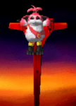

DONQUIXOTE attacks WINDMILL!
It's super effective!
WINDMILL fainted!
It's super effective!
WINDMILL fainted!

@Ocean: Are those battle graphics remakes or new classes? To be honest I always feel like making a badass NES retro game whenever I come across your PB screenshots.
Yep, Don Quixote reference. The whole game isn't based on Don Quixote, but I had to add that there somewhere. It wouldn't leave me alone.
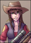
@Darken: They're all edits, since FF1 battle graphics are what I started the project with. The Red Mage girl is a FF5 class edit, the Fighter guy is either an FF3 or FF5 character edit, and the White Mages had some more editting done. I forget what the base one is, probably Celes from FF6 judging by the pose. I could be wrong, I'm very forgetful.
As a side note, a few turns after that screen was taken, we were brutally slain by the GIANT.

@Eschalt: It seems as if our rivalry never ended, I'll assure you this time I will win the fight lmao. I like the edits the work perfectly with you game.
copypasta bitches
I've been getting a LOT of responses about how the map looks very similar, if not too similar to FF6 itself. Sometimes I look at it and I really have no choice to agree, in that end, it might bereft me to mix it up a bit. However, a thought occurred to me; isn't a maps 'atmosphere' more than just how it looks?
For example, when I look at a map rip of Mt. Kolts like Kaempfer posted, I imagine more than how it looks, I have the Mt. Kolts music playing in my head, a sprite of Terra running around, going into the menu screen to see FF6 menu and Terra, Celes, Gau, and Edgar in my party, and so on. Basically, I figure that my maps similarity to FF6 might be canceled out by the fact that it's an entirely different game otherwise. Worst case scenario, since this is just another dungeon, it can be overlooked.
Of course this is just conjecture on my part so feel free to call me out if I don't know what the hell I'm talking about.

I wouldn't worry about it looking like FF6. If your game uses rips, it will either look like another game (or other RPG Maker games in the case of custom graphics made for it like Mac&Blue), or a bunch of different games (possibly look like garbage, depending on what game rips are being used). Best to have a game that looks like another and hope that the rest of your game keeps the reminiscence of FF6 to a minimum.

