


THE SCREENSHOT TOPIC RETURNS
Posts

-i assume you're going to shade/finish the knight, so i'll just say the sprite base looks nice except those huuuuge-ass feet
-the walls and ceiling look fine, the carpet looks great, but i highly suggest un-gradienting the floor. or at least reducing the contrast, i guess. maybe on the pillars too. just reduce the contrast, it looks weird right now.
-the torches are cute =3
-the walls and ceiling look fine, the carpet looks great, but i highly suggest un-gradienting the floor. or at least reducing the contrast, i guess. maybe on the pillars too. just reduce the contrast, it looks weird right now.
-the torches are cute =3

I was going for a slightly megamanish style(hence the huge feet) I wasnt going to shade the knight I know that sounds strange as he stands out as a different style but when its playing somehow it feels right(maybe its just me :P)
you dont like the gradient on the floors :( I really liked the floor and pillars(apart from the top of the pillars) do you mean the circuler gradiant on all floor tiles or the gradiant on the edge floor tiles?
torches are animated, the light flickers slightly :)
you dont like the gradient on the floors :( I really liked the floor and pillars(apart from the top of the pillars) do you mean the circuler gradiant on all floor tiles or the gradiant on the edge floor tiles?
torches are animated, the light flickers slightly :)


Hey, Itaju, has anybody ever said they wanted to have intercourse with your game? I'm sure you've heard it once or twice, there's no way you haven't. ~<3
Grindalf, You got a nice old-school vibe going on, which is a great thing! Good clean graphics.
Itaju, that's really some pro-stuff you got there! Really flawless!
Itaju, that's really some pro-stuff you got there! Really flawless!
author=LockeZauthor=GamingMitchell03232013It's not unusual or even necessarily bad for characters and tilesets to be done in sorta-different styles; it makes the characters pop and seem important.
Maybe it's just me, but I feel that the characters clash with the Tileset. Just my ¢2 though.
However size is still important, and in this case the main problem is that the wooden sign is way too big compared to the people. Everything else is rocks and can therefore be whatever size it wants.
Totally. I'm well aware of the size difference between my characters and Mack's tiles. I'm working on downsizing a lot of the tiles to fit with the size of my sprites. Right now I'm mostly working on interior objects and such, but things like the sign post aren't far off from being downsized. Something like this will probably happen:


@Grindalf: A few things to keep in mind: For the shadows, try to avoid using a darker color of that one you're using as a base. It makes things look a bit dull if not dirty. If you're using blue, for example, instead of a dark blue try a purple-ish color. Likewise, don't use white for the lights. Notice how the light around the torches is white, when it should be a yellow-ish, red-ish hue... Also, yeah, try to give the same shading to everything. The character and the carpet don't look too well with just flat colors like that.
@UPRC: That looks great now. I'd just move the bridge of solidified lava a few pixels down so the characters walk right in the middle of it.
@UPRC: That looks great now. I'd just move the bridge of solidified lava a few pixels down so the characters walk right in the middle of it.
author=alterego
@Grindalf: A few things to keep in mind: For the shadows, try to avoid using a darker color of that one you're using as a base. It makes things look a bit dull if not dirty. If you're using blue, for example, instead of a dark blue try a purple-ish color. Likewise, don't use white for the lights. Notice how the light around the torches is white, when it should be a yellow-ish, red-ish hue... Also, yeah, try to give the same shading to everything. The character and the carpet don't look too well with just flat colors like that.
Thanks for the tips, especially the torchlight color. Its so obvious I almost feel stupid :P
I'm drawing a few simple characters for my AHE entry ^^
I start with a rough sketch to set the overall look and position, then draw at the bottom and will assemble later in the top right.
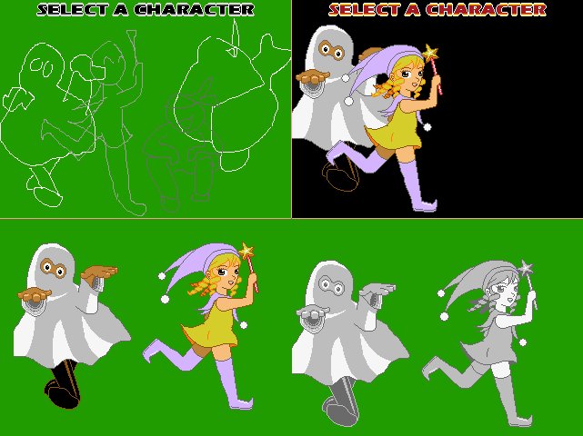
I start with a rough sketch to set the overall look and position, then draw at the bottom and will assemble later in the top right.


Hey guys I have an image that needs some feedback:
http://rpgmaker.net/portal/development/image_feedback/
http://rpgmaker.net/portal/development/image_feedback/


Does my new title picture look decent?
Sorry guys, my browser and PC are screwing up really bad lately. :(
The picture is here---> http://postimg.org/image/s481ipnkj/
The picture is here---> http://postimg.org/image/s481ipnkj/
LockeZ

I'd really like to get rid of LockeZ. His play style is way too unpredictable. He's always like this too. If he ran a country, he'd just kill and imprison people at random until crime stopped.
5958
Your title screens are always a little too artsy for my personal taste, but I can't deny you are getting really good at accomplishing what you're trying to do. This one is pretty nice looking overall; I can appreciate the Sin-City-ish use of color, and the use of the three images side by side conveys what I assume are three major ideas of your game (damage, murder, pain?) without seeming like an overwhelming mess.
Some suggestions:
- I'm guessing the red speckles on the woman's back and side are supposed to be blood, but they don't look much like blood. The shape of the red speckles kind of looks like a large scab that is in the process of healing, after she was scraped over a large portion of her body, like from sliding across pavement. If that's actually what you were going for, I recommend using a darker shade of red, though. If you were going for blood, I recommend making it less speckled and more splattered/drippy.
- The image on the computer screen would look better if instead of stretching it out horizontally to fit the screen, you just kept it at the original proportions and then filled the empty space on the left and right sides of the screen with white. Like so:

(I didn't resize the japanese text in the computer screen, and moved it a little to the side, because after changing the dude's head it looked off-center. Your call though, I didn't really know for sure what to do with it, I don't even know if it was stretched or not)
Some suggestions:
- I'm guessing the red speckles on the woman's back and side are supposed to be blood, but they don't look much like blood. The shape of the red speckles kind of looks like a large scab that is in the process of healing, after she was scraped over a large portion of her body, like from sliding across pavement. If that's actually what you were going for, I recommend using a darker shade of red, though. If you were going for blood, I recommend making it less speckled and more splattered/drippy.
- The image on the computer screen would look better if instead of stretching it out horizontally to fit the screen, you just kept it at the original proportions and then filled the empty space on the left and right sides of the screen with white. Like so:
(I didn't resize the japanese text in the computer screen, and moved it a little to the side, because after changing the dude's head it looked off-center. Your call though, I didn't really know for sure what to do with it, I don't even know if it was stretched or not)
author=LockeZ
Your title screens are always a little too artsy for my personal taste, but I can't deny you are getting really good at accomplishing what you're trying to do. This one is pretty nice looking overall; I can appreciate the Sin-City-ish use of color, and the use of the three images side by side conveys what I assume are three major ideas of your game (damage, murder, pain?) without seeming like an overwhelming mess.
Some suggestions:
- I'm guessing the red speckles on the woman's back and side are supposed to be blood, but they don't look much like blood. The shape of the red speckles kind of looks like a large scab that is in the process of healing, after she was scraped over a large portion of her body, like from sliding across pavement. If that's actually what you were going for, I recommend using a darker shade of red, though. If you were going for blood, I recommend making it less speckled and more splattered/drippy.
- The image on the computer screen would look better if instead of stretching it out horizontally to fit the screen, you just kept it at the original proportions and then filled the empty space on the left and right sides of the screen with white. Like so:
(I didn't resize the japanese text in the computer screen, and moved it a little to the side, because after changing the dude's head it looked off-center. Your call though, I didn't really know for sure what to do with it, I don't even know if it was stretched or not)
Hehe, thanks! :D
The blood on her back is supposed to be like, just a small splatter on her. I'll try improving it :)
Thanks for the suggestions! That pic looks crisp and clean now (~_^)V
I'll use your suggestions :) The Jap text is not stretched,it just looks that way cause it is flipped.

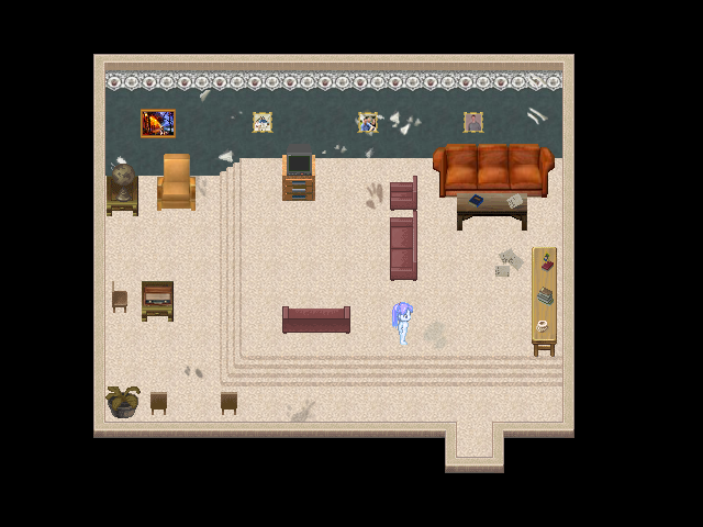
working on my Earthbound city. 2 districts, the sleazy downtown and the high brow upton (still incomplete)

Dookie, you captured the Earthbound style really well. Are you using RM? I had no idea it could handle that kind of isometric mapping so fluidly.

author=Avee
I'm drawing a few simple characters for my AHE entry ^^
I start with a rough sketch to set the overall look and position, then draw at the bottom and will assemble later in the top right.
That funky ghost character is really cool, is he scratching or what?. Looks great in any case!
LockeZ
I'd really like to get rid of LockeZ. His play style is way too unpredictable. He's always like this too. If he ran a country, he'd just kill and imprison people at random until crime stopped.
5958
kinda hate this map but should probably not worry too much since contest deadline
SPOOKY GHOST GIRL

