


BERRYRMN'S PROFILE
BerryRMN

2883
The RPG Maker Score Table
Warning: Major Spoilers for RPG Maker games in the comments section.
A score table of all the RPG Maker Games I've interacted over the years. Some may change depending on the situation.
https://docs.google.com/document/d/1uBqPDqbJSCo-pykYjZZs5om23IIEW2HHI3S83Z-nPkg/edit?usp=sharing
Warning: Major Spoilers for RPG Maker games in the comments section.
A score table of all the RPG Maker Games I've interacted over the years. Some may change depending on the situation.
https://docs.google.com/document/d/1uBqPDqbJSCo-pykYjZZs5om23IIEW2HHI3S83Z-nPkg/edit?usp=sharing

Search
Filter
 Release Something: Gotta Go Fast!!!
I guess I'll respond on some of the criticisms here then.
For these comments, I'll just say that I've posted a new version to criticize. With more details, reduced size and reformatted areas. Also, yes. I am the one who made the character assets. I tried to replicate the RTP format, but it does look offputting and funny. But considering that you questioned it, I'll assume that you thought that this is RTP or something? XD Maybe it did the job?
------
Oh. A different comment. LOL. X3
XD Thank you. Though I'm surprised that you actually thought its a big mashup of both Yoda and Burt. XD ROFL.
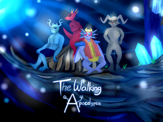
- This goblin is actually inspired by one of Aekashics' gunblins. I can't specify.. but I looked it up and I was blown away. While it took a lot of reiterations (to differentiate it and remove all the guns, capes and glasses), I did try to look up some other concepts like from Skylanders, Pathfinder, Clash of Clans (Yeah, I have quite the reference library to choose from.)
XO <falls down><thinks really really hard><having a moment of silence>
....
...He just said my character designs look good...
..
..
.
!!!!!!!!! :O <Mouth is open agape for a little while..>
THANK YOU SO MUCH! <gasp><wheeze><shock a little><Ahahaha...Oh man..I just. I'm speechless..>
Anyways, over-the-top reactions and hyperbole's and all...
To answer your question... Yeah. I designed all the concept art for the main cast and the supporting cast. They're mostly original. Though I did took inspirations from games and shows alike. I noticed that there isn't much non-human playable cast, and I ended up making the entire cast for this game mostly non-human in appearance.
I'll look over some more entries later. I'm tired since I just got back from a trip.. and I'm pooped. (-_-)
author=luiishu535
@BerryRMN:That kitchen counter is insane! Man, is there a reason for it being so long? Your map could be reduced in overall size a little as well; make the room smaller.
author=karins_soulkeeper
@BerryRMNThe map's too empty (and unnecessarily large)! I suggest you either make it smaller, or fill it with more stuff
author=Irog
@BerryRMNThe three characters looks very funny. Are they custom? The room is too large and empty. Reduce the room size or add furniture and accessories. The sink table is way too long.
For these comments, I'll just say that I've posted a new version to criticize. With more details, reduced size and reformatted areas. Also, yes. I am the one who made the character assets. I tried to replicate the RTP format, but it does look offputting and funny. But considering that you questioned it, I'll assume that you thought that this is RTP or something? XD Maybe it did the job?
------
author=pianotm
@BerryRMNI love those sprites. The one in front looks like the love child of Star Wars' Master Yoda and Burt from Sesame Street.
Oh. A different comment. LOL. X3
XD Thank you. Though I'm surprised that you actually thought its a big mashup of both Yoda and Burt. XD ROFL.
- This goblin is actually inspired by one of Aekashics' gunblins. I can't specify.. but I looked it up and I was blown away. While it took a lot of reiterations (to differentiate it and remove all the guns, capes and glasses), I did try to look up some other concepts like from Skylanders, Pathfinder, Clash of Clans (Yeah, I have quite the reference library to choose from.)
author=Deltree
@BerryRMNI like the character designs! And one appears to be a lizardman! Are they original?
XO <falls down><thinks really really hard><having a moment of silence>
....
...He just said my character designs look good...
..
..
.
!!!!!!!!! :O <Mouth is open agape for a little while..>
THANK YOU SO MUCH! <gasp><wheeze><shock a little><Ahahaha...Oh man..I just. I'm speechless..>
Anyways, over-the-top reactions and hyperbole's and all...
To answer your question... Yeah. I designed all the concept art for the main cast and the supporting cast. They're mostly original. Though I did took inspirations from games and shows alike. I noticed that there isn't much non-human playable cast, and I ended up making the entire cast for this game mostly non-human in appearance.
I'll look over some more entries later. I'm tired since I just got back from a trip.. and I'm pooped. (-_-)
Release Something: Gotta Go Fast!!!
I've been trying to get this reply out sooner, but I accidentally close the tab on this one and all my feedback I've made is gone. T-T <sad>
I'll be posting individual responses to the feedback on a later time (as well as probably a part 2 of my comments for other people's works), but from what I can garner, there's a lot of complaints of map sizes and height of the walls. I'll see what I can do. But that would also mean that I would have no choice but to do a lot of mapping changes in the area. Then again, I did made this in just 1-3 minutes.. so editing them with more details would really help a lot. Guess I still have some work cut out for me.
@ J-Man
Animation looks pretty nice overall and the graphics of the characters and the enemies are pretty cute. Something like Ragnarok like design or something to that effect. The whole battle is interesting and while it does have interesting mechanics, it does pad out a little too long for my tastes. The cutscenes are rather simple, but I'd say that its pretty decent considering this hasn't been finalized yet?
It has a pretty look to it and the text box effect emphasized a lot to the feel of the game. The default facesets does seem a little jarring at times, but I suppose this hasn't been edited completely yet, so I wouldn't be too hard on it for now.
@ Ocean
@ Ratty524
@ Deltree <OMGGM,I'm fangasming Ican'tbelieveI'mactuallygoingtodothisAAARRRGH>
@ Luchino
@ luiishu535
@ Red_Nova
@ Punkitt
@ kr0x
That's all for now. I'll probably look at the others at a later point in time and respond to da criticisms then. c:
I'll be posting individual responses to the feedback on a later time (as well as probably a part 2 of my comments for other people's works), but from what I can garner, there's a lot of complaints of map sizes and height of the walls. I'll see what I can do. But that would also mean that I would have no choice but to do a lot of mapping changes in the area. Then again, I did made this in just 1-3 minutes.. so editing them with more details would really help a lot. Guess I still have some work cut out for me.
@ J-Man
Animation looks pretty nice overall and the graphics of the characters and the enemies are pretty cute. Something like Ragnarok like design or something to that effect. The whole battle is interesting and while it does have interesting mechanics, it does pad out a little too long for my tastes. The cutscenes are rather simple, but I'd say that its pretty decent considering this hasn't been finalized yet?
It has a pretty look to it and the text box effect emphasized a lot to the feel of the game. The default facesets does seem a little jarring at times, but I suppose this hasn't been edited completely yet, so I wouldn't be too hard on it for now.
@ Ocean
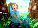
The sprites look rather interesting, to say the least. I don't have much to say about Rubi though since its simple and looks nice enough. On the other hand, the overworld sprites looks pretty solid, but I find the house having slight contrast problems. Being that the pinkish looking roof on the house is a little bit more disoriented in my eyes so it doesn't seem to look awfully appealing in my point of view. But otherwise, it is drawn very well and I admire the effort on making the sprites look as it is.
@ Ratty524
The intro is very well executed. Its simple yet there's a lot of feel to it that makes the moment and the build up much more interesting. The emotions and the trials that are to befall the child are going to show us the atmosphere and the tone of the game in general and see the foreshadows the conflict that is to come. Admittedly, it does come off a little weird, but I'll take it. There's nothing really bad to comment on it per se, but if there's something I can criticize, its that the sprites sometimes looks pretty funny at points. But that's just nitpicking all the way.. sooo... yeah.
@ Deltree <OMGGM,I'm fangasming Ican'tbelieveI'mactuallygoingtodothisAAARRRGH>
Admittedly, the gameplay is going to be amazing from what I can tell on the screenshot and from what it entails, it covers a lot of points. Especially since its made in Unity of all things, I guess this means that a lot of effort and work has been placed on the project itself.
We can tell that the damage popup is interesting in that it jumps up when damage is taken. The timing of the damage is accurate enough. Its positioning is relatively fine so that it doesn't distract the view but at the same time it is a little too high for my liking. And the animation for Tox for his breath and its impact is executed at a good distance point and its impact hits at the right moments. The knockback could use some work for the enemies, but otherwise its pretty good overall as well as implementing the momentum gauge for some effect. I also noticed the time dropping on the down-left corner. I'm sure its useful for something, but I don't really know what.
All in all, it's pretty and the effects are nice to look at. Animation looks simple and does its job relatively well. Popups are pretty to look at and the character poses and backgrounds blend really well. Good work. c:
@ Luchino
There's not much to say to criticize or compliment on it. Its really well done and the battlers looks nice and cool (The slimes have such great visual detail). The ship bridge looks simple and yet with details it could be amazing. The ship_1 looks almost amazing to look at and the port town looks detailed enough (wish I could see a bigger size of it). This game might look pretty good by standards. Keep up the good work.
@ luiishu535
Simple and red. Might looks better with a little more details, but its pretty good to look at.
@ Red_Nova
As usual.. I'm impressed by the amount of effort you put. Its pretty impressive that you were able to customize the menu screen in an interesting light. Played the demo already and it does look nice on the overall scope of things. Your games are brutal sometimes.
@ Punkitt
Cute, simple and adorable. c: Custom made, is it? Its looking very well designed. Some people may not be a fan, but I'm okay with its look. The shape of the weird L object is interesting but its positioning and its color just seems so off to me that it just looks weird. Otherwise, its pretty to look at.
@ kr0x
Aww. Its so adorable and scary at the same time. Clips looks cute and the backgrounds looks simple enough.
That's all for now. I'll probably look at the others at a later point in time and respond to da criticisms then. c:

