


BERRYRMN'S PROFILE
BerryRMN

2883
The RPG Maker Score Table
Warning: Major Spoilers for RPG Maker games in the comments section.
A score table of all the RPG Maker Games I've interacted over the years. Some may change depending on the situation.
https://docs.google.com/document/d/1uBqPDqbJSCo-pykYjZZs5om23IIEW2HHI3S83Z-nPkg/edit?usp=sharing
Warning: Major Spoilers for RPG Maker games in the comments section.
A score table of all the RPG Maker Games I've interacted over the years. Some may change depending on the situation.
https://docs.google.com/document/d/1uBqPDqbJSCo-pykYjZZs5om23IIEW2HHI3S83Z-nPkg/edit?usp=sharing

Search
Filter
 ConcordantCutscenes.PNG
author=zDS
Really nice art here! You have a very unique drawing style.
Ahaha. Thanks. There's definitely more of this in the new iteration. And fun fact, the last iteration had a LOT of cutscenes. I spent like... a long time trying to get as much cutscenes as I can pushing through the last iteration. I realized that halfway through when I decided to scrap the previous version that I completely burned up a lot of time on the scenes and ended up... having to discard them.
All my hard work went up in flames... ah well. I guess I can add that to the art dev when I actually finish the game and I would make a summary of the development using those unused images.
 Being the villain
author=WheelmanZero
WARNING:The following response is hilariously spoileriffic.
Pfft, you call that critical? The angry video game nerd would scoff at such a thing! Thanks for the additional feedback Berry, I'll address everything as best I can.
Ragnarok is pretty much designed to be a very simple villain whose motivation comes from his general perception of the world. His "final boss" speech in the intro is meant to articulate the fact that through his eyes, the correct state of the world is to be covered in darkness, while light is an anomaly that needs to be destroyed. Not a very deep character, I know, but trust me, there are plenty of other villains in the game who have deeper motivations for their actions.
Lianna's reasons for living are not only the primal fear of death that generally grips human beings, but her anger over losing her family. As noted later in the story, Pandora considers giving up and killing herself a way of surrendering to the wishes of the world she hates. We all know villains tend to be sore losers, heh heh. Later on in the story, Pandora does show signs of mental trauma, but that's all I can say for now.
The scene where Lianna's mother explains the history of the world is meant to cement the fact that people generally fear dark mages because they know they have the potential to summon Ragnarok, hence the hatred. I felt that the angry mob attempting to kill Lianna was enough of a demonstration of the persecution of dark mages, and that another scene of a similar nature would've been redundant.
Both Draconus and Lanith have backstories rehashed in optional, unlockable cutscenes, showing how each of them first encountered Pandora and became her allies. Considering how many backstories I'm telling, I'm surprised I didn't give the shopkeepers their own.
The initial battle at the start of the game is designed to be the final boss battle of a typical rpg, hence the genericness. Neither Ragnarok nor the heroes are designed to be attached to at all. The heroes do their thing, then are never seen again due to the 200 year time jump. There are bits and pieces of their past unlocked through cutscenes later on in the game, but mostly the player is never meant to care about whether they live or die.
The battles are meant to be the meat of the game, designed to hold the player's interest through custom animations, moving battlebacks, sound effects, and the summon mechanic to add a little variation. I wanted the player to actually look forward to fighting, as it is what you generally spend the most time doing in an rpg. I personally prefer random battles to touch encounters, because the latter actually trains me to dodge enemies and avoid fighting, not to mention enemy sprites tend to clutter up a map. There's a script in the game that prevents encounters from popping up every 3 steps, so the encounter rate won't be all that abusive. To phrase it more briefly, the battles are tailored to my personal tastes.
I was actually worried that having so many trainable summons in the game would make it too grindy, so I designed a rare candy-like item that grants exp to the summon currently in the party. The item can be either purchased or won through a certain event, so it should help take the edge off of summon training while adding more value to gold. The exp curve should prevent players from making any one summon too OP, as the item grants 300xp a pop.
As for the roles of the summons in the demo, Draconus was meant to be the area of effect attacker, Lanith is a gimmicky psudo-white mage, and Chimera is the physical heavy-hitter. I tried to give each summon their own gimmick to keep things interesting, but from a technical standpoint, you don't have to recruit a single optional summon to beat this game. Recruiting summons and having them learn new attacks is meant to be fun, but not mandatory, and some of the summons do have similar functions.
And now for the giant pink elephant in the room; the intro length. I honestly cannot think of a way around it that wouldn't involve me butchering Pandora's backstory and diminishing its emotional impact. The initial battle with Ragnarok is meant to provide some stimulating interactivity for the player, while the cutscenes are meant to lay the setting, draw them into the story and get them to understand Pandora's motivations. The intro is by far the longest string of cutscenes in the game, but isn't mandatory, so if the player wants to get to the nitty gritty, they can reboot the game and choose to skip it. F7 also skips through dialogue, so the player is never required to sit through any one cutscene.
Well, I hope I addressed everything adequately, and it only took me 70 paragraphs! Everyone's motivations and character will be flushed out throughout the course of the story. Except Ragnarok, that guy's just a jerk. Thanks again for both your time and feedback, and I hope to hear from you again once the completed version is up and running!
Hah. I mentioned that I wasn't being too critical. But I never said I intended to be super critic levels of critical. Me doing that would break the game and sour the experience, as I would complain on a lot of aspects of the game already as is. Especially since this is made by you alone, I presume, this is impressive as it already is.
I mentioned taking a neutral but ultimately subjective stance since I want both positives and negatives to be shown so you can justify and tell us your thoughts on the matter and use it as a framework for future development decisions. I enjoyed the game for what it is regardless and I do look forward to the completed version.
Though I will agree with your points for now and am expecting the full version soon. If Battles are formatted to the way you wish, as you say, then I hope it will be to the level of expectations that you would want. And hopefully, it won't be too annoying.
Thanks for taking the time to answer my really long feedback though. It was honestly pretty long.
 BlueSkies 2 demo version 2.0!! More fixes!! and plot continuation!
Hello again. Time for some 2.0 notes. And this time, with slightly better grammatical writing, since I'm bad at those. :c I suppose the next version, I presume, might require me to PM you, or it might go onto spoiler territory, I suppose. Take this feedback however you will and I hope you continue to work on this the best you can.
And that is all for my notes on the current version. I’m looking forward to the next one and see what new things I can see from here on out. I won't be a massive bug hunter honestly, I won't have much time to hunt every bug. But if there's any while I'm playing, I'll tell you.
You have a habit of saying Thank You as thankyou. Is that a trend or something or is it something that you typed in a hurry or something? I’ve noticed that when I was playing Blue Skies 1 as well. I noticed that seems to happen with a lot of the text sometimes. I feel like for the demo, it’s fine. But for a full version, I might be turned off by it if it isn’t fixed, honestly. But considering that you were working on this alone, I think I should try to tolerate it. It’s a minor gripe though. Take it with a pinch of salt.

The anthem seems rather light hearted, I kind of liked it a little bit, honestly.
And I am aware that your english is not the best around, you admitted it yourself. Especially since it's your second language. So I won’t criticize heavily on this one.
Alden and Clark seems to have tragic backstories. Alden especially. Although I might have probably seen those types of tragedies before, so really. It’s kind of sad and empty both at the same time. Although you don’t really need to have complex backstories, I’d say this is okay, I suppose.
I will admit that I partially warmed up to Alden, so that’s good.
I may have not said this before, but your main character seems really, really nice. (Skye is also this in Blue Skies 1 Technically it was supposed to be Blue Sky but I think the characters called him out on it too, so at least you're kind of aware...) It’s probably the naivete, but personally, Lyrelle’s kindness can either turn people off or warm them immediately. I’m on the middle ground on this one. Although her way of expressing “humor” is probably one of the many ways I can tolerate the overabundance of kindness in her.
I haven’t said this before, but the talk feature during “breaktime” scenes allows you to get to know about the cast pretty well, learning their history and building the world too. Your ability to put characterization on characters with significant detail is commendable and I find it interesting. Not everyone will agree with me on this, but it is possibly one of the stronger points of this game. And I’d appreciate that. Remembering the fact that “A poor story can be compensated with good and memorable characters”, I think you pulled off the story and characters with adequate balance. Well done.
Also, reducing the price of mana potions and the weapons and armor to a more acceptable price. I like that. I can at least buy a weapon/potion or two now on a fair basis without it feeling too expensive. Whether it remains that way remains to be seen.


Hanni’s analyze abilities has its screens reduced everytime I press C. I don’t know if that’s intentional.

And I noticed the battles flow much faster this time around, so it is less annoying to wait for the camera to be completed. So that’s a plus I guess.
And I noticed you haven’t fixed the text overlapping on characters. But I suppose that would be noticeable when you put it on the updates.

The aforementioned bug that I said when River left Senna Woods is now fixed. Good.
The anthem seems rather light hearted, I kind of liked it a little bit, honestly.
And I am aware that your english is not the best around, you admitted it yourself. Especially since it's your second language. So I won’t criticize heavily on this one.
Alden and Clark seems to have tragic backstories. Alden especially. Although I might have probably seen those types of tragedies before, so really. It’s kind of sad and empty both at the same time. Although you don’t really need to have complex backstories, I’d say this is okay, I suppose.
I will admit that I partially warmed up to Alden, so that’s good.
I may have not said this before, but your main character seems really, really nice. (Skye is also this in Blue Skies 1 Technically it was supposed to be Blue Sky but I think the characters called him out on it too, so at least you're kind of aware...) It’s probably the naivete, but personally, Lyrelle’s kindness can either turn people off or warm them immediately. I’m on the middle ground on this one. Although her way of expressing “humor” is probably one of the many ways I can tolerate the overabundance of kindness in her.
I haven’t said this before, but the talk feature during “breaktime” scenes allows you to get to know about the cast pretty well, learning their history and building the world too. Your ability to put characterization on characters with significant detail is commendable and I find it interesting. Not everyone will agree with me on this, but it is possibly one of the stronger points of this game. And I’d appreciate that. Remembering the fact that “A poor story can be compensated with good and memorable characters”, I think you pulled off the story and characters with adequate balance. Well done.
Also, reducing the price of mana potions and the weapons and armor to a more acceptable price. I like that. I can at least buy a weapon/potion or two now on a fair basis without it feeling too expensive. Whether it remains that way remains to be seen.
Hanni’s analyze abilities has its screens reduced everytime I press C. I don’t know if that’s intentional.
And I noticed the battles flow much faster this time around, so it is less annoying to wait for the camera to be completed. So that’s a plus I guess.
And I noticed you haven’t fixed the text overlapping on characters. But I suppose that would be noticeable when you put it on the updates.
The aforementioned bug that I said when River left Senna Woods is now fixed. Good.
And that is all for my notes on the current version. I’m looking forward to the next one and see what new things I can see from here on out. I won't be a massive bug hunter honestly, I won't have much time to hunt every bug. But if there's any while I'm playing, I'll tell you.
 BlueSkies 2
Well, I played the demo for a really long bit. And I'll give you my feedback on the whole thing. My entire notes of the game I took, so to speak. It'll be pretty long winded, so I hope you don't mind a lot of reading. XD
Overall, I'd say this is promising and very well done, but it is a long demo and some areas really starting to pad out too long for my tastes.
My suggestion would be to reduce the encounters in each dungeon and add more experience based on the level you want them to raise on but limit it to that so they can continue with the plot, this prevents too much grinding and actually reduce the amount of playtime people want to play. (Although, some sections are balanced, preventing you from being overpowered, so that's okay I suppose. Just take this advice with a grain of salt.)
Also, reduce the cost of your weapons/armor. 450 is fine if you grind like crazy, but I'd earn at least 1000 gold from my encounters, you can only buy at least 1-2 armor pieces and that's pretty lacking, making weapon/armor shops pretty obsolete in my opinion. So at least 250-350 would be more suitable to me.
The items are okay, Mana Potions could be much cheaper, but I won't complain.
And hey, your game, your call, I suppose.
It had a lot of promise and I can't wait to see where it develops. Keep up the good work.
I'd love Echo607 to play your game, but copyrighted music and all. XD I really want her to see this extremely passionate work you put into though for other people to see, especially since this is XP of all things. Hahah..
Early cinematics look visually appealing early on, great job at attempting to emphasize visuals and use music to hook interest. The dark tone is set up very well early on, showing effects of war and such.
The other XP games that hooked my interest early on is either Gaia's Melody, Reconstruction and Master of the Wind, so this game is a breath of fresh air to see another game with some potential or another.
Overall, Opening cinematic looks pretty and really well executed.
And the opening intro is contrasted by the introduction of the older Lyrelle's event, which balances out the tension of the opening.
Very nice looking UI for the Menu screen.
One major problem that I can say is in the save file. Admittedly, the save file is nice looking. It's just hard for me to control between saves because of the formatting. Sorry about this. If you can't change it, that's fine. Just had to say it though.
Um. Where did the voice acting in battle commands come from? Wow. You definitely put a lot of effort in this game that's for sure.
Although it gets a little grating after awhile, honestly. And it doesn't make a lot of sense at some points, but oh well. Being picky is a bad habit of mine.
Battles are definitely more interesting early on. But it might be a little slow, admittedly.
I'm just glad that Luna and Lyrelle make a good dynamic pair.
And later the development between River and Lyrelle took an interesting turn, that's for sure.
River's voice.. I feel like I'm hearing Yuri Lowenthal's.. Oh well.
Um, I'm not sure if this is intentional, but it's really hard to read the text from this. Talking both at the same time is fine and all, but it's probably better to put it separately between text so we players can read it.

The letter from her mom, even in text, really brings to heart a lot of aspects of their character and it's hard to make the player feel for something, so I commend you for making the letter scene really impactful.
I noticed a bug when you enter Senna Forest with only River before you talk to Luna and come back to the world map, you can't go anywhere else. Is this intentional?
I hate to admit it, but I liked River's character. Darn, XP music hurts my emotions a lot playing through this.
Ophelia knows more than she lets on, I think.
Also, I feel like every ship scene I've been into has its fair share of danger problems. Legionwood has it. This one too.
This one reminds me partially of the scene from Golden Sun's one..
Plot twist when we land. Woo. I kind of expected-not expected it for some reason or another. (It doesn't make sense)
Alden and Clark.. They're.. interesting.
And I'll admit the backtracking is a little annoying and pads out the game a bit, but there is at least some vague reason why characters don't just teleport back out from the dungeon at the very least.
And I finished the game. Took me a good while too, I had a lot of fun playing this demo.
The other XP games that hooked my interest early on is either Gaia's Melody, Reconstruction and Master of the Wind, so this game is a breath of fresh air to see another game with some potential or another.
Overall, Opening cinematic looks pretty and really well executed.
And the opening intro is contrasted by the introduction of the older Lyrelle's event, which balances out the tension of the opening.
Very nice looking UI for the Menu screen.
One major problem that I can say is in the save file. Admittedly, the save file is nice looking. It's just hard for me to control between saves because of the formatting. Sorry about this. If you can't change it, that's fine. Just had to say it though.
Um. Where did the voice acting in battle commands come from? Wow. You definitely put a lot of effort in this game that's for sure.
Although it gets a little grating after awhile, honestly. And it doesn't make a lot of sense at some points, but oh well. Being picky is a bad habit of mine.
Battles are definitely more interesting early on. But it might be a little slow, admittedly.
I'm just glad that Luna and Lyrelle make a good dynamic pair.
And later the development between River and Lyrelle took an interesting turn, that's for sure.
River's voice.. I feel like I'm hearing Yuri Lowenthal's.. Oh well.
Um, I'm not sure if this is intentional, but it's really hard to read the text from this. Talking both at the same time is fine and all, but it's probably better to put it separately between text so we players can read it.
The letter from her mom, even in text, really brings to heart a lot of aspects of their character and it's hard to make the player feel for something, so I commend you for making the letter scene really impactful.
I noticed a bug when you enter Senna Forest with only River before you talk to Luna and come back to the world map, you can't go anywhere else. Is this intentional?
I hate to admit it, but I liked River's character. Darn, XP music hurts my emotions a lot playing through this.
Ophelia knows more than she lets on, I think.
Also, I feel like every ship scene I've been into has its fair share of danger problems. Legionwood has it. This one too.
This one reminds me partially of the scene from Golden Sun's one..
Plot twist when we land. Woo. I kind of expected-not expected it for some reason or another. (It doesn't make sense)
Alden and Clark.. They're.. interesting.
And I'll admit the backtracking is a little annoying and pads out the game a bit, but there is at least some vague reason why characters don't just teleport back out from the dungeon at the very least.
And I finished the game. Took me a good while too, I had a lot of fun playing this demo.
Overall, I'd say this is promising and very well done, but it is a long demo and some areas really starting to pad out too long for my tastes.
My suggestion would be to reduce the encounters in each dungeon and add more experience based on the level you want them to raise on but limit it to that so they can continue with the plot, this prevents too much grinding and actually reduce the amount of playtime people want to play. (Although, some sections are balanced, preventing you from being overpowered, so that's okay I suppose. Just take this advice with a grain of salt.)
Also, reduce the cost of your weapons/armor. 450 is fine if you grind like crazy, but I'd earn at least 1000 gold from my encounters, you can only buy at least 1-2 armor pieces and that's pretty lacking, making weapon/armor shops pretty obsolete in my opinion. So at least 250-350 would be more suitable to me.
The items are okay, Mana Potions could be much cheaper, but I won't complain.
And hey, your game, your call, I suppose.
It had a lot of promise and I can't wait to see where it develops. Keep up the good work.
I'd love Echo607 to play your game, but copyrighted music and all. XD I really want her to see this extremely passionate work you put into though for other people to see, especially since this is XP of all things. Hahah..
TipSystem.png
The text on the tips. The descriptions are a little too dark for my liking. Either you want to make it a little more brighter or make it a little more consistent to the description text. Dark blue and brown-ish colors doesn't seem to match properly.
Visually, map looks pretty and you have a good sense of mapping. Keep up the good work.
Visually, map looks pretty and you have a good sense of mapping. Keep up the good work.
 Concordant
Announcement: v. 0.5 Alpha is now in release!
-----
This version will include:
- More soundtracks
- Two-Three partially completed routes
- More taste of interactions in gameplay.
- Revamped UI and Menu Screen
I will not promise you this, but there is a possibility that v.0.8 will be worked on, fixing some of the bugs, glitches, grammars and the like. So look forward to that in the future.
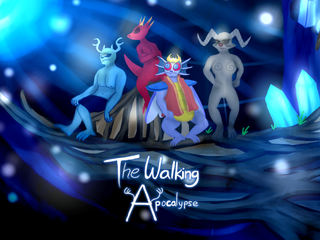
Being the villain
Played it for a bit. Have to say that this game has potential. It definitely looks pretty.
Edit: After replaying the demo once more, I realised that I wasn't being too critical. (As I read and skimped past the early scenes without a second thought.) I won't be too negative, there are good parts in the game. But there are parts where I suddenly realised to face palm at certain situations because of how corny and uhh..(for the lack of a better word) lacking it is.
Spoilers though.
All in all, relatively good mapping (with some gripes) and good early build up so far (at least during Lianna's section) and I look forward to the full version. Also, my apologies if I was a little more critical this time. I realized that I want to remain neutral to this as much as I can, so you can learn from the good and the bad.
Edit: After replaying the demo once more, I realised that I wasn't being too critical. (As I read and skimped past the early scenes without a second thought.) I won't be too negative, there are good parts in the game. But there are parts where I suddenly realised to face palm at certain situations because of how corny and uhh..(for the lack of a better word) lacking it is.
Spoilers though.
Kind of sad and tragic how the antihero/our main character is developed early on. Though it is really heavy reading through the scenes following up to that build up and set up plot, as jstomp had put it. Since the intro has you read text after text of exposition and the spiel of good vs evil stuff we all know and love(or hate, in some cases) in classic ol' RPG's. Kind of wish we could learn the main character's backstory piece by piece as you beat the "bosses" or something, but I won't complain. And also kinda wish the end part is a little less... Corny. Corny is fine, it's subjective and I personally don't mind corny dialogue at times. But too much of it and you get sick of it. Simple as that.
Addendum: Yeeaaaaahhhhh... After giving the plot a second time readthrough, I realised Ragnarok was generic and cheesy. This is probably intentional or something, but I suppose it might turn off some people. Also, too much exposition dump or banter can easily turn some people off.
I want Draconus to play a more prominent role than the succubus is to be honest. Also, heroes of light are fine and all with their dialogue, but we don't know either side of the story, so it's hard to relate to them early on if you just, in a metaphorical sense, "put the cheese in before the meat and the bun" (and the veggies). In the end, both sides are so cheesy that they lack substance of character in them to make me invested in how they will fail or succeed, because it remains the same either way.
Also, maybe instead of chatting about how pointless the characters are, maybe shed a little bit of insight into Ragnarok's origins and history. We ARE playing as the bad guy here. All we know is that he hates Lumierre. And that's it. It makes him hard for us to kind of root for him or play as him. Unless it gets explained later on how, I feel a little off putting about it.
And it took at least 50 minutes just to get to the meat of the gameplay. If people watched through this the first time, they'd be turned off after 10-15 minutes.
Regardless, you kind of succeeded in hooking me in through Lianna's suffering at least, since her build up and execution is presented pretty well in my eyes, with light comedy peppered down a little bit in the aftermath of the "event" that shaped the main character to what she is now.
However, some sections of her dialogue is a little bit weird. What's her motivation for keeping herself alive when she lost everything she had? Also, what's the village's motivation for hating her? We don't know enough to exactly feel really mad at them for it other than she's a part of the bad ones, we must kill them. The heart is there, it just lack context to make make us feel hatred over them. Showing dark practices being punished as a context would really give some meaning to the villager's actions.
Also, for a girl with very little knowledge and wisdom, you'd think she'd have scarring suicidal thoughts running through her mind since her parents and later her only caring ally died. But that's my two cents on the whole thing. Take it with a grain of salt.
I'll admit that I felt sympathy for "Pandora", especially after what happened to actually build her hatred towards humanity like that. But it lacks the "spice" make me feel past that emotional spectrum.
Also, I didn't talk about the gameplay much more so than the story, but I will admit that the random encounters are annoying. While the mechanics are interesting, I don't like to grind too much. I haven't lost once though, but still. Random encounters are going to be really cumbersome and annoying once you go through step after step trying to just get on with it. Thankfully, a certain
tool helped me make this less annoying, but other people may not be so lucky.
The "train your summon" mechanic is interesting, but some characters (especially the Chimera) feel redundant. They all have different levelling curves, I think, which makes it really hard to train everyone. And in addition, when I know there's going to be more party members, you'd think to add a little more usability than what you have right now. My biggest gripe and worry will be that one character will be redundant like the other and the main characters have more power over the other main summons. Though it being in its early stages, I won't complain all that much. After all, it is only a taste of what's to come.
I will admit your use of sound design is impressive. There are some mapping gripes in Lianna's home. But you said mapping wasn't your strongest suit. So I won't complain on that part at least.
Though from your direction, I feel like the ending is going to be pretty honestly "predictable" with minor twists (at least that's how I feel). I want to hazard a guess as to what the ending is, but I don't want to until I play the full version and see it for myself.
Also, I hope the ending isn't going to be cheesy pompous speech, but in reverse. At least, I hope it's not.
All in all, relatively good mapping (with some gripes) and good early build up so far (at least during Lianna's section) and I look forward to the full version. Also, my apologies if I was a little more critical this time. I realized that I want to remain neutral to this as much as I can, so you can learn from the good and the bad.
 Release Something: Gotta Go Fast!!!
Alright. Time for some more responses and criticisms. Also, since there's more time and people post a lot of stuff, I guess I'll post the replies based on new criticisms provided and probably add an updated version and new areas to be feeded with a lot of advices.
I'll attest to the fact that the first map pic is made really rushed. (Fits the theme of gotta go fast) Like I don't really think of making concepts at this stage and just make whatever suits the stage well enough in under one - three minute(s). The second one is more of an experiment to see if the colors match the ambience of the theme and it looks like it did. But I agree that I was taking up space just for the sake of space and filling it without any meaning just seems worthless. Appreciate that, I'll just try and see if 2.0 or 20 would be relatively well enough.
I'll admit I'll have to re-think this again if 2.0 still has some problems..
As I previously said to Liberty, there's not much thinking and planning when making this map. The first one is made in 1-3 minutes and the second one is made without really thinking what makes a dining room + kitchen. And yeah, after looking at a kitchen and all, I can see why a sink is supposed to be where its supposed to be. lol.
- Have fixed some of those issues, after looking up mapping styles and looking what makes a kitchen, a kitchen. Also, these "alien critters" aren't here to steal the food. In fact, one of them lives there. c:
I see. That is fine. Thank you. But I do need to reiterate it a little more. Though I'll keep the tint to that much considering people liked the atmospheric vibe it brings.
------
Now, onto reviewing more stuffs.
@ InfectionFiles
@ SgtMettool
@ mjshi
@ AceofAces
@ pooperflooper
Probably will look at some more parts later. I've seen @Liberty, @Addit, @MakioKuta and @Archeia_Nessiah. Though I can't give an opinion on this since as far as I'm seeing, their images and sprites looks amazing enough. I could give criticisms.. but I can't seem to express it like the others do. So I'll leave it at that.
author=Liberty
@BerryRMNNot bad. I do ask how a one-tile-high area could have two-tile-high cabinets and pillars, though. Remember to keep an eye on consistency. You could also make that cooking room a LOT smaller and still have it contain the things you need to show. Currently it's quite large and it feels like you've added things just to take up space, instead of designing the room around the items it needs.
The second image is a big improvement, though it still looks like you've tried to fill an area instead of thinking about what you wanted and then making the room the right size. You're getting there, though.
I'll attest to the fact that the first map pic is made really rushed. (Fits the theme of gotta go fast) Like I don't really think of making concepts at this stage and just make whatever suits the stage well enough in under one - three minute(s). The second one is more of an experiment to see if the colors match the ambience of the theme and it looks like it did. But I agree that I was taking up space just for the sake of space and filling it without any meaning just seems worthless. Appreciate that, I'll just try and see if 2.0 or 20 would be relatively well enough.
I'll admit I'll have to re-think this again if 2.0 still has some problems..
author=Ratty524
BERRYRMN:- Numerous things are wrong, here. The walls holding those pans and kitchen utensils are a tile higher than the walls surrounding the area. You might want to extend the table one tile down so that the stack of plates don't appear to be hanging off like that. Overall, the entire room doesn't make sense from a practical standpoint. There should be some mapping tutorials on this site that might help you out better than I can at the moment.
- This map is better!? Was the previous one an obsolete version? Still, the placements of your counters and shelves don't really come off as being practical. Why would someone put a bucket of water and two big pots blocking off a dining table? Why is the sink not against a wall, especially since drainage pipes are often connected to walls? I'd rethink this room in general.
As I previously said to Liberty, there's not much thinking and planning when making this map. The first one is made in 1-3 minutes and the second one is made without really thinking what makes a dining room + kitchen. And yeah, after looking at a kitchen and all, I can see why a sink is supposed to be where its supposed to be. lol.
author=Kylaila
@BerryRMNWeird alien critters, check. Food, check. I really like the ambience of the second screenshot - it also has a lot denser beautiful mapping. The first seems more like a make-do in a dungeon, and the kitchen-counter is soo long. The only odd thing is that the pans are way in the back, far away from where they are actually used. That seems quite unnatural.
- Have fixed some of those issues, after looking up mapping styles and looking what makes a kitchen, a kitchen. Also, these "alien critters" aren't here to steal the food. In fact, one of them lives there. c:
author=Irog
@BerryRMNYour new map looks much better. I wasn't sure what is RTP and what isn't; so you made a good job on those three characters.
author=eplipswich
@BerryRMN:Yeah, the original Cooking.png just looks weird to me. The new version looks so much better.
I see. That is fine. Thank you. But I do need to reiterate it a little more. Though I'll keep the tint to that much considering people liked the atmospheric vibe it brings.
------
Now, onto reviewing more stuffs.
@ InfectionFiles
The dark gritty atmosphere kinda fits but some of the areas are a little hard to make out. The bushes aren't so clear. And I could've sworn I saw something like a pole amidst the bushes. Probably add lighting a little?
Also the house looks kind of disproportionate to me. The windows and the door size just looks odd to me. Kinda need some more refixing on the house, otherwise it just seems strange in my eyes.
Though the fog effect is used relatively fine in this, I'll also say that the character looks weird to me. It's hard to make out from here. Its a preference thing though.
---
The other image conveys a good ambience and atmosphere and setting up a good tone. While I find this one slightly better than the first one, it does look slightly jarring to me. Probably because I'm not a huge fan of black and white imagery.
@ SgtMettool
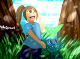
OMGGM. They're so cute. Considering how cute the cast of Brave Hero Yuusha and the effect it brings, I'd say you did a pretty decent job making these pixellated things look rather magical. Nice work.
The facesets are also a nice touch. I kind of liked it. The expressions look real and I would think that this has a lot of potential. Keep it up.
The facesets are also a nice touch. I kind of liked it. The expressions look real and I would think that this has a lot of potential. Keep it up.
@ mjshi
This is a simple one. I'll admit that the background looks nice in general. I don't know if adding stuff to occupy space will look nice enough, but the best thing I can come up with is that you should try and add some shelves and the like? Probably add tables and chairs? Your preference, your call though.
Also, that image portrait on the bottom right-ish seems off.
Also, that image portrait on the bottom right-ish seems off.
@ AceofAces
Some of the images are in languages I don't understand, I'm afraid. :c
Also, I might not be able to check the Luna Engine, sorry.
The rival battler looks nice. If you were the one who drew it, that's great.
The stealth mechanic is a great feature to have. Though the map is barren at the moment so it looks awfully empty. Probably need to add more stuffs and increase the complexity to make it look like a puzzle of sorts. It helps a lot.
The town map, however, looks ok in my eyes. Someone else might do a better job criticizing this than I do since I'm bad at making realistic looking maps..
@ pooperflooper
This looks pretty neat. I'm impressed with the color schematics you used for this one. Brings a good expression of the dark, gritty undertones. It kind of looks like one of those Night Before Christmas kind of feel. I can see why people said this is more along the lines of Tim Burton's style of choice..
Probably will look at some more parts later. I've seen @Liberty, @Addit, @MakioKuta and @Archeia_Nessiah. Though I can't give an opinion on this since as far as I'm seeing, their images and sprites looks amazing enough. I could give criticisms.. but I can't seem to express it like the others do. So I'll leave it at that.
Release Something: Gotta Go Fast!!!
author=pianotmBerryRMNpianotm
@BerryRMNI love those sprites. The one in front looks like the love child of Star Wars' Master Yoda and Burt from Sesame Street.
Oh. A different comment. LOL. X3
XD Thank you. Though I'm surprised that you actually thought its a big mashup of both Yoda and Burt. XD ROFL.
No, it's just what it looks like. Wait...you mean you don't see it?
I guess not until I checked it again. I guess if you tweaked the colors and remove Yoda's eyes mixed with Burt's nose... you could say that they do look similar. Guess not being much knowledgeable on Sesame Street can get to you sometimes.
Release Something: Gotta Go Fast!!!
author=Froggeauthor=BerryRMNSenpai noticed you!
XO <falls down><thinks really really hard><having a moment of silence>
....
...He just said my character designs look good...
..
..
.
!!!!!!!!! :O <Mouth is open agape for a little while..>THANK YOU SO MUCH! <gasp><wheeze><shock a little><Ahahaha...Oh man..I just. I'm speechless..>
HAHA!! Senpai did notice me,

