


NEWBLACK'S PROFILE

The undead are among us,
at dawn they shrink back to their silken beds.
They dance by night
and drink the blood
of a child's broken neck.
at dawn they shrink back to their silken beds.
They dance by night
and drink the blood
of a child's broken neck.


Search
Filter
 Forkits Engine demo 4 - Platforming!
Well ofc it's hard to tell what's really a spoilar or not without knowing more about the game yet, but yeah, I meant those.
Oh and - although they've been pretty early-days sorta content, I dig these video updates that explain thangs as you progress with the backend stuff, they're edutaining.
Oh and - although they've been pretty early-days sorta content, I dig these video updates that explain thangs as you progress with the backend stuff, they're edutaining.
Forkits Engine demo 3 - Alpha Blending
Forkits Engine demo 4 - Platforming!
Neat, I'm guessing the configured movement allows you to alter the platforming behavior parameters - so that you can iterate toward really "tight" platforming controls and determine which values work best for your level designs? (think of the speed-runners :V)
The engine's looking pretty rigorously constructed at the moment, look forward to seeing more substantial gameplay footage that demonstrates the mechanics-o-play :)
Also jes saiyan, but you might wann' avoid spoilars in these videos, looked like there may have been some potential ones?
The engine's looking pretty rigorously constructed at the moment, look forward to seeing more substantial gameplay footage that demonstrates the mechanics-o-play :)
Also jes saiyan, but you might wann' avoid spoilars in these videos, looked like there may have been some potential ones?
 DMN!
DMN!
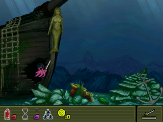
The Drop - Prototype Gameplay Footage
Let's Play - The Curse of Cpt. Loveless Demo
Nice going. There's a video we have in our secret vaults of Kazesui getting an S rank that I was keeping as proof that it was possible, should the need arise. Guess that's not gonna be necessary now (although it still may get posted at some point in the future). I haven't even got one myself yet D:
Thanks for doing these recordings though, shame about the flicker on the S rank run ;-;
Thanks for doing these recordings though, shame about the flicker on the S rank run ;-;
God's Pet Lizard
Welp, this is sort of what I meant to post yesterday, but rmn kept messing with my posts.
Rambling about art stuff here -
I think a lot of, if not most, people who get into art go through a phase where they seem to think that more realistic/"mature"/good art = super soft gradients between values and colours and a weird obsession with things being so smooth in gradiation that everything becomes a blur and has no form and I think it's a sort of reflex against the use of flat colours in an attempt to get away from thinking in terms of simple colours (because that's somehow "too basic" or something? I don't know). But it's such a mis-step, because really flat or near flat tones, large value shapes and harder delineation of colour, when used properly, are actually much closer to a represnetaion of reality than the wanton use of soft brushes and linear gradients.
Case in point here:

4 values there, and not a smooth gradient in sight. Sure once your main values are established you can come in and smooth some transitions between values, gradient stuff where surfaces turn toward or away from light sources, or add in some texture and stuff, but hard values should form the basis of your "shading" primarily, if you want things to not look flat.
Anyway, yeah, don't mean to nitpick you to death, just an area of interest for me.
Rambling about art stuff here -
I think a lot of, if not most, people who get into art go through a phase where they seem to think that more realistic/"mature"/good art = super soft gradients between values and colours and a weird obsession with things being so smooth in gradiation that everything becomes a blur and has no form and I think it's a sort of reflex against the use of flat colours in an attempt to get away from thinking in terms of simple colours (because that's somehow "too basic" or something? I don't know). But it's such a mis-step, because really flat or near flat tones, large value shapes and harder delineation of colour, when used properly, are actually much closer to a represnetaion of reality than the wanton use of soft brushes and linear gradients.
Case in point here:
4 values there, and not a smooth gradient in sight. Sure once your main values are established you can come in and smooth some transitions between values, gradient stuff where surfaces turn toward or away from light sources, or add in some texture and stuff, but hard values should form the basis of your "shading" primarily, if you want things to not look flat.
Anyway, yeah, don't mean to nitpick you to death, just an area of interest for me.
God's Pet Lizard
God's Pet Lizard
Sorry to be that guy but the pre-colouring version looks best to me. Your lineart is always nice and solid but your colours are diffuse, blurry and too saturated.

