


WOLFCODER'S PROFILE

Search
Filter
 untitled3.jpg
trees.png
plantbrush.png
Yeah I've been adjusting the color of the grass and the lighting model until the end of time. I can fix that by simply reducing the maximum sun power at noon and increasing ambient power so those dirt blocks aren't as dark to reduce the contrast effect... but the problem is that it ALSO must have high contrast when the sun is at low power (sunset / sunrise) or it would look like an orange night, and underground that unlit areas are hard to see (but not impossible unlike other block games!).
Considering the ambient component of the lighting model is a crude approximation of radiosity, I could just have the ambient component get brighter or darker based on the sun power (and underground blocks are not effected by the sun).
Considering the ambient component of the lighting model is a crude approximation of radiosity, I could just have the ambient component get brighter or darker based on the sun power (and underground blocks are not effected by the sun).
screen0.png
Lots of people play games for different reasons and hold various things in higher regard. Things like story, appearance, soundtrack, and other elements found alongside gameplay can effect how specific types of players like or dislike something. I've carefully made my decisions in all these areas, balancing integrity with popularity.
Kemonomimi are a critical theme in LandTraveller. No kemonomimi, no LandTraveller. It's like asking of mech suits are optional in MechWarrior, or if driving is optional in F-Zero, or if jumping is optional in a Mario game. Some things have to be exactly as I designed them to be, and other things have to be adjusted to fit exactly how people react.
There are just as many people who would play my game for these little things as the people who would avoid my game for little things as you see above. It's true I personally judge a game solely on its gameplay, but when you create a game you must be willing enough to adjust your idea for the better yet be loyal to your idea.
As a critical theme, it indeed goes further than appearances and deep inside the gameplay. The animal you choose to be effects lots of various things including the RPG character building. I anticipate most people wouldn't mind either way animal or no, but the RPG character development must be spot-on no matter the theme. Especially since its the one thing I felt none of those other constructive block games did right.
screen0.png
screen0.png
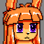
Kemonomimi is a central theme of the game. It's somewhat of a furry game except I like this specific look vs. your typically fully anthropomorphic animal... Though it gives it much more of an anime-inspired feel rather than what one usually thinks when they think of furry. The traits will go much deeper than appearances- I'm mostly disappointed in modern anime's lack of depth when these types of characters occur.
I am WolfCoder after all, furry computer scientist and game developer at your service.
I am WolfCoder after all, furry computer scientist and game developer at your service.
cliffs.png
Actually these were supposed to be islands- the world generator just bugged out a little and I thought it looked cool anyways.
sandstone.png
They stand out, yes. But they still match due to the cohesive elements the 3D and the sprites share. They're fitting with one another, because it feels like they were made to be together.
http://pspmedia.ign.com/psp/image/article/777/777214/disgaea-portable-20070330001541942-000.jpg
No, now THAT looks jarring. Even more than I remember Disgaea being. They look completely out of place. It's like they dumped sprites from one version of Disgaea into a map from another (which is probably what they actually did). Are you looking at the drop shadows I don't have yet? Or the fact every game I referenced had lots of orthographic projection shots (no depth perspective and shot from low orbit) while mine uses 45 degree FOV.
I hope you aren't trolling me or something.
sandstone.png
I don't see this difference that you're talking about. The sprites in the games I mentioned (including Disgaea) stood out from their backgrounds just as much. If you're talking art-wise, I drew the sprites and backgrounds such that the backgrounds are soft and the sprites are sharp and high contrast (the outlines are much darker too) which differs from the PS2 era games that still did sprites on 3D.
You're probably thinking about the linear interpolation applied to the sprites and textures in Disgaea.
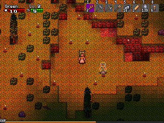
Lots of pixel artists make their outlines on the characters much brighter and with matching color than the way I have it here, but I really hate that as it makes everything look either dull and gray or too pastel. I'm shooting for the earlier 90s look (SNES and Genesis), especially the gamma and chroma ramps seen in Madou Monogatari (Genesis). Considering your earlier comment on my prototype of "the brightness/contrast hurting your eyes" I'm guessing this is what you're trying to refer to. If so, unfortunately this is something I'm explicitly not going to change. I will touch up the sprites, yes, but that's only because I feel they need much more improvement by replacing some of the hairs, cleaning up the animation, and adjusting the colors to be even more saturated and high contrast.
I can't apply a filter or make the background textures equally high contrast and vibrant because then it'll become very difficult for your visual cortex to focus directly on the characters you're trying to help or fight. Even if I had your same tastes in art, I would still have to deliberately do something like this for an action game or it becomes hard for your mind to process the movement and threats.
You're probably thinking about the linear interpolation applied to the sprites and textures in Disgaea.
Lots of pixel artists make their outlines on the characters much brighter and with matching color than the way I have it here, but I really hate that as it makes everything look either dull and gray or too pastel. I'm shooting for the earlier 90s look (SNES and Genesis), especially the gamma and chroma ramps seen in Madou Monogatari (Genesis). Considering your earlier comment on my prototype of "the brightness/contrast hurting your eyes" I'm guessing this is what you're trying to refer to. If so, unfortunately this is something I'm explicitly not going to change. I will touch up the sprites, yes, but that's only because I feel they need much more improvement by replacing some of the hairs, cleaning up the animation, and adjusting the colors to be even more saturated and high contrast.
I can't apply a filter or make the background textures equally high contrast and vibrant because then it'll become very difficult for your visual cortex to focus directly on the characters you're trying to help or fight. Even if I had your same tastes in art, I would still have to deliberately do something like this for an action game or it becomes hard for your mind to process the movement and threats.

