


GIAKS'S PROFILE
giaks

1550
A time comes in every man's life when they get shaken to the core, when the river of ambition sinks low to the earth and the very rock that man has built the foundation of his life upon crumbles. There in his tiny shattered world, amongst the rubble of his broken hopes and dreams he waits. Time loses meaning and he watches as eternity fades into oblivion...yet still he waits; for one day he knows the rain will fall.
...and when it does he is reforge, from the mud that surrounds him, from the ash that covers him, from the very spark of thought that has innovated all life...he will rise!
We can shape him, make him to what we want him to be...and in the end...we can be entertained!
RPG MAKER man...it's a ton of fun!!
Search
Filter
 [Poll] Sprite challenge voting round!
author=Link_2112
...So I'm working on a full set of dino rockers. T-Rex on keyboard, maybe Triceretops on drums, not sure about the others yet but I'm looking forward to designing them....
Link I expect this game to be ported over to VX Ace if you win ;)
author=Gourd_Clae
...I'm a little surprised you didn't mention the tail and fire's lack of colors compared to the head and body. Those were a bit slapstick because I was getting a little upset that I didn't know how to properly sprite what I wanted. I did eventually get a certain semblance of it, but the fire and tail were a little beyond what I could do. The tail was supposed to have crystal ball type ornament that was a slightly transparent blue. The fire is fire and since I've never sprited something like that before frustration ensued...
The fire could probably use some work, though I do think it fits the picture alright. The orb is probably my second favorite part of the sprite(aside from the head). I don't think the orb was cropped completely in the image above, when that purple is transparent it has a really cool, hollow faux 3D look to it. It's just the orb as the tail that looks odd to me, the orb itself looks great I think.
author=Marillier
Gurges Bellator kicks major ass
Thank Marillier. Have you downloaded the .xcf file and played around with the layers and colors? I had a lot of fun doing that before I decided on a 'final version' for the contest.
 Battle sprite (RTP edit)
author=BrokenH
Hey,that's pretty nice! My only qualm is her purple sash and her tail are similar colors so it confuses my eyes for a very brief period. Other than that though I really like it!
Thanks BrokenH. The contrast between the sash and the tail is a bit off, and how the right side of the tail is darker in front and lighter in back. Good catch :)
author=Marrend
Daaaamn. That's pretty awesome!
Thanks Marrend. It was your post that inspired me to do attempt to make her. I think you're right, the soldiers would be pretty easy to edit and use as they are, where as the succubus would need a little bit more work to get a useable battler.
Thanks to both of you for your input :)
Spirit and face graphics
I made a battle sprite for your succubus, I'm not sure if it's what you are looking for...anyway you can find it here:
Battle Sprite RTP edit - http://rpgmaker.net/forums/topics/13908/
Hope it works.
Battle Sprite RTP edit - http://rpgmaker.net/forums/topics/13908/
Hope it works.
Battle sprite (RTP edit)
If you are reading this and haven't voted in the RMN sprite contest...you're missing out! All the sprites are really good so go vote!
VOTE HERE - http://rpgmaker.net/forums/topics/13896/
Ado13 has asked if anyone could help him out with some sprites. So I put this together with some RTP editing. I tried to stay as true to the face graphic he provided. There are at least three things I'm not to keen on with this sprite, it just gets to a point where it feels "good enough"
Ado13's forum post: http://rpgmaker.net/forums/topics/13753/
This sprite can be used by anyone in noncommercial games.
I'm open to feedback, what does everyone like and dislike about it, what looks good and what looks off. I'm also curious what parts of this sprite everybody recognizes from the VX Ace RTP.
** The arms are behind her, the left one is going straight down and the right one is grabbing it...it's hard to see because on the face picture she has black sleeves...and with the wings it just got a little rough. I just couldn't find any other placement that I liked once I got this one.
Spirit and face graphics
So this is going to be a very uneducated question. What do the sprites look like for Yanfly's battle system? Just like regular RTP type sprites? Also the face sets needed for the battle system, are those just a set of faces with expressions on them like you posted up there for the succubus?(only you know, you need them for the soldiers) I've never used Yanfly's battle script before. I'm not gonna say I can do this, I am curious enough to poke around though.
[Poll] Sprite challenge voting round!
Voting is fun, however I enjoy talking about stuffs too...here are my thoughts. I'd be interested in hearing what everyone else thinks as well. What did everyone like/dislike about the sprites?
Velocity Riptor
Gurgest Bellator
Mystery Owl
Finguy
Aklanz
Octhosevil
Cowardly Lion
Serpent Maiden
I feel that given the right game and the right style these are all really good.
Velocity Riptor
A really good concept and a great name! I really enjoy the art style Link presented here. The lines are clear, the colors are good. I like how straight forward the different body parts are, this would be a great sprite to rig up and animate. The shading is the only thing I'd like to see more of, only because I feel there is a lack of synergy between the body and the face. The face just has so much more detail.
Gurgest Bellator
This one was of course mine. I think I did an alright job translating the original picture used for inspiration to a VX Ace sprite. I think the hair stands out a bit to much with the outline, the lighting from the flare could maybe be a bit over powering, and it does look RTP...who isn't a little tired of looking at RTP type battlers.
Mystery Owl
The colors are really good, they provide some nice contrast. I feel like this could slide into 2k3 very neatly. The tail looks a bit strange. I personally think the face looks awesome, almost mechanical. Very cool.
Finguy
The video that inspired this sprite was crazy. I think this sprite is super well done, every time I look at it I think about that crazy video. I like how strong the lines are, the personality given to the face is really good. I think this would make a great sprite for a side view battle system. My only thoughts on how to improve this one is don't link the video haha.
Aklanz
This is another sprite that would be great for a side view battle system. I had the opportunity to crop this one so I got to see the larger original scan. That being said I think the only thing I'd change on this is the resize. It is a bit fuzzy, playing around with different resize settings I'm sure that would be fixed. I like how straight forward the entire sprite is. This is another sprite that could be easliy rigged up and animated.
Octhosevil
The style of this sprite could be very fun when applied throughout an entire game. Fun expression, creative idea, the colors all go well together well, and fair symmetry. It is very dark on my monitor, the background has already been discussed. I think this is a very fun sprite.
Cowardly Lion
The colors go together well, the sprite looks more or less solid. There is a little bit of mirroring which is something I try to stay away from, it seems to work alright on this sprite however. The shadow is maybe a little bit blocky(that's a word right?).
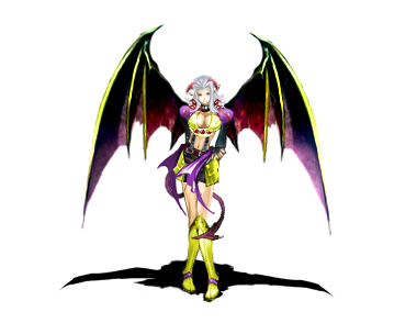
Serpent Maiden
The wings and shield definitely stand out, I think because the colors are so plain. The sprite itself isn't bad, I feel like green and yellow on a dragon type creature is maybe a bit to typical, still it works. Over all I think the color usage is my only issue with this, not a lot of risks taken, still not a bad presentation.
I feel that given the right game and the right style these are all really good.
Is it possible to get better at mapping?
This is my basic approach to mapping. I did this in VX Ace, however I apply the principals to all the different versions of RPG Maker. I tried to get them as short and simple as possible. Ultimately mapping will come down to research and practice.
1) Break it up.

Nobody likes looking at an empty map.

Use walls, grass, paths, fences, cracks, water...etc to break up your base tiles.
2) Hinges and object population
3) Nature Vs. Man-made
4) The do-nots of mapping...
There are clearly many many other aspects to mapping, these however I believe are the most basic.
1) Break it up.
Nobody likes looking at an empty map.
Use walls, grass, paths, fences, cracks, water...etc to break up your base tiles.
2) Hinges and object population
A hinge is anything used to connect the floor with the wall. Generally they start at the floor and go up more then one tile above the player or they start on the wall and travels down to the floor.

In this image you can see how the trees, the tent, the vines, even the smaller ledge and the cave opening all act as hinges to link the floor and wall together.
Putting hinges on your map is part of a process I call object population. Your map will need more then just hinges to look full...
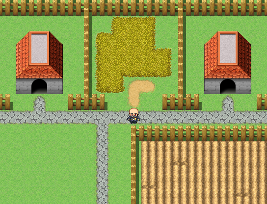
Here is a basic town map, it's been broken up by fences, houses, a path, a garden, and a bit of tall grass.

After populating the map with objects this is what it looks like, as you can see I have trees as hinges between the grass and the path/fence, I have broken up the garden by populating it with plants, and I have added a few bushes and some windows.
We could even say that empty lot sold, and an INN was constructed there.
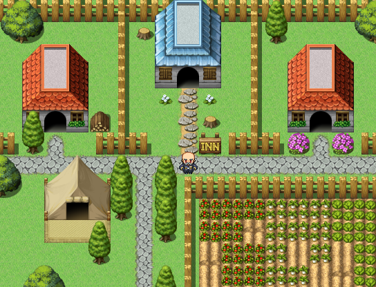
We could use the house as a hinge.
If we were to go inside the INN...these are the same ideas applied to an interior map:

Floor broken up by walls, carpet, a desk and a door.

Inn with hinges and other objects.
In this image you can see how the trees, the tent, the vines, even the smaller ledge and the cave opening all act as hinges to link the floor and wall together.
Putting hinges on your map is part of a process I call object population. Your map will need more then just hinges to look full...
Here is a basic town map, it's been broken up by fences, houses, a path, a garden, and a bit of tall grass.
After populating the map with objects this is what it looks like, as you can see I have trees as hinges between the grass and the path/fence, I have broken up the garden by populating it with plants, and I have added a few bushes and some windows.
We could even say that empty lot sold, and an INN was constructed there.
We could use the house as a hinge.
If we were to go inside the INN...these are the same ideas applied to an interior map:
Floor broken up by walls, carpet, a desk and a door.
Inn with hinges and other objects.
3) Nature Vs. Man-made
In this next screen shot you will see the wall of a castle, all the trees have been planted in a row, bushes in a row, the path is straight...it may not be a good looking map, still it's passable.

map with overlay:

In a man-made area such as towns, castles, and sometimes dungeons(depending on the theme) The way your map is constructed can be far more balanced and even then it can out in the middle of a forest.

Here is the same map, changed into a forest...it has all the components, something is just a little off.

If we break up how even the walls are, and the water, if we spread out the trees, flowers, and bushes in a more uneven manner. The map starts to take on a look more like a forest.
The suppose principal here is that it is more forgiving to make your maps balanced and even where humans are involved and to make things more uneven and natural looking...in nature.
That's not to say that towns always have to be even and balanced, if your games theme is post apocalyptic, you may find it better to make the towns more uneven and nature slightly more balanced to give the player the feeling that nature has more harmony then mankind. Like I said, just ideas not mapping rules.
map with overlay:
In a man-made area such as towns, castles, and sometimes dungeons(depending on the theme) The way your map is constructed can be far more balanced and even then it can out in the middle of a forest.
Here is the same map, changed into a forest...it has all the components, something is just a little off.
If we break up how even the walls are, and the water, if we spread out the trees, flowers, and bushes in a more uneven manner. The map starts to take on a look more like a forest.
The suppose principal here is that it is more forgiving to make your maps balanced and even where humans are involved and to make things more uneven and natural looking...in nature.
That's not to say that towns always have to be even and balanced, if your games theme is post apocalyptic, you may find it better to make the towns more uneven and nature slightly more balanced to give the player the feeling that nature has more harmony then mankind. Like I said, just ideas not mapping rules.
4) The do-nots of mapping...
Do not be afraid to play around editing graphics
Do not use colors that look terrible together unless you want to draw attention to something
Do not take constructive criticism the wrong way
Do not take negative criticism to heart
Do not give up
Do not use colors that look terrible together unless you want to draw attention to something
Do not take constructive criticism the wrong way
Do not take negative criticism to heart
Do not give up
There are clearly many many other aspects to mapping, these however I believe are the most basic.
Is it possible to get better at mapping?
Mapping is an art form, and as such there is no right or wrong way to map...just as there is no right or wrong way to draw. I think everyone has their own style when it comes to mapping. I do have a couple(four...maybe) 'basic' principals I try to follow when mapping, I could jot them down for ya if you wanted.
 Arcade Hero
Every time I load this game page up I get the urge to listen to Buckner & Garcia music on youtube. Already you've done a great job of bringing up all those old arcade memories. I'm excited for this!

