


OROCHII'S PROFILE


Search
Filter
 MPU_screen3.png
MPU_screen5.png
Mild language is occasional, just to make it clear. It's just to not limit it and make it "unnaturally formal". But it's not intended to be overused.
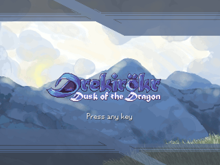
 Drekirökr - Dusk of the Dragon
I'll fix that then, you're right, the link code makes things easier.
And the thing on her hand was supposed to be a kind of bow, BUT it was my first attempt drawing them... Someday I'll try it again, and making some "previous practice" heheh.
Thanks for your comment, cheers,
Orochii Zouveleki
And the thing on her hand was supposed to be a kind of bow, BUT it was my first attempt drawing them... Someday I'll try it again, and making some "previous practice" heheh.
Thanks for your comment, cheers,
Orochii Zouveleki
SS4.png
Too much useless colors in bars, they're (almost) imperceptible. Or have they some kind of "animation"?
Anyway, I like the layout itself.
Anyway, I like the layout itself.
Retroquestcap6.png
Retroquestcap7.png
Drekirökr - Dusk of the Dragon
Well... I'm not going to have the trailer for tomorrow, I'm going now to the 11/11/11 (EDIT: I'm not going to post more promises. But fear not, you will see a demo someday even if hells freeze and I die). I'll take this time to get some more chipsets done (this week was VERY prductive, I finished two of them, considering that I'm in college and don't have that much time lol). And to give last tweaks to the two backdrops I have in process (and give some to the lava cave too).
If I continue like this, I'll have my demo much faster yay!
Anyway, salut,
Orochii Zouveleki
If I continue like this, I'll have my demo much faster yay!
Anyway, salut,
Orochii Zouveleki
dc1.PNG
in_work.png
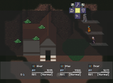
Tiles by themselves are not that bad (I like the wall, it's very NES-ey <?>). Try doing some borders for the walls and grass and they will see much better. And those dark-sections (some kind of ceilings?) that are that common in RTP.

