


UDIVISION'S PROFILE
udivision
2453
Fan Games, Original Games, Construct 2, RPG Maker...
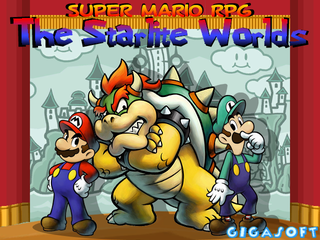
Super Mario RPG: The Sta...
Mario, Luigi and Bowser are on an all new adventure that spans more worlds than one!
Mario, Luigi and Bowser are on an all new adventure that spans more worlds than one!
Search
Filter
 paperknights_small.png
Sure. I don't have a title screen yet (this is more of a promotional image) so I'll keep that in mind when I make it.
 Aesthetics aesthetics aesthetics...
^You're spot on with the river. Hopefully it's not too bad. I added a "shadow gradient" to the front of the bridge to make it look like it's slightly above it.
The bridges typically would need character interaction to pop up like that, but the Popop Flowers would be the type of thing to do that on their own, hence the name. I'm glad you like the updates!
The bridges typically would need character interaction to pop up like that, but the Popop Flowers would be the type of thing to do that on their own, hence the name. I'm glad you like the updates!
Screen6.png
tikibumibeach.jpg
 Paper-based Powers + Dunegon Design
I think my problems maybe stemming from not committing to anyone one particular "theme" even though it's supposed to be some sort of book/pop-up book.
Stuff like this:

*a game called Tengami by nyyjen
Is amazing, and very consistent.
In terms of story, word choice, and some design choices (the hero is silent but his thoughts/actions are narrated) it's obvious that the game is supposed to be a book. However, looking at the art you either think "It's cartoony" or "Looks like Paper Mario." You don't really think "This looks like a pop-up book or a comic book, etc..." That might be something I should work to fix, and following your suggestions would be where to start. But on the same hand, maybe "Looks like Paper Mario" is what the goal is because this game is obviously inspired by it more so than comics or kids books.
Stuff like this:
*a game called Tengami by nyyjen
Is amazing, and very consistent.
In terms of story, word choice, and some design choices (the hero is silent but his thoughts/actions are narrated) it's obvious that the game is supposed to be a book. However, looking at the art you either think "It's cartoony" or "Looks like Paper Mario." You don't really think "This looks like a pop-up book or a comic book, etc..." That might be something I should work to fix, and following your suggestions would be where to start. But on the same hand, maybe "Looks like Paper Mario" is what the goal is because this game is obviously inspired by it more so than comics or kids books.
Screen_2e.png
Thanks! It's actually the third version, thanks to feedback from helpful critiques it was greatly improved.
Paper-based Powers + Dunegon Design
Thanks! The beauty of tilesets is that you can change how the graphics look without having to change much your maps around too much. I'll do what I can about the "look"; it is a bit hard because it isn't a widely used art style and I have to create all of the assets myself. I do try to continue to improve the look of the game, so if you have any specific suggestions let me know.
 "Good" rm2k3 event coding
Screen5.png
author=Irili
Hmm...don't know what it is but the pond seems odd in comparison with the rest of the scene.
Probably because everything else is cleaner cut and the pond has a blur for the edges. I'll have to change that...
author=purplex
this looks like part of a cut scene sequence, am I right?
Yea. Each "corner" rises and leaves as the narration goes.

