


RACHEAL'S PROFILE

Search
Filter
 Drie - Party Skill Sets
Thanks for your continued commenting~ I really appreciate it.
Yes, you have to pick Use Item (or any other item-requiring skill) before you can select an item. There's no menu before the skill menu though.
I'm still pretty much a rookie at balancing an RPG myself. I largely go with trial and error and massive amounts of testing.
Boost Potion, Experiment (a starting skill), Large Experiment, and Toss Potion (also a starting skill) all have their effects determined by the item chosen. This includes if they're single- or multi-target. I suppose mentioning that would have been smart. I also realise now that my description of Large Experiment doesn't make sense... I guess I need to rethink that skill. (Curse you Kai's skill set.)
Because of the way AP works, if you go with low-cost AP moves, with a full party, you have at least eight moves per turn and up to twenty four by end game (unlikely as six AP is difficult to reach. You also don't have a full party very often). You don't really need much in the way of AoE when you have that many different actions in a single turn.
Oh, and the order the skills are listed here is not the order you learn them. I just have like skills grouped.
I agree that 10% is probably a bit low, but I'm going to wait for balancing to see where it ends up. Nurse and Mend are not meant to be your go-to healing skills. They just have the advantage of not requiring items in a pinch. They're more of a cheap, light top up if you are running a little low.
I should also mention that while you are limited in the number of items you can carry into an individual battle, you'll going to be picking up items like crazy on the field. It's rather like the Atelier series in that regard. A trip through the basic forest could net you 20-30 flowers in a short period of time. These flowers can then be used to make healing potions.
All of this is subject to extensive testing though. They've already been largely changed from the original draft.
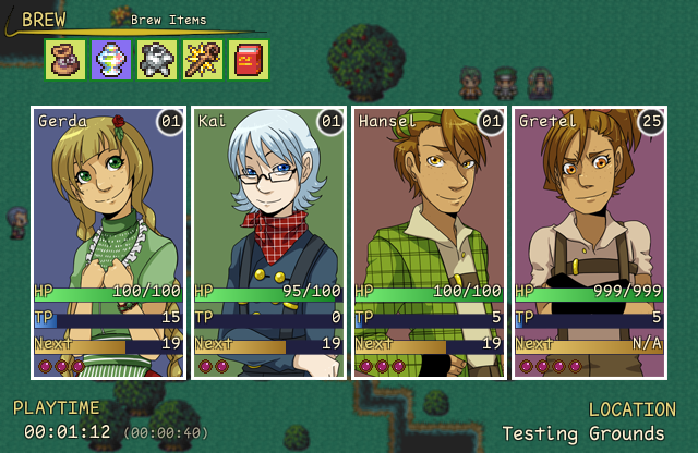
 Menu.png
The icons are just placeholders until we make our own. Same with that yellow bar thing near them. You should have seen them when they had absurd colors.
The stats aren't final in this screenshot, but the ranges are. Levels go from 1 to 25, and HP goes from 100 to 999. TP is 100 always.
The stats aren't final in this screenshot, but the ranges are. Levels go from 1 to 25, and HP goes from 100 to 999. TP is 100 always.
 Upcoming Kickstarter Campaign
 Dragonfly Summer Olympics
Everything is hard-coded. The scripts are in no way useful for anything but this project. They're also horribly written since there was a short timeline.
 Twee - Menu Critiques?
I would love if more people pitched in their own ideas. Honestly, this is a better response than I was expecting at least. I'm starting to like it a lot more, but it's still not quite there I think.
It's the switching actors with the left/right arrow keys that is the conflict, not item/skill switching. Shift is currently being used to hide the window and get a look at the battlefield, but that is mostly a fluff feature. It might become more important if I add hp bars to the enemies eventually.
I don't know why my brain previously had such an issue with putting the AP icons on the right side while still filling from the left coding-wise. I switched them around in less than two mintues tonight.
I was quite fond of your idea of a series of lines. I also changed the color to a slight blue/turqoise tint to help against the harshness of the black. Still not decided 100% on the help text. Presently I'm thinking of using a different description in the battle menu devoid of flavour text. That way it can fit in two to three lines with just the essential information and move with the cursor.
Twee - Menu Critiques?
First off, I appreciate the nitpicking. I have never been happy with the battle screen, and that's why I posted this in the first place. You spend so much time on that screen, and I greatly want to make it look as nice and readable as I can.
I'd say a battle against a single foe would be extremely rare. The very first battle and perhaps a couple of the early boss battles and that's about it. A battle without your full party, however, will be fairly common. I think there's actually only one dungeon where you have everyone for the entire thing.
The only issue with columns of two, and most likely the reason I switched to a single column to begin with, is the fact it is currently set up that you can switch characters with left and right (actions happen immediately and can be inputted in any order). This makes it impossible to select the right column at present. I could change it to Q/W I suppose, but I'm not sure how natural that would feel. Also, the main menu has skills in one column as well.
Ease of browsability shouldn't really be an issue because you're going to spend the majority of the game with five skills or less. Each character ends the game with a total of seven skills, one of which is optional/secret. If it was a game where each character ended up with 20+ skills, I would completely agree.
I've never been a fan of the windowskin. It was originally all blue, but the background changed at some point to match the game better. I think the border didn't change because we couldn't get anything to look right? I actually just this morning changed it to match the main menu better, but I'm still very eh towards it. It ends up looking a bit chalkboardy with the off-white border? I think that's the reason I didn't change it to white originally.
The names are on the right side because then they're near the hp/tp/status icon and also because I couldn't find a good home for the AP icons when the name was on the left. You can laugh at some of my early attempts at organizing the hud here.
With all that said, here was my quick attempt at utilizing your suggestions:

I did really like how the skills looked in two narrower columns, so I played around a bit with something fairly different.
Semi-mocked up because I was too lazy to drastically change the help window without first seeing a rough approximation. One version with and one version without the windowskin. The help window in the windowskin one would be changed as well, it's just harder to mock up quickly. I'd also probably think of more relevant information to put in the help window and not just a couple things off the top of my head.


I do worry that I'm just falling back to what I've done before though. I also worry that I'm just avoiding using the windowskin because I'm not happy with it, though I've never been a fan of giant windows in general. One advantage of not using the windowskin is I could more easily change the window to match the skill list size dynamically, though I could probably do it with the window if I gave it more thought.
I'd say a battle against a single foe would be extremely rare. The very first battle and perhaps a couple of the early boss battles and that's about it. A battle without your full party, however, will be fairly common. I think there's actually only one dungeon where you have everyone for the entire thing.
The only issue with columns of two, and most likely the reason I switched to a single column to begin with, is the fact it is currently set up that you can switch characters with left and right (actions happen immediately and can be inputted in any order). This makes it impossible to select the right column at present. I could change it to Q/W I suppose, but I'm not sure how natural that would feel. Also, the main menu has skills in one column as well.
Ease of browsability shouldn't really be an issue because you're going to spend the majority of the game with five skills or less. Each character ends the game with a total of seven skills, one of which is optional/secret. If it was a game where each character ended up with 20+ skills, I would completely agree.
I've never been a fan of the windowskin. It was originally all blue, but the background changed at some point to match the game better. I think the border didn't change because we couldn't get anything to look right? I actually just this morning changed it to match the main menu better, but I'm still very eh towards it. It ends up looking a bit chalkboardy with the off-white border? I think that's the reason I didn't change it to white originally.
The names are on the right side because then they're near the hp/tp/status icon and also because I couldn't find a good home for the AP icons when the name was on the left. You can laugh at some of my early attempts at organizing the hud here.
With all that said, here was my quick attempt at utilizing your suggestions:
I did really like how the skills looked in two narrower columns, so I played around a bit with something fairly different.
Semi-mocked up because I was too lazy to drastically change the help window without first seeing a rough approximation. One version with and one version without the windowskin. The help window in the windowskin one would be changed as well, it's just harder to mock up quickly. I'd also probably think of more relevant information to put in the help window and not just a couple things off the top of my head.
I do worry that I'm just falling back to what I've done before though. I also worry that I'm just avoiding using the windowskin because I'm not happy with it, though I've never been a fan of giant windows in general. One advantage of not using the windowskin is I could more easily change the window to match the skill list size dynamically, though I could probably do it with the window if I gave it more thought.
Twee - Menu Critiques?
@Dyhalto: All feedback is appreciated. Considering the default has a "such and such enemy appears" message, it should be a cinch to add it back in. Of unimportant note, I do currently have it set up so holding shift will hide the windows so you can see the battlefield better. Thanks for the suggestion.
@Grayburg: As you can see here, presently the dialogue window also just uses a faded black background, so the new one does actually fit in with that. The menu is now the only place where the windowskin is being used.
The G# stuff is just placeholder text. It is simply like that in the database to make it easier to set up. It won't exist in the final game. Making the window narrower might be a good idea, but I'll wait until skill names and costs are finalized to ensure there is enough room.
 Review Scores: An Informal Poll
author=Dyhalto
3.5+ : Rotates through the "Highly Rated" roster.
<3.5 : Doesn't.
Pretty sure the cutoff is actually 4, not 3.5.
Review Scores: An Informal Poll
This is coming from someone who has never written a review, but this is how I've always viewed the numbers personally.
.5 - Completely Unplayable. Game crashes immediately and often.
1 - Unplayable. It might technically be playable, but the experience is frustrating. No redeeming qualities.
2 - Below Average. Inferior to the norm, but still playable. Nothing particularly interesting and a fair number of negative points.
3 - Average. The same type of game you see everywhere. Nothing remarkable, but also nothing terrible.
4 - Above Average. Better than your average game. Has a number of interesting features, but doesn't quite bring it all together into a complete package.
5 - A Must Play. A game I would recommend to all my friends. Not necessarily perfect, but the highlights greatly outnumber the faults

