


ROACH714'S PROFILE
Roach714

170
Search
Filter
 Megaman X
Megaman X
yeah, corruption has been in progress a while now, looks so sick!
as for the later X games- gameplay wise, maybe they're alright. Aesthetically and musically, COME ON. what a let down. Begining of the synth/pop/cutesy bubbley ps1 mega man age. barf.
it just lost some of the charm.
side note: im in a metal band that plays music from the mega man x series (1-3, specifically).
facebook.com/thexhunters
check it out!
Megaman X
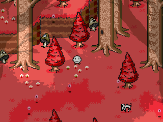
Everyone check out Megaman X Corruption. Its a fan game, not an RPG, but it looks like what x4-x6 SHOULD have been. Goes to show that fangames can indeed surpass some of the later sequels.
On topic:
I think an action/RPG would be more suited to mega man X's fast paced style.
A walking mega man x sprite seems so...lethargic compared to the energy of the games.
Dashing, Wall climbing, and charge/shooting are integral to the experience.
Combine those with some more RPG elements and I think it would work.
Want to edit your game's entire text all at once? Simple + Easy -- DreaMaker (RM2k/3/XP Text extractor tool)
thats exactly what I do, killerworlf. Even for towns, NPCs, quest or location names as well. Learned the hard way and this saved me lots of time.
This tool could be cool though, I've been thinking about adding some control codes (./ .!) to certain characters text and it would be a pain to dig it all up by hand.
This tool could be cool though, I've been thinking about adding some control codes (./ .!) to certain characters text and it would be a pain to dig it all up by hand.
SilverSnakes Lets Play
http://rpgmaker.net/games/1958/
cancelled my demo a few years ago, but recently getting back into RM and taking another crack at it, would love to have some input.
Demo, bout 3 hours, good chunk of game complete.

cancelled my demo a few years ago, but recently getting back into RM and taking another crack at it, would love to have some input.
Demo, bout 3 hours, good chunk of game complete.
What are you thinking about? (game development edition)
We need more sandbox games right now. RPG Maker games are so linear nowadays... where's the replayability?
its hard enough to get people to play through ONCE
 The Screenshot Topic Returns
I dont buy "this is is style" as an excuse.
Its not WHAT hes doing (im not saying his weird dark techno anime stuff shuold go), but HOW its being done (low res graphics, lack of any design).
And it doesnt matter WHAT type of game he's going for, have you EVER seen a title screen look like that? In any genre?
The style he's going for (or at least what I think he's attempting) I can envision some of these screens, when done in a more successful way, looking pretty cool.
You cant just say "WELP THE SCREENS ARE SUFFERING AND CONFUSING BUT THAT WAS HIS STYLISTIC CHOICE", come on.
The things he's adding don't SERVE any purpose, they are just there.
Not everyone has to go for MINIMALISM, but as an amateur game maker who obviously has some graphical/design issues and seeking help, it might be a good place to start.
Start with the basics and learn to integrate your style as you develop it.
We are all constantly learning from each other, and sure GOOD is subjective, but that goes for the opinion of ANYTHING.
I guess a chef could make an expensive dish out of hair and sand if thats 'what he wanted to make', but dont expect anyone to eat it.
The Screenshot Topic Returns
woah.
It was more making a point that all that shit on the screen is distracting from the purpose of the title screen (TO DISPLAY THE TITLE). I hope he wouldnt actually use this, and say what you will but it DOES look better, regardless of what "STYLE" he is attempting, he should start with the basics of title placement and a strong logotype before piling on a bunch of random images.
And anyone can add suggestions for what they would personally do in their own game, thats the point of a discussion thread. To get all different angles from different game makers.
The Screenshot Topic Returns

even something like this would look ten times better.
I realize I took out basically everything, but thats the point.
you could keep the bad tattoo looking designs in the corner maybe, but I suggest taking a more traditional approach. or at least a less visually assaulting route.
The Screenshot Topic Returns
I have problems with them title screens.that's all.
Most of the time I end up editing them or completely replacing them.
title screen is probably the least important thing in your game.
you should be working in other areas in my opinion, but anyway-
constructive criticism:
that random frame disjoints the image, the title being in the lower right looks weird and diminishes the importance of it.
and the graphics themselves dont seem consistent. I dont understand the imagery used here, the upside down girl picture... its very confusing.
But if you insist on revising this design rather than starting over PLEASE remove the cropped white mannequin head laying in a pixelly pile of pink blood. Thats arguably the worst part.
my advice: simpler is better. look at the layout of old NES title screens, very simple and effective, usually just the games graphic logo on a black backdrop and it works very well. stop trying to mishmash 1000 elements into one image (that goes for ALL of your screens). Keep it simple, bud.

