


DETHMETAL'S PROFILE


Search
Filter
 The Screenshot Topic Returns
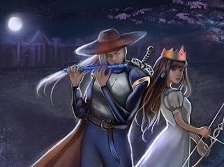
I love the atmosphere in that one, alterego. You might actually be able to make the overlay a tiny bit more opaque and have it look good. Maybe you can experiment by adding a slow "wavy" effect to see if it looks good or not. To represent fire.
The Screenshot Topic Returns
The Screenshot Topic Returns
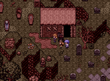
I should rephrase what I said. I like the dialogue box itself, the shape and everything, just not the colour scheme. It's probably just me though:) I absolutely love the sprite style.
The Screenshot Topic Returns

The Screenshot Topic Returns
author=SayaWelp, I wish I posted here before Nessiah, now I feel a distinct lack of self-confidence.
On the other hand, I would appreciate pointers on how to get rid of the nasty white outlines of the speaker's picture. (Will making the background black work? ... that might give nasty black lines.)
P.S. I suck at mapping.

Quoted because we're on a new page. This looks really really good, imo. The sprites and map is beautiful. However, the dialogue box looks terrible. Why white on black? I think you can come up with a better colour scheme for it than that. I'm not a fan of the character portrait either, I don't think it matches very well with the more realistic style of the character sprite, but I'm probably just being picky.
 Fat NPC's/Heroes
avatars
Whenever I see somebody with an amine girl as their avatar, I always assume they're a girl even if I know they're not.
What are you thinking about right now?
author=Adon237author=dethmetalThere.
Did anyone here go to RMN? It's One of the strangest communities I've ever considered myself a part of.
At first I thought I really put RMN by accident and I felt stoopid

