


SHOW ME YOUR SCREENSHOTS - FALL EDITION
Posts

post=99361
Yeah, the background is pretty much temporary till I get around to making it better.
I think it's fine the way it is.
You should do the whole game in monochrome pink, i think that'd make for a real cool look.
post=99370post=99361I think it's fine the way it is.
Yeah, the background is pretty much temporary till I get around to making it better.
You should do the whole game in monochrome pink, i think that'd make for a real cool look.
I'm going to. Charsets are in monochrome purple though.
post=99386post=99370I'm going to. Charsets are in monochrome purple though.post=99361I think it's fine the way it is.
Yeah, the background is pretty much temporary till I get around to making it better.
You should do the whole game in monochrome pink, i think that'd make for a real cool look.
Sounds good!


Finally got most of the basic stuffs like the Game Maker version finished. The black tile on the left is a sample of unpassable tile ( though it doesn't block the bullet ). GUI and most of the stuffs here still placeholder.
This is the furthest zoom out in the game, so it wouldn't get any smaller. But I'd like to know if the characters and bullets are too small.
I wish I know how to export RM map to a readable file, so that I can just use Rmxp as a stage editor. *sigh*
post=99386post=99370I'm going to. Charsets are in monochrome purple though.post=99361I think it's fine the way it is.
Yeah, the background is pretty much temporary till I get around to making it better.
You should do the whole game in monochrome pink, i think that'd make for a real cool look.
I love the sound of this already. So much. Graphically simple games like this is shaping up to be have always enchanted me. Less is more, simplicity can be complex, etc. Good shit, Lennon.

post=99668
This is the furthest zoom out in the game, so it wouldn't get any smaller. But I'd like to know if the characters and bullets are too small.
Character and bullet size are fine. And I'm not quite sure what that game is supposed to be, but it already looks promising.


yo dawg i heard u like mountains
(Looks good, by the way. I'm a fan of small character sets on the world map, but it's your call. Doesn't detract from the overall appearance one way or the other.)
(Looks good, by the way. I'm a fan of small character sets on the world map, but it's your call. Doesn't detract from the overall appearance one way or the other.)
(Looks good, by the way. I'm a fan of small character sets on the world map
I've been trying to do that with without making it look like garbage.


I'm still tweaking it but  .
.
Figured it looked better than the LOLMSPAINT crap. (Which was made in the same program as this was you scurvy dogs!)
Figured it looked better than the LOLMSPAINT crap. (Which was made in the same program as this was you scurvy dogs!)

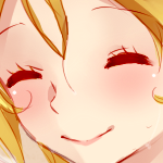
For the hair: There is just too many shades (that lack good contrast conflict to each other) to the point it looks like a bad gradient effect. The human shape as a whole is pretty stiff and I feel it needs better outlining. Also pick less MSpaint colors plz? I don't get a very tribal vibe from the tones.
Overall I think you are at least improving.
Overall I think you are at least improving.

EDIT: :| That just makes the hair issue more pronounced. I'll mess with it some more.
post=99735
BUT WHAT IF HE LOOKED LIKE THIS
Actually, I'm amazed more people haven't done this! 16 pixel tall characters for towns/cutscenes/etc and 8 pixel square for worldmaps- ingenious!
I recall having the idea long ago, but dismissing it as I didn't want to make duplicate sets of all graphical resources.
Damn, though, your FFIV-styled sprite looks awesome.

CP: The thick black outlines in certain areas could be changed to darker shades of the things they outline.
...? The only black I've used is for outlining the gray on the sword.
..Oh, the black around the hand is supposed to be sword hilt. I'll try to work with that.
..Oh, the black around the hand is supposed to be sword hilt. I'll try to work with that.

