


RAMSHACKIN'S PROFILE


Search
Filter
 Screenshot Survival 20XX
@Frogge - love the layout of the cave. Scratch the wip and call it complete.
@grindalf - not a bad start to your character, but I recommend 50-100% less dithering.
@grindalf - not a bad start to your character, but I recommend 50-100% less dithering.
Screenshot Survival 20XX
@Liberty - the second, more gray floor tile looks great. It makes the map feel more colorful and alive, which is totally bizarre to say given the tiles are gray.
edit:
oh wow didn't realize I was a page behind and now no one knows what screenshot I was talking about :(
edit:
oh wow didn't realize I was a page behind and now no one knows what screenshot I was talking about :(
Screenshot Survival 20XX
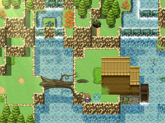
Like the new edit, Liberty! I still can't figure out for the life of me what that brown thing above the town and between the mountains is.
Thanks for the compliments! Don't worry, it's not the entire dungeon, just the first room :p
And good call on making the vine climbables easier to spot.
author=Frogge
@ramshackin 2.0: Really nice map! It seems a little small though, I'm sure that's not the entire dungeon is it? One thing I'd point out is that the vine climbables are a little hard to spot on their own, some kind of marking on the floor would make them way easier to see methinks. It could be anything from a little dirt patch to darker grass, just make it flash out a little more. I really like your green grass blending with the more blueish grass too!
Thanks for the compliments! Don't worry, it's not the entire dungeon, just the first room :p
And good call on making the vine climbables easier to spot.
Screenshot Survival 20XX
Despite LockeZ's complaints, vine cube usage has risen 300%.
Yeah, the stairs can blend better with the surroundings.
I think you're right about the blue ground gems. I was going for a rainbow flow from top to bottom, which meant blue or green glow in the center, but the color never work with the shade of the grass. Maybe I'll just ditch them. I can play around with the lamp tint too.
Also I totally forget the end tiles in the shrine archway. I swear I had them placed at one point!
author=Liberty
Perhaps have stone at the bottom and top of the stairs, since they're made of stone themselves? It would make sense.
Yeah, the stairs can blend better with the surroundings.
author=Versalia
I LOVE what you did with the forest color palette! Not enough people playing with color palettes on their tilesets to really set the mood. It looks very ethereal. Can I suggest making the lamps more fairy-colored, and not using any of the blue ground-gems? The yellow and purple ones look great.
I think you're right about the blue ground gems. I was going for a rainbow flow from top to bottom, which meant blue or green glow in the center, but the color never work with the shade of the grass. Maybe I'll just ditch them. I can play around with the lamp tint too.
Also I totally forget the end tiles in the shrine archway. I swear I had them placed at one point!
Screenshot Survival 20XX
Want some early feedback on a new dungeon - Ferndale Glen, Forest of Fairies.

And the underground areas:

And the underground areas:
Describe the best boss you've designed
I'll cheat and describe two.
The Prophet on the Hill
The Prophet has two skills. At the start of battle he adds an Extinction state to all battlers that lasts for the duration of the battle. When any battler dies with Extinction, they damage all other battlers. If any battler dies from that damage, they themselves deal damage to all remaining battlers and so on.
The boss has 6 zombie minions that do minor physical damage and can spread Disease, a poison like state that spreads between party members at the end of each turn.
The Prophet does nothing for most of the battle, but if all zombies are dead, he will use his second skill to revive them all.
The catch is the boss is immune to all damage except damage caused by Extinction. The zombies are pretty flimsy and will die in 2-3 hits from a player, and by the time 3 zombies have died, enough extinction damage has been done to kill the remaining 3, which easily snowballs into a full party wipe. The boss is balanced to survive the first "extinction event" but die on the second.
I love this boss because he plays so distinctly different from other battles in the game. If you charge in and start cutting down zombies, you'll wipe everyone, including the party, in the first few turns. You have to play cautiously and get a feel for how much you can attack a zombie without killing it, then slowly pace out the zombie deaths to give enough time to heal and keep HP at a point that at least one character will survive the chain reaction. Meanwhile the minor damage from the zombies adds up enough to mess up your plan.
Duke
Duke has one skill and no minions. On the first turn, he'll punch a party member for minor physical damage. On the second turn, he'll punch two. Three on the third turn, and so on.
At the start of the battle, he's a joke. The boss is rather early on in the game, so it gives the player a chance to learn how to maximize the party's skills rather than focus on reacting to the enemies.
But once you hit the eighth turn, you reach the tipping point where you spend more of your turn healing than doing damage. And the boss is getting stronger each turn. The last few turns become this frantic panic of desperation moves as you try to drain the last few hp from the boss as your party members start dropping.
Screenshot Survival 20XX
How do you design your dungeons?
I start with the visual design. Usually have a few ideas in my head, then play around in RM to figure out what's most feasible and what kind of tiles I'll need to make. The goal here is to have at least 2 visual themes to make things slightly more interesting to look at. I guess music goes with this step too as it can influence the feel just as much as the look.
Then I settle on 1 or 2 core puzzle mechanics, followed by the theme for the enemy design, and a boss that builds on the normal encounters. Bonus points if the theme behind the puzzle mechanics works its way into the boss.
For the layout, I usually structure the whole thing as one big puzzle that when solved reveals the boss room near the entrance. Most of my dungeons have the entrance/exit as the same place, so finishing the dungeon next to the entrance is huge.
Does anyone know how to achieve a similar effect like this?
author=Luiishu535
A bit off-topic, but what do you think about the tunnel? I have a feeling that I could handle shading of the glass a bit better.
Perspective's a bit off. With the camera angle, you'd actually be able to see a bit of the tunnel top. Same with the trees. Otherwise tunnel looks good :)
Also side note, it looks like you've got interesting colors choices but you're hiding them with the fog/cloud overlay :(

