


EL_WAKA'S PROFILE
El_WaKa

3568

Search
Filter
 Jotun Colosseum
 A Golden Week of RPG Maker 2003
My gamepage is up, gonna post a fallback version while I polish the game just a bit more
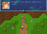
Cave Adventure R
Cave Adventure R
 Cave Adventure R Review
 Cave Adventure R
Everything above this comment is outdated and don't applies to the current game
Sorry for double post
Sorry for double post
Jack's Magic Beans
Sorry, I'm going to be honest, is almost unplayable, I don't know where to go, the mapping is horrible, it looks like one of those "my first game"
I know is your fallback version but it really needs tons of polishing, good luck
I know is your fallback version but it really needs tons of polishing, good luck
A Golden Week of RPG Maker 2003
 Maps Weekly!
author=CashmereCat
Hotelboat

Maybe is just me, but the second floor looks weird, like it is standing over water, but I like how it looks overall
author=Cap_H
Waka,These doors are just too big for the room. You have one tile big characters and two tiles tall walls. So, I would prefer doors to have just one tile. The another problem I can see are crates at the bottom. They look like they are standing on the wall.
If I change the door I have to change the bookcases and the wall too, but yeah, it would look better with big characters
Removed the crates, I added them because I thought that that corner would look empty...
author=ExtremeDevelopment
Next, the sewers. It actually does look better but still kind of linear. Rats don't seem necessary. They would be blocking your path.
Your science lab does look very nice considering you made it with the RTP. Maybe you could try using some custom tiles. There's a lot of futuristic tiles online. You probably already know how to import custom tiles.
Finally, the boat house. It does look nice, but using logic if you decided to tour the sea on a windy day, that tent would fly off.Maybe you could try making the platform bigger and putting an actual house on it. Also that moss at the edge is actually supposed to be used on walls, but that's actually a pretty creative way to use it. Oh and the one tile boxes usally don't go well together because they actually look too far away. New rating: 3.5/5 but I think with some practice you can get a lot better.
Forest - I will try to make it more natural, but I think a path would look bad, is supposed to be a not very transited path (maybe to a lake?)
Sewers - I was going to make rats that you can walk over it (And run away when you get close) and the sewers are man made, they are supposed to be linear (And when you are in the game you don't want to get lost in the sewers, unlike a forest you don't have many points of reference)
Boathouse - Is boathouse in a lake, it's not supposed to get very far (Maybe in a game where it grants you access to an island in the lake, and you can rest in the tent)
Thanks to everybody, that's why I like this thread, I will get better over time
A Golden Week of RPG Maker 2003
Maps Weekly!
author=Liberty
Much better. If you want, you could use a bit of shift mapping to give the doors a 'frame'. (Or just make the part behind the doors floor tile
Thanks, It looks better now (not posting a image because is just a small difference)
Maps Weekly!
author=nhubi
El-Waka I think the doors need to move down on the wall, floor to ceiling still needs to go below the architrave to look right. In other words the doors are just too tall for the wall height.
It looks better when there are only a few bookcases instead of covering the wall, I think removing a few would better...
EDIT:


