ORANGE-'S PROFILE
orange-

1659
Search
Filter
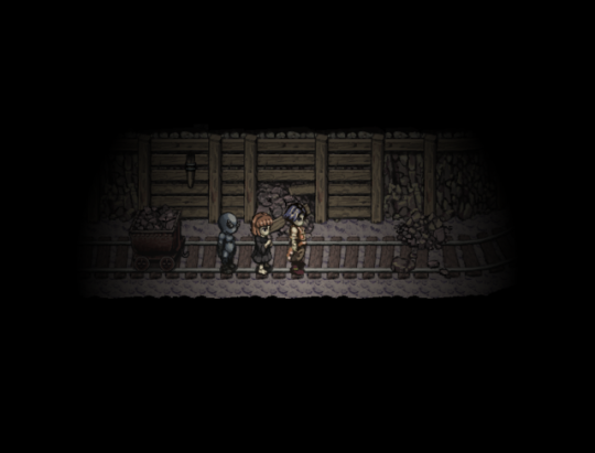
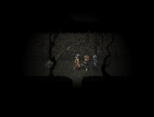
 Screenshot Survival 20XX
I've been super busy lately, but I just dropped the new demo version of Fear & Hunger and here's a screenshot to go with it:
There's also video, but I don't want to clutter this place with that. :)
There's also video, but I don't want to clutter this place with that. :)
 necronomicon.png
author=blueperiod
This looks really cool but I feel that the font kind of cheapens the look of it. The aesthetic is so beautiful and unique but then you have this really generic modern-looking font on top of it and it clashes with the entire art style. I know font has to be readable and the one you have here is VERY readable, but I think a clean serif font or something slightly more austere looking would make the whole thing look a lot more cohesive.
Yup thanks for the feedback! I actually changed the font right after releasing the demo. It'll be better in the upcoming version! :)
 A little video with some new features :-)
author=moekyunRight! I'll give the development time an extra week or two most likely from my initial release plan because of this very reason.
Don't rush finishing the demo or else bugs will swarm us. D:
A little video with some new features :-)
@Dragnfly, let's just say I modified my chances with that coin toss for the video ;'D mostly because I was fine-tuning the animation and had to do it multiple times, but yeah..
Fair point with the "new ghoul friend"
Fair point with the "new ghoul friend"
A little video with some new features :-)
author=Marrend
Take out the "&t=5s" at the end of the URL, like...
...so, and it should be okay.
haha thank you so much! I was really struggling with that :'D
Whatchu Workin' On? Tell us!
Geeeeeezzzz, I've spent a couple full days on coding the game's new mechanics and my brains just cannot handle this anymore. I need to take a break. The game is becoming too complicated for my sake with all the different characters, etc. D:
[RMVX ACE] Working on making a custom tileset for a game and mapping
Well-- I think with 3 major focuses you can get forward.
1. Perspective - your perspective is all over the place at the moment. Trees, that hole on the ground and that left looking bunny are all from side-view perspective, while the bunny looking down, the fences and ground tiles are all top-down perspective. Try to get them consistent.
2. Shading - While you could say there are graphical style with minimal shading, such as Earthbound and the likes of that - I'd still suggest at least adding one more shade of color to each of your surfaces. With good shading you can make those side-view trees look like top-down trees - just to give more depth to your objects. Using pixels or points as shading, like you've used, is an interesting choice too, but you can be more bold with it.
3. Round things up - This is more of a personal opinion, but I really don't like the square design of tilesets in RPG Maker. If you can give more roundness to your dirt patches, it creates a more natural feel immediately.
Keep at it, there are already really good looking graphics there that show promise. That down looking bunny and those fences are good. Study some existing tilesets more and don't be too afraid to rip them off and mimic things to certain extent :)
[RMMV] When using bow as a weapon, is there a way to make ATTACK reduce an arrow in battle?
Pretty much what the title of the topic says: When using bow as a weapon, is there a way to make each ATTACK-command reduce an arrow from inventroy in battle? I suppose this could be done with scripting I'm sure, but I got no talent in that - is there an easier way to do it with RPG Maker's ready commands?
We All Fall Down Rehaul
Sounds great! Even if it's a lot of work without much "new" content to the players, I'm sure it'll pay off in the end to stay true to your vision. Keep at it man, interested in seeing what all this means as far as the game mechanics go!