


DETHMETAL'S PROFILE


Search
Filter
 new_faceset_menu.png
I've spent all day looking at these, so I may be going a bit crazy. I can't tell if the muted color palette in the portaits work with the blue menu/message boxes or not. Interested to hear your thoughts! Should I change the palette?
tower4.PNG
author=Dyhalto
Nice, but an in-game screencap would be even better. I want to see the whole shebang.
Expect one soon! Just want to get some gameplay bits finished before I do so.
lakebottom.png
watercaverncomparison.png
author=Kaempfer
Really cool, looks like a big improvement. Are those underwater sections contained on another map?
Yes!
watercaverncomparison.png
Screenshot_7_gif.gif
HoneynookVillage.png
wellofsouls.png
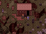
author=Cap_H
dethmetal, your work with palette is rad as always. I love how you can turn usually clashing colours in a melancholic harmony.
Btw, Is this rtp mixed with refmap and some custom re-colors? Or are they custom tiles? Or something else?
These resources are free-to-use and come from this website.
http://hi79.web.fc2.com/material/frame-material.html
However, I edited many of the tilesets myself (including the one used in the above screenshot.) I didn't really use any refmap - I love refmap, but there's so many games out there that already use those tiles brilliantly.
I often combine the resources from the Japanese website above with Theo tiles, which I used a lot in the early parts of my game. This helps my game feel a little more cohesive. It's tricky to get those two styles to work together, but through careful editing and color correcting via Photoshop, I make it happen.

