


DETHMETAL'S PROFILE


Search
Filter
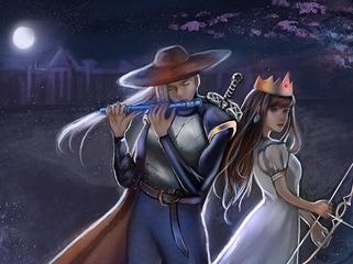
 TF_Seimu.PNG
 RPG MAKER 95
author=Darken
I think Kirby Warrior was the first RpgMaker game I ever played at all period. But other than that the only one I've played and really liked is Crestfallen.
Same. I've never used the actual program, however.
This is a very interesting thread. It's nice to know there's still somebody out there using RPG Maker 95. Your collection is really, really cool. I'd like to have a similar collection someday, if possible, for RPG Tsukuru 2000 and 2003 since I've been using them for about half my lifetime.
I enjoy watching clips from RM95 games because it's honestly quite amazing how big of a jump the developers made from 95 to 2000.
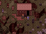
wellofsouls.png
Screenshot Survival 20XX
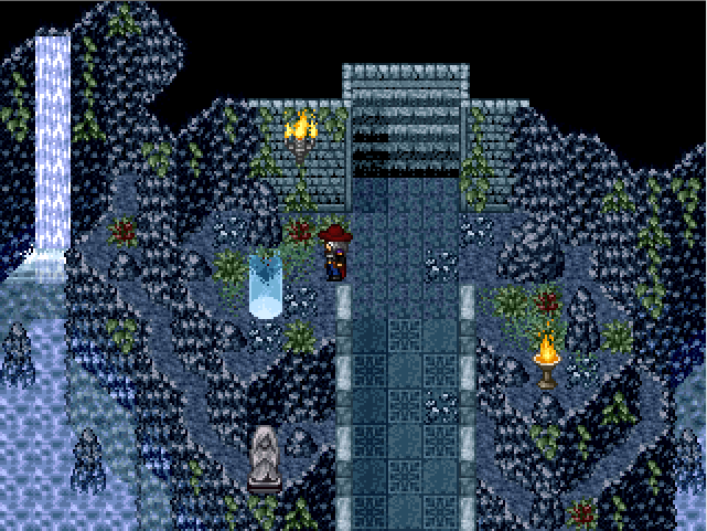
Both. I tend to use bridges in all of my dungeons whether it be a mountain, forest, cavern, or whatever else, and I like to include some sort of water in my dungeons (I find pure caves to be a bit boring).
Not as many dungeons of mine fit this theme as it probably seems, though. I think I'm just more likely to take screenshots of these ones because look nice. I tried to vary my dungeons and make them all feel distinct and take place in different types of settings.
Thank you!
Not as many dungeons of mine fit this theme as it probably seems, though. I think I'm just more likely to take screenshots of these ones because look nice. I tried to vary my dungeons and make them all feel distinct and take place in different types of settings.
Thank you!
Screenshot Survival 20XX
Looking good, Blindmind! My only gripe is that it's a bit hard to tell where you can walk and where you can't - the top of the trees barely look different than the tree "walls". The tree stumps look much better in the interior part of the dungeon (which overall looks great), whereas in the exterior shot you posted it's sort of a mess. It's hard to tell what's a wall/tree-trunk and what's walkable ground. I hope that I properly articulated what I'm thinking.
Arcmagik - Looks great! I'd suggest putting a fountain or something in the very middle of the courtyard. It's a tad empty there at the moment.
Here's the bottom floor of a dungeon that I just finished today:

Arcmagik - Looks great! I'd suggest putting a fountain or something in the very middle of the courtyard. It's a tad empty there at the moment.
Here's the bottom floor of a dungeon that I just finished today:
wellofsouls.png
Dungeons in RPGs - Which types do you prefer?
That reminds me. Puzzles + random encounters is really bad combination. A game can have one of those, but should never have both.
Dungeons in RPGs - Which types do you prefer?
While browsing a "things you don't like in jRPGs" thread on Reddit, many users mentioned they did not like puzzles in dungeons and preferred straightforward, point A to point B style design. My game features dungeons littered with various types of puzzles, so this makes me a bit nervous.
I'd like to hear your thoughts on this. What kind of dungeons do you prefer? Do you like dungeons filled with puzzles, ala Zelda? Do you prefer linear gauntlets, like in most old-school RPGs and many of the Final Fantasy games? Large, open areas with an emphasis on exploration? Something else? A mixture of everything?
I'd like to hear your thoughts on this. What kind of dungeons do you prefer? Do you like dungeons filled with puzzles, ala Zelda? Do you prefer linear gauntlets, like in most old-school RPGs and many of the Final Fantasy games? Large, open areas with an emphasis on exploration? Something else? A mixture of everything?
Does Anyone Remember GamingW? (Remembering Gamingw)
author=Additauthor=kentonaNope, not since then.
S4D released Monopolo, and then took it down. ...I wonder if he ever put it back up.
One of these days it will come back…one of these days…
Why did you take it down? Just curious.
[RMVX ACE] Menu UI alternatives?
The main problem, in my opinion, are the differences in pixel density. The background texture is using 1x1 pixels, the faceset is using 4x4 pixels, and the font is using 4x4 pixels as well... except for the border around the font, which is 1x1. It gives everything a sloppy appearance.
I may have explained that very badly; perhaps someone else can explain it better.
I may have explained that very badly; perhaps someone else can explain it better.

