


BULMABRIEFS144'S PROFILE


Search
Filter
 Crescent Prism: Chapter 1
 Screenshot Survival 20XX
You see? The next page, something was posted. Exactly as planned.
https://www.youtube.com/watch?v=lt4329_W_s0
I have no words for this black and white cowboy skeleton.
https://www.youtube.com/watch?v=lt4329_W_s0
I have no words for this black and white cowboy skeleton.
Talk about RM Games! Mid-Year Misao Discussion Topic
Blue blew.
Personally, I'd make three categories of my own. And no, I don't really have any interest in recent games.
Games That Sucked After Feedback From Jerks:
(I think you can figure this out yourself. One was that one with space aliens, that cat, and terrain attack battles. And the two girls one of which is a knight and the other a princess which the author ragequit after neg feedback)
Games That Are Awesome But Need To Finish:
White Magic
(A good concept but done entirely too quick, and then canceled)
Echo - Our Voice
(Dammit I love the opening song to this. Plus it has a cool plot and a cool battle system)
Numina
(I like the cutscenes, I like the music, and I like the concept. But's kinda stuck in development hell)
Games That Are Awesome But No Part Two:
Forever's End
Love and War
And then there's a couple self-contained that are finished and awesome. And another list of generic and boring games that the author needs to actually stop copying author people and their "success" and make something original. And horror genre stuff that is too much jump scares and not enough real horror. But that's too many categories, and yeah just no.
author=Darken
SO...
It's almost half way through 2019 and you didn't play any RM games this year and you probably forgot that the nominate function exists.
Let's just spend some talking about RM games! Doesn't have to be super critical opinions or feedback, could just be a casual impression of what you played so far / game you want to play or a "What RM games are you thinking about" equivalent. Ultimately though it might also be a good chance to fill up your nominate lists (even if super relative) and talk about your personal favs, what might win overall, or even what you hope might get released in time. If you did a review of a recent game, feel free to share it! Post what you've been browsing and how you've been choosing which RM games to play lately.
Games I've Played:
Theia - The Crimson Eclipse
Given that it's been featured, this game needs little introduction. It's an epic Italian RPG Maker game recently translated and fully playable in English! I've been playing it off and on and it's really a treat, feels like a super pretty RM game you'd see posted in screenshot topics never to be released because of how polished it is. Only now it exists! I enjoy a lot of the visual details and how the animations all come together, there's some pretty cool stuff. I'll probably post more opinions when I get farther into the game, I've also been meaning to set this up to be played on my TV with a SNES controller because I'm one of those people.
Get an HMDI cable, and a crappy Logitech controller, set the computer settings to Do Nothing when you close the cover, and just plug it in and close the case. Voila, your computer is now a Nintendo Switch (not really)
Slimes
A GAME where you fight SLIMES and... that's it, there's no literal title joke that's actually all you do. I think the low download count is a bit sad considering there's some really cool stuff worth appreciating here. It's set in a fictional country with a heavy religion thematic backstory involving a slime epidemic. The slimes start to develop a very continuous personality throughout the demo and I like a lot of the world building documents you get for clearing every floor. It's got a bleak outlook on JRPG tropes but I think it has its own voice regarding the dynamics of how society chooses to deal with an impending threat. I highly recommend it.
That actually sounds interesting.
Steamed Hams, but it's RPGMAKER2003!
The meme game to cap off the decade of what we thought was a good idea to make youtube edits of. It's actually quite enjoyable playing this and being amazed that this is happening inside of an RPG_RT and almost checking to see that this isn't some elaborate mole box prank. As someone who's seen all that RM2K3 has to offer, it's cool to see the amount of detail that went into condensing all of this inside of rm2k3's rather limited (and "beloved") default battle system.
When I finished the game, I was never clear whether the creator forgot the fire engine graphic due to running out of elements or whether that was exactly the joke.
Games I've been meaning to play:
Final Fantasy: Sky Warriors
I'm not big on fan-games, but I think the fact that this is made by a very oldschool RMer has me interested (also what RM game isn't a fan game these days ohohoho gotem). I remember when RM2K3 had a bit of a phase where people were making 8bit games left and right (Dragon Fantasy, Hellion, Ocean Blue) and it makes me nostalgic for... games that were trying to be nostalgic. I also think the battle charset edits look pretty cute.
I played this for awhile, and personally I enjoyed it, but I think I got frustrated at the game's midpoint. I got a boat, and they said something about heading to the west, but I went to the wrong spot and got killed really quick. Also, when I played it at least, there was a terribad glitch with the boats, and I somehow could phase through stuff but couldn't land the boat properly.
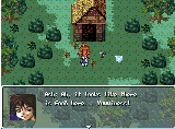
Crescent Prism - Chapter 1
So I'm getting to the demo/episodic category of games that I admittedly hold off on because there might be more content later. But given the recent shift in development maybe I should just sit down and play the first damn chapter. It looks like fun little romp that resembles a Nintendo-like RPG if mario didn't exist or something. I keep seeing good things about it and the creator's other games.
Ooooh, I saw that on the Screenshots page. And then I forgot about it for awhile. Thanks! (Skipping some of these)
Villnoire
"Wait people still make games like this?" Yeah man, yeah man, they do. Rocking the FSM chipsets and settling for nothing less than ambition. The game quietly made itself to 80% completion and while that might be some bs a teenager would put in their gamingW sig years ago... I choose to believe. Your so called rational mind will lack the glory of being right on the money when you see that bright green Completed status one day.
Edit: the prophecy came true
It's done? Yay! I played Villnoire as a demo and it was great.
Alright now its your turn to talk about recent RM games, go on, jog your memory if you have to. (You don't have to be as elaborate or screenshot pasty as me btw).


Personally, I'd make three categories of my own. And no, I don't really have any interest in recent games.
Games That Sucked After Feedback From Jerks:
(I think you can figure this out yourself. One was that one with space aliens, that cat, and terrain attack battles. And the two girls one of which is a knight and the other a princess which the author ragequit after neg feedback)
Games That Are Awesome But Need To Finish:
White Magic
(A good concept but done entirely too quick, and then canceled)
Echo - Our Voice
(Dammit I love the opening song to this. Plus it has a cool plot and a cool battle system)
Numina
(I like the cutscenes, I like the music, and I like the concept. But's kinda stuck in development hell)
Games That Are Awesome But No Part Two:
Forever's End
Love and War
And then there's a couple self-contained that are finished and awesome. And another list of generic and boring games that the author needs to actually stop copying author people and their "success" and make something original. And horror genre stuff that is too much jump scares and not enough real horror. But that's too many categories, and yeah just no.
Screenshot Survival 20XX
Blue-ness
I figured you were under the impression that I meant the blue next to Theas and <Shift. So it's some sort of transparency thing? Yeah, I didn't know because your last post before this seems to be a few pages back. It just kinda looked like what I get in paint projects when I copy and paste. You can probably fix that by tweaking transparency some more?
Yes they are different engines, but many codes are translatable.
This is my ring menu code. This is what I mean. And you may have similar code, or this may be completely impossible, in which case I'm just gonna say moot point. But your engine can probably do things mine can't.

(This simulates rotating the cursor, by "renaming" the current position)

(This creates a cursor position and description name. The cursor nor the character ever move. But they appear to)

(And this is the results of pressing the confirm/select button when the cursor is "on" a certain selection. No variables at all here, which is important to me)
Notice I said important to me. The point I'm making that Darken is being rude about, is not that I mean "you must do it this way blah blah blah" but rather "don't get locked into someone else's mentality on how you should program, not mine, not some tutorial's, not Darken's, not anyone's. Figure out the code you want and how to do it." To me, I wound up with a lot of cool codes once I stopped fixating on the "you need to use switches this way and variables that way" mentality. It was around this time I created a ring menu, a system for determining weapon "state" (Poor, Good, Perfect, even though weapons actually have no state, allowing weapons to be broken after repeated uses), and a custom item menu. Is it perfect? Oh hell no, using names as variables opens up some very weird glitches. Is it fun? Hell yes. So try coding in a way you don't normally do, and you'll figure out something for your engine.
The point of this thread is to (a) post pictures, and (b) have fun and give or receive critique. Some people have lost this, and do things like spend 8 pages telling people off. I have no use for such people. The point of a screenshot thread is to have fun posting screenshots.
So by all means, post pictures of code, post weird artwork, even post videos like I've seen some people do. Don't worry about derailing things, because in two pages someone else will post something else, and they'll critique that instead.
author=EtherPenguin
@Bulmabrieffs144 The discolored squares are indeed the player character. If you look the screen with the grass tiles I posted in my last response, you'll see the one character with some sprites done is in roughly the same spot as the discolored square in the other screens. I didn't mean to imply you didn't know what blue looked like, I didn't realize I came across so rudely. It's just the transparency of the menu is very thick, it's barely see-through, which why the square is such a dark color.
I figured you were under the impression that I meant the blue next to Theas and <Shift. So it's some sort of transparency thing? Yeah, I didn't know because your last post before this seems to be a few pages back. It just kinda looked like what I get in paint projects when I copy and paste. You can probably fix that by tweaking transparency some more?
author=EtherPenguin
I'm sorry I didn't mention I was working in a different engine earlier, but considering this is the screenshot thread, I was hoping to get more universal advice on the aesthetic principles of UI design. I really appreciate the gesture of offering some coding advice and even offering to teach me through pms. That's very kind, I do appreciate it. I just feel we're working with incompatible programs. To make things clearer, I'm using the methods outlines in these videos for programming the menus and databases: https://www.youtube.com/watch?v=1ITZOrI2qkA .
Yes they are different engines, but many codes are translatable.
This is my ring menu code. This is what I mean. And you may have similar code, or this may be completely impossible, in which case I'm just gonna say moot point. But your engine can probably do things mine can't.
(This simulates rotating the cursor, by "renaming" the current position)
(This creates a cursor position and description name. The cursor nor the character ever move. But they appear to)
(And this is the results of pressing the confirm/select button when the cursor is "on" a certain selection. No variables at all here, which is important to me)
Notice I said important to me. The point I'm making that Darken is being rude about, is not that I mean "you must do it this way blah blah blah" but rather "don't get locked into someone else's mentality on how you should program, not mine, not some tutorial's, not Darken's, not anyone's. Figure out the code you want and how to do it." To me, I wound up with a lot of cool codes once I stopped fixating on the "you need to use switches this way and variables that way" mentality. It was around this time I created a ring menu, a system for determining weapon "state" (Poor, Good, Perfect, even though weapons actually have no state, allowing weapons to be broken after repeated uses), and a custom item menu. Is it perfect? Oh hell no, using names as variables opens up some very weird glitches. Is it fun? Hell yes. So try coding in a way you don't normally do, and you'll figure out something for your engine.
author=EtherPenguin
I really didn't mean to cause a scuffle and derail the thread with this. I certainly never meant to imply I was calling you stupid or anything terrible like that. I just don't think there's more to say regarding programming this stuff. I don't want to bury posts talking about actual screens like PhantasmaX's lovely screen or Sidewinder's funky fallout-inspired skeuomorphic interface. I'm so sorry if my posts and ensuing scuffle derailed things.
@Darken Thanks for the note on the font! I think I will ditch the anti-aliasing.
The point of this thread is to (a) post pictures, and (b) have fun and give or receive critique. Some people have lost this, and do things like spend 8 pages telling people off. I have no use for such people. The point of a screenshot thread is to have fun posting screenshots.
So by all means, post pictures of code, post weird artwork, even post videos like I've seen some people do. Don't worry about derailing things, because in two pages someone else will post something else, and they'll critique that instead.
Let's Play: My Own Game
Screenshot Survival 20XX
author=Darken
I wouldn't bother listening to what bulma says because apparently everything has to do with the extremely limited ring menu bulma made and keeps hitting the same point about not over-relying on variables in a very specific rpgmaker eventing context.
I think the font could just be opaque white rather than the extra shades but that's just me. I think it can get distracting when you over detail important graphics, it can look fine for borders and other less important things. Overall I think the UI looks fine, you're not doing anything out of the ordinary and you have a ton of examples to look to on how to keep the number of input traveling to a minimum. I actually think the indicator to see that you can swap to other characters in the equip screen is neat. It just comes down to how fast the player can find what they need and how fast they can read all of the information. Which is hard to test and not worth fussing about until later in.
I've only built a partial RPG system in Game Maker before but it sounds like you're on the right track if you're using data structure grids and what not. Just keep it simple and make it easier to edit later.
Also this is starting to feel like a game development topic and not a screenshot showoff topic, just saying.
Uhhhh okay. So don't listen to anything someone says cuz they mention something and you decide "everything" has to do with that. Excuse me, but I actually do have worth as a person. I don't care how good Nemoral is, that doesn't give you the right to belittle others for their concept ideas.
I was talking about the fact that if you do a database, with variables, you have to do Thea Helmet Equip variable. Then Thea Weapon variable. Then Thea Armor variable. Then Thea Accessory variable. Say you're using five characters. This is twenty variables that you have to manage and cannot overlap because variables take a specific space in memory. I have 11 heroes, so this is quite a few variables for every situation you need it, this adds up and you can't reuse these without creating conflicts. Or you can just tab up or down on the hero name and reuse the same equipment. From an organizational standpoint one of these gives you headaches. And I've done this this way before. But obviously I dunno what I'm talking about...
Ether Penguin, there are discolored squares. Not blue, I know what what was. But like spots below the name Seren. And to the right of plain clothes and travel charm.
I dunno if it is universal. Basically, rpgmaker has a number of condition branches, and some of them are like If Bob's name is Bob. You can use these as objects to identify what you're currently selecting. If RingMenu's name is System. It also has If Bob is Equipped with Long Sword. This part is very useful for a MENU BASED AROUND EQUIPS (sorry for the all caps, but Darken basically called me stupid for suggesting something perfectly suited for the thing you're using it for, assuming your engine has this stuff. Kinda not enough that he probably hasn't tried and can't say the merits and limits of what I'm talking about but also has to trash it. Is it perfect for every situation? No. But for THIS it helps). I'll teach you in PM if you're interested.
As to the thing looking like a game development thread, this is a screenshot feedback thread. And he wanted feedback to his UI, specifically how to get it to work better.
Screenshot Survival 20XX
You have a couple of navy blue squares on your menu.
I've never actually done menus with entire words like that, but the concept is the same as mine.
Now your request was to make them look nice. I'm not sure about that. But it makes the database code easier to manage. Which in turn frees up energy for better artwork. So yea, it looks nice as a result.
I've never actually done menus with entire words like that, but the concept is the same as mine.
I'm pretty obsessive about UI especially for making a game in a genre all about menus. Any and all help with getting these to look nice would be appreciated.
- Never ever ever use variables for storing database-style events. You can use it for figuring out item IDs, doing the math, etc, but the final storage of items should always set an equip to a dummy hero (Thea_Equip set, Scrap Sword). Use variables for things variables excel at (like when you need a precondition, or need to do math). Yes, I know everyone uses variables. And they wind up wasting more. There are two major reasons for this.
- First, every hero (which, any programmer worth their salt can make a dummy hero) has at least four useful stats for condition branches: checking the hero name (this will allow your main screens to be broken down into multiple item screens), skills, conditions, and equips (probably best here, but you can use skills). The three most important of these are name, skills, and equips. This saves variables/switches for the important events of your game, and for things that absolutely must use those.
- Second, for a database, two things are crucial. Easy labeling and the ability to break order. Variables fail on both counts, which is why they tend to do poorly on a ring menu. Hero names and equips are unfixed, meaning they can be renamed/reset easily. This allows you to move completely around a ring menu without having to add then reset to 0. Skills are fixed, which makes them important for something like marking treasure chests you've opened.
- For the art aspect of it... I knew what I was doing when I made the ring menu like that. A full screen template allows you to have a fixed position for items. Using lines and dividers can help you align further, and you simply remove them when done.
- Doing a database menu like this saves alot of the headache you would get trying to manage variables, and it is more user friendly. You should use variables still for this menu (unless you're me, but I'm insane), but figure out how not to overuse them, and how to organize you code for readability.
- Lastly, you mentioned an issue with displaying the numbers. Typically, if you're having trouble with something, you're probably thinking about it wrong, and you should work on drawing (I mean literally drawing) out a design, until you have what you're looking for. It might be that you need to break numbers into parts and have as a picture, or maybe a number pictures up to 255 (or 999) is what you need.
Now your request was to make them look nice. I'm not sure about that. But it makes the database code easier to manage. Which in turn frees up energy for better artwork. So yea, it looks nice as a result.
Screenshot Survival 20XX
author=Liberty
Maybe instead of having them not there, having them greyed out might work instead? Or having multiple versions of the image that is replaced as stuff unlocks (supposing that the unlocking is through specific progression based on the story).
I thought about this. And realized it would be very obnoxious to determine multiple variants of getting the map but not the calendar, the calendar but not the cellphone, everything but the sign, etc.
Orange has a pretty picture. As a person who has worked in lawncare, one critique (since this thread is about constructive criticism and not just fawning over stuff) is to make the maps based around some knowledge of horticulture. I don't always practice this myself, but as a quick example, the fern stalks... ferns are shade-loving plants. The edge one works, the one right next to it is too out in the open. The bushes seem prevalent on the hill, but this is actually the opposite of how things work, where normally vegetation recedes with high elevation. Lastly, weeds don't tend to grow directly under trees, since they drop their leaves and seeds, and try to kill off grass and stuff. That bare spot should be near the tree, and the weed (for reference, a Common Plantain) will compete with the grass and be much more common.
Whatchu Workin' On? Tell us!
Yet another attempt to redesign chests. I hate using switches, so coming up with something to conserve them is a challenge on 2k3.

